
July 25, 2025
What Are AI Data Visualization Tools and Why Do They Matter?
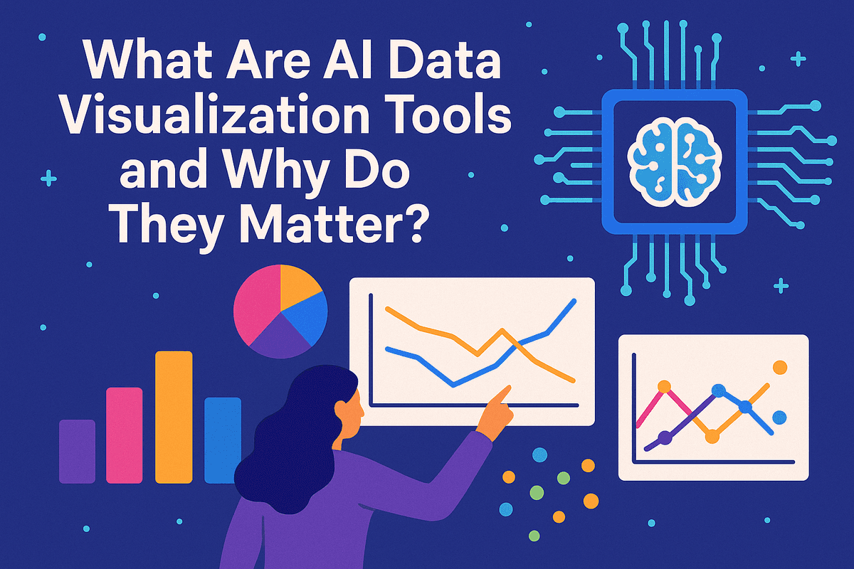
What Are AI Data Visualization Tools and Why Do They Matter?
Data has always told a story, but for decades, we’ve had to be the painstaking translators. The journey from raw numbers in a spreadsheet to a coherent, insightful chart was a manual, time-consuming process. It required expertise, patience, and was often susceptible to human bias and error. We’ve evolved from chalkboards to Excel spreadsheets, but the fundamental challenge remained: we were doing the heavy lifting. This is where the next evolution begins, powered by artificial intelligence.
AI data visualization tools are a new class of software that goes beyond simply plotting points on a graph. They are intelligent platforms that use machine learning (ML), natural language processing (NLP), and advanced algorithms to automate and enhance the entire data interpretation workflow. Instead of you telling the tool what to build, these platforms can analyze your dataset, identify key patterns, detect anomalies, and proactively suggest the most effective visualizations to tell the story hidden within your data.
The AI Revolution in Data Interpretation
Imagine uploading a complex sales report and, instead of manually creating pivot tables and charts, you simply type a question: "What were our top-performing products in the Southeast region last quarter, and how did they compare to the previous year?" An AI-powered tool can parse this request, process the data, and instantly generate an interactive dashboard answering your exact question.
This is the revolution. AI data visualization tools are shifting the paradigm from data presentation to data conversation. They act as an analytical partner, helping businesses of all sizes move from reactive reporting to proactive, data-driven decision-making. By automating the discovery of correlations and trends that a human analyst might miss, these tools uncover deeper, more actionable insights without requiring a PhD in data science.
The Core Benefits: Speed, Accuracy, and Accessibility
The "why" behind the rapid adoption of AI data visualization tools comes down to three transformative benefits that directly impact a company's bottom line and competitive edge.
Speed to Insight
What once took a team of analysts hours or even days can now be accomplished in minutes. AI automates the tedious tasks of data cleaning, sorting, and chart selection. This radical acceleration means decision-makers get critical information when it’s most relevant, allowing them to pivot strategies, address issues, and seize opportunities in real-time.
Enhanced Accuracy and Depth
AI algorithms are designed to analyze vast datasets with an impartiality and thoroughness that is difficult for humans to replicate. They can identify subtle patterns and complex, multi-variable correlations that lie beneath the surface, reducing the risk of cognitive bias influencing interpretations. This leads to more reliable and objective insights.
Democratized Data Accessibility
Perhaps the most significant benefit is the democratization of data. By leveraging natural language queries and intuitive interfaces, AI data visualization tools empower team members across all departments—from marketing to HR to operations—to explore data and find answers for themselves. This breaks down information silos and fosters a culture where anyone, not just data specialists, can engage with data confidently.

A Comparative Look at the Top AI Data Visualization Tools
Choosing the right ai data visualization tools can transform your data from a static spreadsheet into a dynamic source of strategic insight. While many platforms exist, a few industry leaders have integrated artificial intelligence to create truly powerful analytics experiences. Here, we compare the titans of the industry and look at what’s next on the horizon.
Tableau with Einstein: For Enterprise-Level Analytics
Tableau, long a favorite in the business intelligence community, has been supercharged by Salesforce's Einstein AI. This integration makes it a formidable choice for large enterprises that require deep, sophisticated analytics. Tableau with Einstein goes beyond creating beautiful dashboards; it actively helps you understand the "why" behind your data.
Its key AI features include Einstein Discovery, which uses machine learning to automatically find relevant patterns and insights in your data, complete with explanations and recommendations in plain language. The "Ask Data" feature allows users to query complex datasets using natural language, making data exploration accessible to non-technical stakeholders. For organizations dealing with massive, complex data streams and in need of predictive modeling and robust statistical analysis, Tableau with Einstein offers an unmatched level of depth and analytical power.
Microsoft Power BI with AI: For Seamless Ecosystem Integration
For businesses already invested in the Microsoft ecosystem (Azure, Microsoft 365, Dynamics 365), Power BI presents a compelling and seamless option. Its strength lies in its tight integration, allowing for a smooth flow of data and insights across the tools your team uses every day. Microsoft has embedded practical AI features directly into the Power BI workflow.
The "Quick Insights" feature automatically analyzes your dataset and surfaces interesting trends, correlations, and outliers you might have missed. The Q&A visual lets users ask questions in natural language to generate charts and graphs on the fly. Furthermore, Power BI integrates with Azure Cognitive Services and Azure Machine Learning, enabling users to incorporate advanced models for sentiment analysis or forecasting directly into their reports. This makes Power BI one of the most accessible yet powerful ai data visualization tools for a wide range of businesses.
Google Looker Studio with AI Features: For Cloud-Based Data Exploration
Google's Looker Studio (formerly Data Studio), especially when paired with the broader Looker platform and BigQuery, is a champion of cloud-native data exploration. It excels at handling real-time data and leverages the immense power of Google's cloud infrastructure. While its native AI features are more streamlined, its true strength comes from its direct connection to Google Cloud's AI and machine learning services.
Users can easily build reports on data processed by BigQuery ML, allowing for visualizations based on predictive models without ever moving the data out of the Google ecosystem. This makes it an ideal choice for digitally native companies and those who have centered their data strategy around Google Cloud Platform. Its collaborative features and web-based interface make it perfect for agile teams focused on real-time data exploration.
Evaluating Newer AI-Powered Charting Tools
Beyond the big three, a vibrant ecosystem of newer, more specialized ai data visualization tools is rapidly emerging. These platforms often focus on solving specific problems with cutting-edge AI. Some tools are built entirely around natural language, promising to generate complex dashboards from a single text prompt. Others use AI to automate the entire design process, ensuring visualizations adhere to best practices for clarity and impact. While they may not have the all-encompassing feature set of a Power BI or Tableau, these challengers offer innovation and agility, making them perfect for teams looking to supplement their existing stack or experiment with the future of intelligent data visualization.
Essential Features of Modern AI Data Visualization Tools
What separates a truly intelligent platform from a standard dashboard builder? It's the ability to move beyond simply plotting points on a graph to actively assisting in the discovery process. The best ai data visualization tools are not just passive canvases; they are active partners in analysis. They are defined by a core set of transformative features that automate, simplify, and predict, turning raw data into a clear strategic advantage. Let's explore the essential capabilities you should look for.
Automated Insight Generation and Anomaly Detection
Forget spending hours manually sifting through datasets, hoping to spot a trend. Modern AI tools do the heavy lifting for you. They employ sophisticated algorithms to automatically analyze your data and surface key insights, correlations, and, crucially, anomalies.
Imagine a platform that alerts you to a sudden, unexpected drop in user engagement in a specific demographic or highlights a marketing campaign that is performing exceptionally well without you even having to ask. This feature acts as a vigilant analyst, working 24/7 to pinpoint statistically significant events that a human might easily overlook. It’s about moving from "what should I look for?" to "here is what you need to see," saving invaluable time and focusing your attention where it matters most.
Natural Language Querying (NLQ): Ask Questions, Get Visuals
One of the most powerful innovations in data analysis is the ability to talk to your data. Natural Language Querying (NLQ) breaks down the barrier between complex data and non-technical users. Instead of writing code or navigating complicated menu-driven interfaces, you can simply ask questions in plain language.
Typing a query like, "What were our top-selling products in Europe last quarter?" or "Compare customer satisfaction scores between our New York and London offices" prompts the AI to instantly generate the most appropriate chart or graph to answer your question. This democratizes data, empowering team members from sales, marketing, and operations to self-serve their own data needs and get immediate visual answers without relying on a data science team.
Predictive Analytics and Forecasting Capabilities
Looking at historical data is useful, but being able to accurately predict the future is a game-changer. Leading ai data visualization tools integrate machine learning models to provide powerful forecasting capabilities. They analyze past trends, seasonality, and other variables to project future outcomes with a measurable degree of confidence.
This allows you to move from reactive to proactive decision-making. You can visualize projected sales revenue for the next six months, anticipate future inventory requirements to avoid stockouts, or predict potential customer churn rates. The AI doesn't just show you a line on a graph; it generates clear, visual forecasts that help you plan strategy, allocate resources effectively, and mitigate risks before they arise.
Real-Time Data Connection and Automated Reporting
The value of an insight diminishes with age. In today's fast-paced environment, decisions must be based on the most current information available. That's why seamless, real-time data connectivity is a cornerstone feature. These tools connect directly to live data sources—from cloud databases like Snowflake and BigQuery to CRM platforms like Salesforce and streaming services.
Once connected, dashboards and reports can be set to refresh automatically, whether it's every minute, hour, or day. This eliminates the tedious and error-prone cycle of manual data exports and report creation. Your key metrics are always up-to-date, providing a true, living picture of your business performance and ensuring your entire organization is operating from a single, reliable source of truth.

Best Practices for Using AI Data Visualization Tools Effectively
Acquiring a powerful new piece of software is just the first step. To truly unlock the potential of your investment, you need to master its application. The most sophisticated ai data visualization tools are no exception; they are powerful amplifiers of your data strategy, but their effectiveness hinges on your approach. By adopting a few key best practices, you can transform these tools from simple chart-makers into indispensable partners for discovery and decision-making.
Start with Clean, Prepared Data for Accurate AI Analysis
The timeless principle of "garbage in, garbage out" is more relevant than ever in the age of AI. An AI model is only as good as the data it's trained on. Before you even think about generating a chart, you must ensure your dataset is clean, well-structured, and ready for analysis. This involves critical data preparation steps like:
- Handling missing values: Decide whether to remove, replace, or estimate missing data points.
- Correcting inaccuracies: Identify and fix typos, inconsistent formatting (e.g., "NY" vs. "New York"), and outliers that could skew results.
- Ensuring proper data types: Make sure numerical columns are recognized as numbers and dates are formatted correctly.
Investing time in data hygiene is non-negotiable. Clean data allows the ai data visualization tools to perform accurate calculations, identify genuine patterns, and produce trustworthy visuals, forming a solid foundation for all subsequent insights.
Craft Effective Prompts for Natural Language Queries
One of the most revolutionary features of modern AI visualization platforms is the ability to use natural language queries. Instead of navigating complex menus, you can simply ask the tool what you want to see. However, the quality of your output depends directly on the quality of your input. To craft effective prompts, be specific and provide context.
For example, instead of a vague prompt like "Show me sales data," try a more detailed request: "Create a time-series line chart showing our monthly sales revenue for the 'Pro Plan' from January to June of this year." This clarity guides the AI to produce the exact visual you need, saving you time on edits and revisions. Think of it as a conversation; the more clearly you state your request, the better your AI partner will understand and deliver.
Validate AI-Generated Insights with Human Expertise
AI is brilliant at identifying correlations and spotting anomalies at a scale no human could match. However, it often lacks the real-world context and domain-specific knowledge to understand why those patterns exist. This is where human expertise becomes critical. Always treat AI-generated visuals as a starting point for investigation, not a final conclusion.
When an AI tool highlights a surprising trend, use your team’s expertise to validate it. Ask critical questions: Does this insight align with our recent marketing campaigns? Could this dip in engagement be related to a known server outage? This human-in-the-loop approach combines the computational power of AI with the nuanced understanding of human intellect, ensuring that the insights you act on are not just statistically significant but also business-relevant.
Master Storytelling with Data to Build Compelling Narratives
A chart or graph on its own is just a collection of data points. Its true power is unleashed when it's woven into a compelling narrative. The best ai data visualization tools automate the difficult parts of chart creation, freeing you to focus on the uniquely human skill of storytelling. A great data story guides your audience, makes complex information digestible, and drives action.
Structure your presentation like a story:
- Set the Context: What is the business question you are trying to answer?
- Present the Findings: Use the AI-generated visualizations as the evidence to support your key points.
- Reveal the Insight: Explain what the data means in a business context.
- Recommend Action: Conclude with a clear recommendation or next step.
By mastering this final step, you transform raw data into a persuasive narrative that can inspire change and drive your organization forward.
AI Data Visualization Tools in Action: Real-World Use Cases
The theoretical power of AI-driven analytics is impressive, but its true value is revealed in practical, everyday business applications. Across industries, companies are deploying ai data visualization tools to transform raw data into a strategic advantage, moving beyond static reports to interactive, predictive insights. Let's explore how these tools are making a tangible impact in e-commerce, finance, and marketing.
How E-commerce Brands Track Sales Trends in Real-Time
The fast-paced world of e-commerce generates a tsunami of data every second—from clicks and cart additions to purchases and returns. Manually sifting through this information is impossible. This is where AI-powered visualization shines.
Imagine a global online retailer launching a 24-hour flash sale. An AI-driven dashboard can display a live world map, with sales hotspots glowing brighter in real-time. The system can automatically identify that a particular influencer's post has caused a sudden spike in sales for a specific product in a new demographic. The AI can then send an alert to the marketing team, suggesting they immediately boost ad spend targeting that audience. These ai data visualization tools don't just show what's happening; they use predictive algorithms to forecast inventory needs for the next hour, helping prevent stockouts and flagging underperforming products that may need a promotional push, all through clear, intuitive visuals.
Streamlining Financial Reporting and Forecasting with AI Visuals
For finance departments, accuracy and foresight are paramount. Traditional financial reporting often involves manually compiling data into dense spreadsheets, a process that is both time-consuming and prone to error. AI data visualization automates and elevates this entire workflow.
Instead of a static quarterly report, a CFO can now use an interactive dashboard that visualizes the company's financial health. They can drill down from a high-level profit and loss chart into specific expense categories with a single click. The AI's anomaly detection capabilities can automatically flag and visualize unusual transactions that might indicate fraud or an accounting error. Most powerfully, AI enhances forecasting. By analyzing historical data alongside external market variables (like interest rates or supply chain indicators), these tools can generate multiple, visually distinct forecast scenarios, allowing leadership to see the potential impact of different strategic decisions and plan for a range of possible futures.
Optimizing Marketing Campaigns Through AI-Powered Dashboards
Modern marketing campaigns are complex, multi-channel efforts. Marketers need to understand not just how each channel performs individually, but how they work together to guide a customer toward a purchase. AI-powered dashboards are indispensable for achieving this holistic view.
These platforms integrate data from sources like Google Analytics, social media ads, and email marketing software into a single, cohesive visual narrative. A marketer can use a natural language query feature to simply ask, "What was the ROI for our summer video campaign among millennials in California?" and instantly receive a clear chart and a summary. The AI can perform sophisticated attribution modeling, visualizing the customer journey to reveal which touchpoints are most influential—was it the first blog post they read or the final retargeting ad they saw? Furthermore, ai data visualization tools can use predictive analytics to recommend budget allocations, forecasting which channels are likely to deliver the highest return in the upcoming quarter, turning data into a roadmap for success.

Conclusion: Choosing Your AI Data Visualization Tools
The journey from raw data to actionable insight has been radically shortened by the power of artificial intelligence. As we've explored, the modern landscape of AI data visualization tools offers more than just faster chart creation; it provides a collaborative partner capable of uncovering hidden patterns, predicting future trends, and democratizing data access for your entire organization. The right platform can transform your data from a static resource into a dynamic engine for strategic decision-making.
But with a wealth of options available, making the final choice requires a clear, strategic approach. This conclusion will equip you with a final checklist of factors to consider, a quick-start plan for implementation, and the final push you need to start your data transformation journey today.
Key Factors to Consider Before You Choose
Selecting the perfect tool is less about finding a single "best" solution and more about finding the best fit for your unique ecosystem. Before you commit, weigh your shortlisted options against these critical factors:
- Integration and Connectivity: The most powerful AI data visualization tools are useless if they can't access your data. Prioritize platforms that offer seamless, pre-built connectors to your existing data warehouses, databases, cloud applications (like Salesforce or Google Analytics), and file types.
- User Experience (UX) and Accessibility: Who will be using the tool? Look for a solution that caters to your team's skill level. An intuitive drag-and-drop interface is excellent for business users, while support for SQL or Python will empower your data scientists. Natural Language Query (NLQ) features are a game-changer, allowing anyone to ask questions of their data in plain English.
- Core AI Capabilities: Dig deeper than the "AI" label. Does the tool offer the specific features you need? This could include automated insight generation ("auto-insight"), predictive forecasting, anomaly detection, or intelligent chart recommendations that guide users toward the most effective visual representation of their data.
- Scalability and Performance: Your data volume will only grow. Ensure the tool you choose can handle increasing complexity and user loads without a significant drop in performance. Review its architecture—is it cloud-native, and can it scale resources on demand?
- Cost and Total Cost of Ownership (TCO): Look beyond the sticker price. Consider the full TCO, which includes licensing fees, implementation costs, training requirements, and ongoing maintenance. A per-user pricing model might be cost-effective for small teams, while a capacity-based model may be better for large-scale enterprise deployments.
Your Quick-Start Checklist for Implementation
Once you've made your choice, a structured rollout is key to successful adoption. Follow these steps to get started:
- Define a Pilot Project: Don't try to boil the ocean. Select a well-defined, high-impact business problem to solve with your new tool. This creates an early win and demonstrates value quickly.
- Prepare Your Data: Identify and connect the necessary data sources for your pilot project. Use this as an opportunity to address any data quality or accessibility issues.
- Onboard a Champion Team: Assemble a small, cross-functional group of enthusiastic users for the pilot. This team will become your internal experts and advocates.
- Train and Experiment: Leverage the tool's training resources and give your champion team the freedom to explore and experiment. Encourage them to ask new questions and test the AI's capabilities.
- Measure and Share Results: Quantify the impact of the pilot project. Did you save time? Uncover a new revenue opportunity? Improve a key metric? Share these results widely to build momentum for a full-scale rollout.
Transform Your Data Storytelling Today
You are now equipped with the knowledge to navigate the exciting world of AI-powered data visualization. The gap between data and discovery has never been smaller. The opportunity is no longer just about presenting what happened; it's about understanding why it happened and predicting what will happen next.
Stop wrestling with cumbersome spreadsheets and static charts. The time has come to empower your team, accelerate your insights, and tell compelling stories that drive your business forward. Explore the free trials of the tools we've discussed, launch your pilot project, and begin your transformation. The narrative hidden within your data is waiting to be told—let the right AI data visualization tools help you bring it to life.