
July 18, 2026
What UI/UX Design Means for Small Agencies: A Revenue and Retention Lever

For small agencies, ui/ux design is not just a production discipline. It is one of the clearest ways to protect project profitability, reduce subjective feedback, and make clients feel like the work is strategically sound from the first review.
What is UI/UX design?
UI/UX design brings together two connected parts of a digital experience.
UX, or user experience, is about how well the product works for the person using it: whether they understand where to go, can complete the task, and feel confident along the way. UI, or user interface, is about the visible and interactive layer: layouts, buttons, forms, menus, visual treatments, and microcopy.
For an agency, the practical definition is simpler: UI/UX design is the work that turns a client’s goals, user needs, and brand into a digital experience people can actually use.
That might mean helping a SaaS client make a trial signup flow feel effortless. It might mean helping an ecommerce brand reduce hesitation on product pages. Or it might mean making a service business website feel premium, clear, and trustworthy enough to generate qualified leads.
Good UI/UX connects commercial intent with user clarity.
Why agency owners should treat UX quality as margin protection
Weak UX quietly eats agency margin.
When a website or app concept is unclear, feedback becomes scattered: “Can we make this pop?” “Something feels off.” “The page doesn’t feel premium.” “Can we see another version?” Those comments often point to deeper issues: unclear priorities, confusing journeys, mismatched brand expression, or interface decisions that were made screen by screen instead of experience first.
Every round of rework costs time your team cannot resell.
For small creative and digital agencies, this matters because most projects are priced around assumptions: a set number of concepts, review rounds, design hours, and build cycles. If the experience is not strong early, those assumptions break. Designers spend time defending decisions. Account managers spend time translating feedback. Developers wait for final direction. Partners step in to rescue momentum.
Strong UX reduces that drag. It gives the client a clearer reason to approve the work because decisions are tied to business outcomes and user behavior, not personal taste. The conversation shifts from “Do we like this?” to “Does this help the user take the next step?”
That is margin protection.
It also supports retention. Clients rarely stay with an agency only because the visuals were attractive. They stay when the work performs, the process feels controlled, and the agency consistently brings clarity to complex decisions.
How on-brand experiences reduce revision cycles
Many revision cycles start when the interface technically works but does not feel like the client.
A fintech client may reject a perfectly usable dashboard because the tone feels too playful. A wellness brand may push back on a booking flow because it feels cold or transactional. A B2B consultancy may dislike a homepage structure because the copy and interaction patterns make them feel less expert than they are.
These are not just aesthetic disagreements. They are brand alignment problems showing up inside the user experience.
On-brand ui/ux design reduces those disconnects by making the client’s identity visible in practical interface choices: how options are framed, how much guidance appears on a page, how confident or conversational the copy feels, how restrained or expressive the visual system becomes, and how each interaction supports the brand promise.
For agencies, that means fewer “not quite us” comments and fewer late-stage resets. The client sees their positioning carried through the experience, not just placed on top of it with colors and typography.
When every screen feels like it belongs to the same brand, approvals get easier. Your team spends less time reconciling competing opinions and more time moving the project toward launch.

Core UI/UX Principles That Keep Digital Products Clear, Useful, and On-Brand
Once UX quality is tied to margin, the next question is practical: what standards should your team protect on every client project, even when timelines are tight?
Usability, accessibility, and hierarchy
A beautiful interface that makes users hesitate will create downstream cost: more client questions, more stakeholder opinions, more “can we just tweak this?” cycles.
Strong usability starts with obvious paths. On a service page, that might mean one primary CTA, clear package comparison, and form fields that only ask for what sales actually needs. In a SaaS onboarding flow, it might mean showing progress, reducing setup decisions, and saving advanced settings for later.
Accessibility should be treated as a quality baseline, not a late-stage compliance pass. For small agencies, the biggest wins usually come from simple habits:
- Sufficient contrast between text and background
- Legible type sizes across desktop and mobile
- Clear focus states for keyboard navigation
- Form labels that remain visible
- Error messages that explain how to fix the issue
Hierarchy is where usability and brand start working together. The interface should guide attention in the order the user needs it: headline, value, proof, action. If every card, badge, animation, and CTA competes equally, the screen feels busy and the client’s message gets weaker.
For agency teams, hierarchy also protects production time. When designers, writers, and developers agree on what matters most per screen, fewer subjective debates make it into review.
Consistency across screens, components, and copy
Consistency is what makes a digital product feel intentional instead of assembled.
That means buttons behave the same way across the site. Navigation labels use the same language from page to page. Cards, forms, filters, alerts, and modals follow recognizable patterns. Microcopy uses one voice, not whatever phrasing happened to be generated or written that day.
For small teams juggling multiple clients, this is where UI/UX design can easily drift. One designer creates a polished landing page. Another adds a resource hub two weeks later. A strategist writes new CTA copy. A developer improvises an empty state. None of it is “wrong,” but the experience starts to feel uneven.
The fix is not more meetings. It is clearer reusable rules:
- Component states: default, hover, active, disabled, error
- CTA patterns: when to use “Book a demo” vs. “Get started”
- Navigation logic: what belongs in top-level menus
- Content patterns: how headlines, helper text, and confirmations should sound
- Layout rules: spacing, grid behavior, and section rhythm
Clients may not name consistency as the reason they trust a product, but they feel it. Consistency reduces cognitive load for users and reduces interpretation work for your team.
Brand expression in interface decisions
Brand does not live only in the logo, palette, or hero headline. It shows up in the choices users interact with.
A premium advisory firm may need restrained motion, confident spacing, and direct CTA language. A youth-focused consumer brand may need brighter feedback states, playful empty screens, and more conversational prompts. A technical B2B product may need dense comparison tables, precise labels, and reassuring confirmation messages.
The key is to translate brand traits into interface rules. If the brand is “calm and expert,” what does that mean for error messages? If it is “bold and challenger,” how should onboarding prompts sound? If it is “warm and human,” should the form confirmation feel transactional or personal?
This is where agencies can create visible client value. You are not just making screens look branded; you are making the product behave like the brand.
A Practical UI/UX Design Workflow for Lean Agency Teams
Once the standards are clear, the real leverage comes from making the process repeatable enough that every strategist, designer, and account lead can move in the same direction without adding meetings.
Discovery: goals, users, and constraints
For a lean agency, discovery should not become an open-ended research phase. It should answer three commercial questions quickly:
- What does the client need the user to do?
Book a demo, complete onboarding, request a quote, compare plans, renew a subscription, upload a file, or find support.
- What does the user need before they will do it?
Proof, clarity, pricing context, reassurance, a simpler path, fewer fields, or better timing.
- What constraints will shape the experience?
Existing CMS, development budget, brand rules, compliance needs, stakeholder preferences, content gaps, integrations, or launch deadlines.
This is where agencies protect margin. If these answers stay vague, the team ends up designing around opinions. If they are documented early, every later decision has a reference point: “Does this screen help the target user take the priority action within the project constraints?”
A simple discovery output can be a one-page brief that captures:
- Primary user groups
- Top user tasks
- Business goals by priority
- Known friction points
- Required pages or screens
- Content that exists vs. content that must be created
- Technical or approval constraints
That is enough to keep the project moving without pretending every engagement needs enterprise-level research.
Structure: user flows, wireframes, and content priorities
Before visual design, map the path. For small teams, this step prevents expensive late-stage debates because it separates structure from styling.
Start with the key user flows: the few journeys that matter most to the client’s business. For example:
- Homepage → service page → case study → contact form
- Pricing page → plan comparison → checkout
- Dashboard → task list → completion confirmation
- Landing page → lead magnet → nurture next step
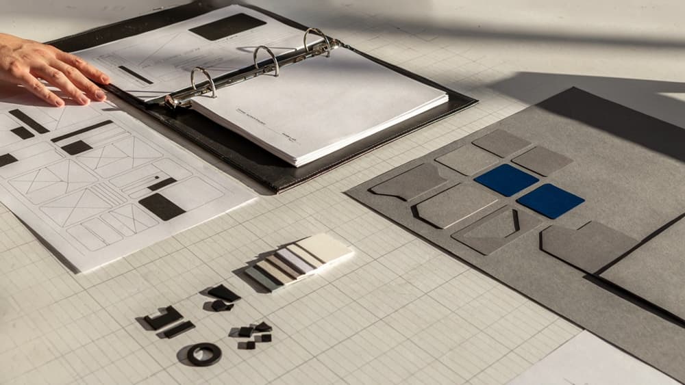
Then move into wireframes that show what each screen must accomplish. The goal is not polish; it is sequence. What does the user need first? What can wait? Where does the decision happen? What supporting content removes hesitation?
Content priorities matter as much as layout. A strong ui/ux design workflow forces teams to decide the message hierarchy before anyone is debating button colors or image crops. For agencies, that means fewer subjective review rounds and clearer feedback from clients: they can react to the purpose of each section instead of getting distracted by unfinished visuals.
Validation: feedback loops before full build
Validation should happen before production design or development locks in avoidable mistakes. Keep it lightweight and specific.
Instead of asking, “Do you like this?” ask reviewers and test users to complete a task:
- “Where would you click to request a consultation?”
- “What information would you need before choosing this plan?”
- “What do you think happens after submitting this form?”
- “Which option feels most relevant to your situation?”
For client stakeholders, frame feedback around the agreed goals from discovery. This keeps reviews from turning into personal preference sessions and helps account teams push back without creating friction.
A practical validation loop for a small agency can be:
- Internal review against the project brief
- Client review of flows and wireframes
- Short task-based feedback from representative users or customer-facing staff
- Revisions before visual design or build
That small pause is often the difference between a clean launch and a project that burns profit in rework.
UI/UX Tools and Deliverables Agencies Actually Need
Once the workflow is clear, the next margin decision is what to standardize. Lean teams do not need a bloated stack; they need a repeatable set of deliverables that moves clients from uncertainty to approval without creating extra production drag.
Research and mapping deliverables
For small agencies, research deliverables should be lightweight, client-readable, and directly tied to design decisions. Avoid turning every project into a strategy marathon. The goal is to capture enough context to prevent subjective feedback later.
Useful deliverables include:
- User goal summary: A one-page view of what priority users are trying to do, what blocks them, and what action the interface must support.
- Journey or experience map: Best for websites, portals, onboarding flows, and service businesses where the client needs to see the full path from first touch to conversion.
- Sitemap or app structure: A clear hierarchy of pages, screens, or sections so stakeholders can approve scope before design starts.
- Task flow: A focused path for key actions such as booking a consultation, creating an account, requesting a quote, or completing checkout.
- Content priority notes: A simple ranking of what each screen must communicate first, second, and third.
The agency advantage is not producing more artifacts. It is producing the few artifacts that make the next approval easier.
Design and prototyping platforms
Most small creative and digital agencies can standardize around one primary design environment, then add specialist tools only when the project demands it. The wrong setup creates tool sprawl: files in one platform, comments in another, prototypes somewhere else, and client feedback buried in Slack.
Platform type | Best use | Watch for |
|---|---|---|
Interface design tools | Layouts, components, responsive screens, design systems | Messy file structure if naming and components are not standardized |
Prototyping tools | Clickable flows, stakeholder demos, usability reviews | Overbuilding interactions that will not affect approval or development |
Whiteboarding tools | Workshops, journey maps, early structure, collaborative planning | Strategy boards that never translate into production assets |
Feedback and annotation tools | Client comments, revision tracking, approvals | Duplicated feedback across email, docs, and design files |
For most agency teams, the practical standard is simple: one source of truth for screens, one place for feedback, and one agreed format for client review. That keeps ui/ux design production visible without forcing every project manager, designer, developer, and client into five overlapping tools.
Handoff assets that reduce developer friction
Developer handoff is where many otherwise polished projects lose margin. If the design file looks finished but the behavior, states, and assets are unclear, the build team has to interpret intent. That creates rework, questions, and inconsistent implementation.
Strong handoff assets include:
- Annotated screen files showing layout logic, responsive behavior, and priority interactions.
- Component documentation for buttons, forms, navigation, cards, modals, alerts, and repeated patterns.
- Interaction states such as hover, active, disabled, empty, loading, error, and success.
- Content and microcopy specs so developers are not pulling text from screenshots or outdated docs.
- Asset export guidance covering icons, imagery, file formats, naming, and usage notes.
- Acceptance notes that define what “done” means for key flows.
The best handoff package is not the most elaborate one. It is the one that lets a developer build without guessing—and lets the agency protect quality without adding another round of avoidable clarification.
How Aethera Helps Agencies Scale On-Brand UI/UX Output Without Tool Sprawl
Once the workflow and deliverables are in place, the next bottleneck is usually consistency: every client has different positioning, tone, product logic, audience expectations, and stakeholder preferences. Aethera gives your team one place to capture that context and reuse it across the messy middle of UI/UX design work.
Ingest the client brand once, then reuse it everywhere
Most agencies already have the raw material: brand guidelines, strategy decks, sitemap notes, sales pages, discovery calls, personas, product docs, past campaigns, and client feedback. The problem is that context gets scattered across folders, Slack threads, Notion pages, and individual team members’ heads.
Aethera turns that client context into a reusable brand brain.
Instead of re-prompting a general AI tool with the same background every time, your team can ingest the client’s brand once and apply it across UX-related outputs, including:
- Screen-level messaging
- CTA options
- Navigation labels
- Empty states and error states
- Onboarding flows
- Feature explanations
- UX audit notes
- Client presentation language
- Recommendation summaries
For a small agency, that means fewer “this doesn’t sound like us” comments from clients and less time spent translating generic AI output into something usable. A junior strategist, designer, or PM can work from the same brand foundation as the senior partner who led discovery.
AI-assisted research, ideation, and interface copy
Aethera is especially useful in the parts of UI/UX work where teams need momentum before polished design begins.
For research synthesis, it can help turn raw inputs into practical working material: audience pain points, likely objections, feature priorities, decision criteria, and messaging angles. For ideation, it can generate multiple approaches without drifting away from the client’s positioning. For interface copy, it can produce options that respect the brand’s voice while staying clear and action-oriented.
That matters when your team is juggling several clients at once. You may need to move from a SaaS dashboard to a nonprofit donation flow to a professional services landing page in the same afternoon. Aethera keeps each client’s context separate, so outputs don’t blur into the same generic AI tone.
Example: instead of asking a blank AI chat for “five CTA ideas,” your team can generate CTA options based on the client’s offer, audience maturity, tone, conversion goal, and existing messaging. The result is closer to something a designer can place in a prototype or a strategist can bring into a client review.
Quality control for consistent client-facing UX recommendations
The biggest risk with AI-assisted agency work is not speed. It is inconsistency across deliverables.
One person writes the UX audit. Another drafts the prototype notes. Someone else prepares the client presentation. Without a shared brand and recommendation layer, the work can feel stitched together even when the underlying thinking is solid.
Aethera helps agencies create a more consistent client-facing standard. Recommendations can be framed in the client’s language, tied back to their goals, and expressed with the right level of confidence and detail. That makes UX feedback easier for clients to understand, approve, and act on.
For owners and partners, the payoff is operational: less tool switching, fewer internal rewrites, faster client-ready drafts, and a stronger sense that every touchpoint came from the same strategic team.