
July 30, 2026
Typography Meaning: The Brand System Behind Written Communication
Typography is where written words become recognizable brand communication. For agencies, that matters because clients rarely judge an asset as “off-brand” from the copy alone. They feel it in the way the words look, sit, and behave across a website, deck, ad, proposal, email, or social post.
What does typography mean?
The simplest typography meaning is the art and system of arranging written language so it communicates clearly and feels intentional.
In practice, typography covers the visual decisions that shape text: which type is used, how large or prominent it appears, how text relates to other text, and how consistently those choices show up across brand touchpoints. It is not just “picking a nice font.” It is the structure that makes a client’s written communication feel like it came from the same brand every time.
For a small agency, typography often becomes one of the fastest ways to spot whether work is mature or improvised. A campaign landing page, sales one-pager, pitch deck, and LinkedIn carousel may all use different formats, but the typography should still create a familiar voice. If every deliverable treats text differently, the brand starts to fragment.
Typography vs. lettering, calligraphy, and graphic decoration
Typography is easy to confuse with other visual treatments of words, but the distinction matters when you are building repeatable client work.
Lettering is custom-drawn text, usually created for a specific use. A hand-drawn logo mark, campaign headline, or mural-style phrase might be lettering. It can be highly expressive, but it is usually not designed to scale across hundreds of everyday brand applications.
Calligraphy is writing made by hand, often with a pen, brush, or stylus. It emphasizes gesture, craft, and the movement of the hand. It can influence a brand’s style, but it is not the same as a typographic system used across web pages, documents, and ads.
Graphic decoration uses text as a visual element. Words might be stretched, distorted, outlined, masked, or arranged mainly for impact. That can be useful in a campaign concept, but decoration is not a substitute for typography. If the text treatment cannot support routine communication, it is an effect, not a system.
Typography is different because it is repeatable. It gives teams a shared way to make written content look consistent across formats, contributors, and channels.
Why typography matters to agency-client output
Agency work lives or dies on consistency. A client may approve a strong identity system, then slowly watch it weaken as different people produce decks, emails, landing pages, reports, ads, and social assets under deadline pressure.
Typography is one of the main reasons that happens.
When typographic choices are clear, each deliverable feels connected to the larger brand. The client’s tone becomes easier to recognize before a reader has finished a sentence. Premium brands can maintain restraint. Challenger brands can keep their energy. Technical brands can stay precise. Editorial brands can feel considered rather than generic.
When typography is loose, the opposite happens. Work starts to look assembled instead of designed. Different teams make different assumptions. AI-assisted drafts, freelance layouts, and internal client edits can all drift in separate directions.
That is why understanding typography meaning is not academic for agency owners. It is a delivery issue. Strong typography helps a small team produce more client work without making every asset feel like a fresh interpretation of the brand.
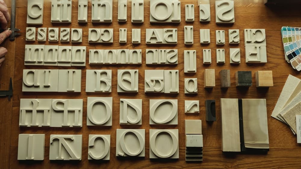
Typefaces and Fonts: The Building Blocks of a Typographic System
Once the typography meaning is clear at the brand level, the next decision is practical: which typefaces and fonts become the client’s working toolkit?
Typeface vs. font: the practical difference
A typeface is the design family. A font is the specific file, weight, style, or format used from that family.
For example:
- Inter is a typeface.
- Inter Regular 16px is a font usage.
- Inter Bold Italic is another font within the same typeface family.
For agency teams, the distinction matters because brand consistency depends on both levels. A client may approve a typeface, but the system still needs rules for which fonts are used where: headlines, body copy, captions, CTAs, social graphics, pitch decks, reports, and web pages.
Without that specificity, teams improvise. One designer uses Semibold for subheads. Another uses Medium. A strategist builds a deck in a fallback font. An AI-assisted workflow generates landing page copy that references the right tone, but the final layout drifts visually because the typographic system is incomplete.
Common type categories agencies should recognize
Most client systems rely on a small set of type categories. You do not need a type designer’s vocabulary to use them well, but your team should recognize the core options.
Type category | Common traits | Typical agency use |
|---|---|---|
Serif | Small strokes at the ends of letterforms; often traditional, editorial, or refined | Luxury brands, professional services, publishing, cultural institutions |
Sans serif | Clean letterforms without serifs; often modern, neutral, or digital-first | SaaS, startups, agencies, healthcare, consumer brands |
Slab serif | Heavy, block-like serifs; sturdy and confident | Bold campaigns, sports, education, challenger brands |
Monospace | Each character takes the same width; technical and structured | Developer tools, data brands, AI, fintech, product UI accents |
Script | Handwritten or calligraphic feel; expressive and personal | Hospitality, beauty, events, boutique brands |
Display | Highly distinctive typefaces designed for impact, not long reading | Logos, campaign headlines, posters, social graphics |
The key is not to collect categories. It is to decide which roles each typeface can safely play in the client’s system. A display face might work beautifully for campaign headlines but fail in a 20-slide sales deck. A serif might elevate a brand manifesto but feel too formal inside a mobile app.
How type choices express brand personality
Type carries tone before anyone reads the words. That makes it one of the fastest ways an agency can either reinforce or dilute a client’s brand.
A few examples:
- A geometric sans serif can make a brand feel clean, efficient, and product-led.
- A humanist sans serif can feel warmer, more approachable, and less mechanical.
- A high-contrast serif can signal sophistication, taste, and editorial authority.
- A rounded typeface can create friendliness, softness, or accessibility.
- A condensed display face can feel bold, urgent, and campaign-ready.
For agency work, the goal is not “choose a nice font.” It is to connect type decisions to brand attributes the client has already approved. If the brand is precise, premium, and calm, the type system should not suddenly feel playful and loud in a social campaign. If the brand is energetic and youth-focused, a conservative type choice can flatten the work before the copy has a chance to perform.
Document those personality links clearly. Not just “Use Neue Haas Grotesk,” but “Use it to preserve a confident, editorial, high-clarity voice across digital and presentation work.” That gives designers, writers, strategists, and AI-supported workflows the same visual guardrails when output scales across channels.
Spacing and Layout: How Typography Creates Order on the Page or Screen
Once the type choices are set, spacing decides whether the work feels polished, readable, and unmistakably intentional—or like every deliverable was assembled from scratch.
Kerning, tracking, and leading explained simply
Three spacing controls do most of the heavy lifting:
- Kerning adjusts the space between individual letter pairs. It matters most in logos, headlines, buttons, and large display text where awkward gaps are obvious. Think of a headline where “AV” looks too far apart or “To” feels cramped.
- Tracking adjusts spacing across a whole word, phrase, or text block. Wider tracking can make small labels, navigation, or luxury brand messaging feel more refined. Too much tracking in body copy, though, slows reading and looks amateur.
- Leading is the vertical space between lines of text. Tight leading can make copy feel dense and urgent; generous leading makes longer content easier to read and gives premium brands more breathing room.
For agencies, the risk is inconsistency. One designer sets social post headlines with airy tracking, another uses default spacing in a landing page hero, and a freelancer compresses leading to fit a print flyer. None of those choices may be “wrong” alone, but together they dilute the client’s system.
Line length, alignment, and white space
Layout spacing shapes how quickly people understand the message.
Line length is one of the most common issues in agency output. If a line is too long, readers lose their place. If it’s too short, the copy feels choppy. For web body copy, a practical range is often around 45–75 characters per line. Shorter lines can work for captions, cards, and mobile layouts; longer lines need more leading and stronger hierarchy.
Alignment sets rhythm. Left-aligned text is usually the most readable for body copy. Centered text works best in short bursts: hero statements, invitations, quotes, or campaign lines. Justified text can look formal in print but often creates uneven gaps if not handled carefully.
White space is not empty space—it is structure. It separates sections, groups related ideas, and gives important messages room to land. In client work, white space is often where brand perception shows up fastest: crowded layouts feel cheap or rushed, while controlled spacing signals confidence.
Spacing rules for digital and print consistency
The easiest way to protect layout quality is to define spacing decisions before production starts. A usable brand system should specify:
- Headline, subhead, body, caption, and button spacing defaults
- Minimum margins and padding for common formats
- Line-height ranges for desktop, tablet, and mobile
- Rules for all-caps labels, including tracking
- Maximum text widths for landing pages, decks, and email templates
- Print-specific adjustments for brochures, one-pagers, packaging, and signage
Digital and print rarely behave the same. A layout that feels spacious on a website may look thin on a poster. A brochure paragraph that reads well in print may feel cramped on mobile. The goal is not identical measurements everywhere; it is a consistent visual rhythm across channels.
That is where the practical typography meaning becomes operational for agencies: spacing turns brand intent into repeatable production standards.

Hierarchy and Readability: Guiding Attention Without Making People Work
Once the type system and spacing rules are in place, the next question is simple: can someone understand the message at a glance?
How typographic hierarchy directs the reader
Hierarchy tells readers what to notice first, what to read next, and what can wait. For agency work, that matters across almost every deliverable: landing pages, pitch decks, social carousels, email campaigns, sales sheets, reports, and paid ads.
A strong hierarchy usually combines:
- Scale: larger type for primary messages, smaller type for supporting detail.
- Weight: bold or heavier styles for emphasis, not decoration.
- Position: important information placed where the eye naturally lands first.
- Spacing: enough separation between sections so the reader understands what belongs together.
- Consistency: the same level of information gets the same treatment every time.
For example, a client case study might use a large outcome-led headline, a short supporting subhead, bold metric callouts, and smaller explanatory copy. If every element competes at the same size and weight, the reader has to work out the structure themselves. That slows comprehension and weakens the message.
Good hierarchy is especially important when multiple people on an agency team touch the same client account. If one designer treats testimonial quotes as hero elements and another treats them as body copy, the client’s materials start to feel inconsistent even when the words are strong.
Readability basics: size, contrast, and scan patterns
Readability is where typography becomes practical. It is not just whether the copy looks polished; it is whether the intended audience can move through it quickly and comfortably.
Three basics carry most of the load:
Readability factor | What to check | Common agency mistake |
|---|---|---|
Size | Is the text large enough for the format and viewing distance? | Using print-sized thinking on mobile screens or presentation slides |
Contrast | Does the text stand out clearly from the background? | Placing light gray copy on white, or brand colors that look good but read poorly |
Scan pattern | Can readers skim headings, subheads, bullets, and calls to action? | Creating dense blocks of copy with no visual entry points |
Scan behavior is especially important in digital work. Most users do not read landing pages, emails, or social posts from top to bottom. They look for anchors: a headline, a bold phrase, a number, a button, a caption. Typography should make those anchors obvious without turning every sentence into a shout.
For small agencies, this is where client trust is won or lost. A campaign can have smart strategy and strong copy, but if the hierarchy is muddy or the body text is tiring to read, performance suffers—and the client may blame the idea instead of the execution.
Accessibility as a typography requirement, not an extra
Accessible typography is not a final compliance pass. It should be part of how the work is shaped from the beginning.
At minimum, agencies should consider:
- Legible text sizes across desktop, mobile, print, and presentation formats.
- Sufficient color contrast between type and background.
- Clear distinction between links, buttons, and body copy.
- Avoiding all-caps for long passages, which can reduce readability.
- Enough line spacing for comfortable reading, especially in longer content.
- Responsive hierarchy, so headings and body copy still make sense on smaller screens.
This protects more than usability. It protects the client’s brand experience. If a brand feels elegant on a designer’s monitor but becomes hard to read on a phone, in an email, or for someone with low vision, the typography is not doing its job.
For agency owners, accessibility also creates a cleaner production standard. Teams make fewer subjective calls, reviewers have clearer criteria, and deliverables hold up across more real-world contexts. That is the deeper typography meaning in practice: visual choices that help every reader understand the message with less effort.
Scaling On-Brand Typography Across Agency Workflows
Once the typography meaning is clear inside the brand system, the agency challenge becomes operational: making sure every strategist, designer, writer, freelancer, and AI tool applies it the same way.
Turn typography rules into reusable brand guidelines
A client’s type system should not live only in a PDF brand book or a designer’s memory. For agency teams, it needs to become a working asset that can be reused across landing pages, pitch decks, social templates, ads, email campaigns, and AI-assisted drafts.
At minimum, document:
- Approved typefaces and fallback options
- Usage rules for headings, body copy, captions, buttons, and pull quotes
- Brand-specific do’s and don’ts, such as “never use all caps for CTAs” or “keep headlines short and editorial”
- Example applications across common deliverables
- Notes on tone alignment, such as whether typography should feel premium, playful, technical, minimal, or bold
The goal is to remove interpretation. A junior designer, freelance copywriter, or account manager should be able to open the guideline and understand how the client’s written communication should look and feel before anything goes to creative review.
For small agencies, this also protects margin. The clearer the system, the fewer rounds are wasted fixing “almost right” work.
Keep AI-generated content aligned with client type systems
AI can help agencies scale content, but it can also multiply inconsistency if every prompt starts from scratch. Typography rules need to be part of the client context, not an afterthought added during design.
That means prompts and AI workspaces should include client-specific type guidance alongside voice, messaging, audience, and offer details. For example:
- “Write homepage sections with short, high-impact headings that fit a bold display type system.”
- “Avoid long subheads because this client’s layout uses narrow content blocks.”
- “Generate social post copy in a format that works with the client’s existing carousel templates.”
- “Keep CTA text concise so it fits established button styles.”
This is where a centralized brand system matters. Instead of asking each team member to remember every client’s typography preferences, agencies can store those rules once and apply them across AI-generated briefs, copy, campaign concepts, and content variations.
Aethera is built for exactly that workflow: ingest the client’s brand once, then keep AI outputs aligned with the typography, tone, and messaging rules that make the work feel like it belongs to that client.
Quality-control typography across every deliverable
Typography quality control should happen before the internal review bottleneck, not after a client spots inconsistencies.
Build a simple preflight step into production:
- Does the deliverable follow the client’s approved type usage?
- Are headings, subheads, CTAs, and supporting copy formatted consistently?
- Does the copy length fit the intended layout or template?
- Are AI-generated variations compatible with the client’s existing design system?
- Would this piece feel recognizable next to the client’s website, deck, or campaign assets?
For agencies juggling multiple clients, the biggest risk is cross-contamination: one client’s punchy headline style slipping into another’s restrained brand, or a social layout rule influencing an unrelated email campaign. A documented, reusable type system prevents that drift.
The payoff is practical: faster production, fewer subjective revisions, and more confidence that every deliverable reinforces the client’s brand instead of quietly diluting it.