
September 6, 2025
An Introduction to AI Data Visualization Tools
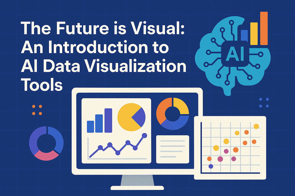
The Future is Visual: An Introduction to AI Data Visualization Tools
In an age where data is the new oil, simply collecting it isn't enough. The real challenge—and opportunity—lies in understanding it. For decades, we’ve relied on spreadsheets and traditional charts to make sense of complex datasets, but this manual approach is slow and often misses the deeper story hidden within the numbers. The future of data analysis is not just about seeing data; it's about interacting with it. Welcome to the era of AI data visualization tools.
What Are AI Data Visualization Tools (and How Do They Work)?
At their core, AI data visualization tools are advanced software platforms that leverage artificial intelligence, particularly machine learning (ML) and natural language processing (NLP), to transform raw data into dynamic, insightful, and easy-to-understand visual representations.
Unlike traditional tools where the user must manually select data points, choose a chart type, and look for patterns, AI-powered platforms automate much of this process. Here’s a simplified breakdown of how they work:
- Automated Data Analysis: AI algorithms scan entire datasets to automatically identify trends, correlations, outliers, and clusters that a human analyst might easily miss.
- Smart Visualization Suggestions: Based on its analysis of the data's structure and the patterns it finds, the tool recommends the most effective chart or graph type (e.g., a bar chart for comparison, a line chart for time-series data) to convey the insight clearly.
- Natural Language Interaction: Many modern tools feature a conversational interface. You can ask questions in plain English, like "What were our top-selling products in the Northeast last quarter?" and the AI will generate the corresponding visualization instantly.
Beyond Traditional BI: The AI Advantage
Traditional Business Intelligence (BI) tools put the burden of discovery entirely on the user. You have to know what question to ask and how to manipulate the data to find the answer. AI data visualization tools flip this model on its head, acting as a proactive analytical partner.
The AI advantage is about moving beyond descriptive analytics ("what happened") into the more powerful realms of diagnostic, predictive, and prescriptive analytics. While a traditional dashboard can show you that sales dipped last month, an AI-powered tool can go further. It can diagnose why they dipped by automatically correlating the drop with other variables like a competitor's marketing campaign or regional supply chain issues. It can then use predictive models to forecast future sales and even prescribe actions to get performance back on track. This shift from a reactive to a proactive stance is the single greatest benefit of integrating AI into your data strategy.
From Raw Data to Actionable Story: The Goal of AI Visualization
Ultimately, the goal of any great data visualization is to tell a clear and compelling story. A spreadsheet full of numbers is just noise; a well-crafted visual narrative is a call to action. AI excels at this translation. By automatically surfacing the most critical insights and arranging them into a logical flow, these tools help construct a data story that guides decision-makers from observation to conclusion.
This capability democratizes data analytics. You no longer need to be a seasoned data scientist to uncover valuable insights. An executive can ask a high-level question, a marketer can explore campaign performance, and an operations manager can identify bottlenecks—all through intuitive, visual interfaces. The best AI data visualization tools don't just create charts; they transform complex data into an actionable story that empowers your entire organization to make smarter, faster decisions.
Head-to-Head: Comparing the Best AI Data Visualization Tools of 2024
The market for AI data visualization tools is more competitive than ever, with established leaders enhancing their platforms with powerful AI and new players emerging with AI at their core. Choosing the right tool depends heavily on your existing tech stack, business size, and analytics goals. Here’s a direct comparison of the top contenders.
Tableau with Einstein: Best for Enterprise-Level Analytics
As a long-standing leader in the visualization space, Tableau’s integration with Salesforce’s Einstein AI creates an enterprise-grade analytics powerhouse. The standout feature, Einstein Discovery, uses machine learning to automatically scan your data for significant patterns, correlations, and anomalies. It doesn't just show you what happened; it provides AI-driven explanations for why it happened and offers prescriptive recommendations on what to do next.
Furthermore, its natural language processing (NLP) capabilities, like “Ask Data,” allow users to type questions in plain English ("What were the top 10 product sales in the Northeast last quarter?") and receive an instant, accurate visualization. This combination of deep diagnostic power, predictive modeling, and user-friendly NLP makes Tableau with Einstein the go-to choice for large organizations needing scalable, governed, and insightful AI-driven analytics.
Microsoft Power BI: Top Choice for Seamless Integration
For companies heavily invested in the Microsoft ecosystem, Power BI is an unbeatable choice. Its greatest strength is its native, seamless integration with tools like Azure, Office 365, and Microsoft Teams. This creates a frictionless workflow, allowing users to move from an Excel spreadsheet to a predictive Azure AI model and back to a Power BI dashboard with ease.
Power BI’s built-in AI features, such as “Quick Insights,” automatically analyze datasets to surface key trends and outliers that might otherwise go unnoticed. Its Q&A function is another powerful natural language tool that lets users explore data conversationally. By leveraging Azure Cognitive Services, developers can also enrich reports with advanced features like sentiment analysis and image detection. If your organization runs on Microsoft, Power BI offers the smoothest path to implementing AI-powered business intelligence.
Looker's AI Capabilities: For Deep, Actionable Insights
Now part of Google Cloud, Looker approaches AI visualization from a data-governance-first perspective. Its core strength is the LookML modeling layer, which establishes a reliable and consistent "single source of truth" for all business data. This robust foundation makes its AI capabilities incredibly trustworthy.
Looker deeply integrates with Google’s world-class AI platform, including BigQuery ML and Vertex AI. This allows users to not only visualize data but also build, train, and deploy machine learning models directly within their Looker workflow. The focus is less on flashy, one-off visualizations and more on embedding reliable, actionable intelligence into daily operations and applications. Looker is ideal for data-mature companies that prioritize a governed, scalable data culture and want to make AI an integral part of their business logic.
Emerging AI-Native Platforms to Watch
While the titans battle it out, a new breed of AI data visualization tools is capturing attention. Platforms like ThoughtSpot and Polymer are built with a search-first, AI-native architecture. Their primary interface isn’t a canvas for building charts but a search bar, allowing users to ask complex questions and get immediate, AI-generated visualizations and answers. This conversational approach dramatically lowers the barrier to entry for data exploration. These tools are perfect for organizations aiming to foster a true self-service analytics culture, moving beyond pre-configured dashboards toward on-demand, dynamic insights.
Must-Have Features of Modern AI Data Visualization Tools
Gone are the days of static charts and manual data-digging. The best modern AI data visualization tools have evolved from passive reporting instruments into active, intelligent partners in your analytics journey. They don't just show you what happened; they help you understand why it happened and predict what will happen next. When evaluating software, look for these four transformative features that separate the truly advanced platforms from the rest.
Automated Insight Generation and Anomaly Detection
The most significant leap forward in data visualization is the ability of AI to proactively find the story in your data. Instead of spending hours slicing and dicing datasets to find meaningful correlations, these tools use sophisticated algorithms to do the heavy lifting for you. They automatically scan your data to identify significant trends, patterns, and, most critically, anomalies—unexpected spikes or dips that could signal a major problem or a golden opportunity.
For a business, this means getting ahead of the curve. An AI-powered tool might alert you to a sudden drop in customer engagement in a specific region or highlight an underperforming marketing campaign before it drains your budget. This automated discovery turns every user, regardless of their analytical skill, into a high-impact data explorer.
Natural Language Querying: Ask Your Data Questions in Plain English
One of the biggest barriers to widespread data adoption has been the need for specialized skills, like SQL or complex filter-building. Natural Language Querying (NLQ) demolishes this barrier. This feature allows you to interact with your data as if you were talking to a colleague. You can simply type or speak questions like, "What were our top 5 products by revenue in the Northeast last quarter?" or "Compare sales growth between laptops and tablets this year."
The AI engine interprets your request, translates it into a formal query, and instantly returns the answer as a clear, relevant visualization. This capability democratizes data access, empowering marketing, sales, and operations teams to get the answers they need on the fly, without having to rely on a dedicated data analyst.
Predictive Analytics and Forecasting Models
While traditional BI tools are excellent at showing historical performance, leading AI data visualization tools look to the future. By integrating machine learning models directly into the platform, they can analyze past data to create robust forecasts. This moves your organization from reactive to proactive decision-making.
Imagine being able to accurately forecast inventory needs for the next six months, predict which customers are most likely to churn, or estimate next quarter's revenue based on current pipeline data. These predictive capabilities are no longer confined to data science teams. Modern tools make forecasting accessible, allowing you to run what-if scenarios and build strategic plans based on data-driven predictions rather than guesswork.
Real-Time, Interactive AI Storytelling
A chart is just a collection of data points, but a story creates understanding and drives action. AI-powered data storytelling automatically transforms your dashboards into compelling narratives. The software can generate dynamic headlines, annotated callouts, and plain-language summaries that explain what the data is showing. For example, instead of just displaying a line chart, the tool might add a caption: "Q3 sales increased by 15%, driven primarily by a 40% surge in the new X-Pro model."
Furthermore, these stories are interactive. Stakeholders can click on a data point within the narrative to drill down for more detail, exploring the "why" behind the "what." This makes presentations more engaging and ensures that key insights are clearly communicated and understood across the entire organization.
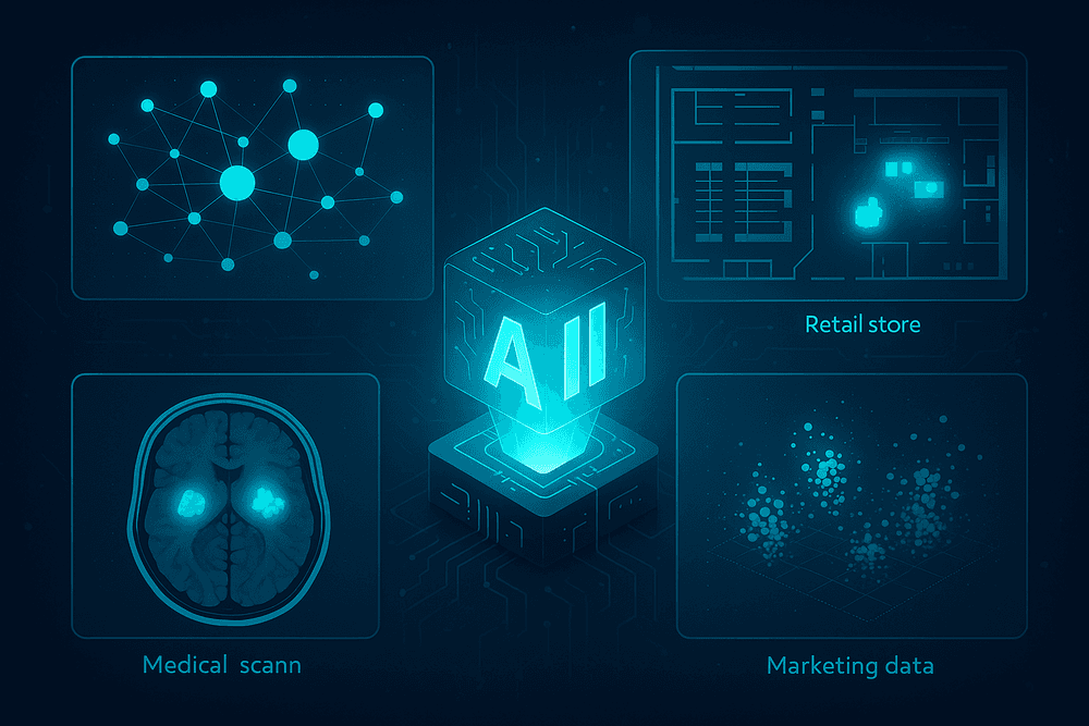
Real-World Impact: Use Cases for AI Data Visualization Tools
The theoretical power of AI-driven insights is impressive, but its true value is realized in practical, industry-specific applications. Across sectors, ai data visualization tools are moving beyond static charts and basic dashboards to become dynamic engines of strategy and operational intelligence. They don't just show you what happened; they help you understand why it happened and predict what will happen next. Here’s how these tools are making a tangible impact in key industries.
Retail: Optimizing Supply Chains and Predicting Customer Behavior
The retail industry runs on thin margins and the constant need to anticipate consumer demand. AI data visualization tools are critical for navigating this complexity. By integrating data from sales, inventory, and logistics, these platforms can create interactive maps that visualize the entire supply chain in real-time. An AI-powered dashboard can automatically flag a potential bottleneck in a shipping route or predict a stockout for a popular item based on social media trends, displaying the alert on a geographic or timeline-based interface.
Furthermore, these tools excel at decoding customer behavior. Instead of just showing sales numbers, they can generate visual customer journey maps, create dynamic heatmaps of in-store foot traffic from sensor data, or build interactive customer segmentation models that update automatically as new data comes in. This allows retailers to visually pinpoint opportunities for upselling and tailor promotions with unprecedented accuracy.
Finance: Detecting Fraud and Visualizing Market Trends in Real-Time
In the high-stakes world of finance, speed and accuracy are everything. AI data visualization tools are indispensable for fraud detection. By analyzing millions of transactions per second, the AI can identify anomalous patterns that suggest fraudulent activity. Instead of a simple alert, it can generate a network graph that visualizes the connections between suspicious accounts, transactions, and locations, enabling analysts to grasp complex fraud rings instantly.
For market analysis, these tools transform overwhelming streams of financial data into clear, actionable intelligence. An AI can monitor global market data, news sentiment, and social media chatter to identify and visualize emerging trends or correlated asset movements that a human trader might miss. These insights are presented on real-time, interactive dashboards where analysts can drill down into specific data points, test hypotheses, and make split-second, data-backed decisions.
Healthcare: Enhancing Patient Diagnostics and Operational Efficiency
The healthcare sector is leveraging ai data visualization tools to improve both patient outcomes and hospital management. In diagnostics, AI algorithms can analyze medical images like MRIs, CT scans, and X-rays to highlight potential anomalies, such as tumors or fractures. The tool then visually presents these findings directly on the image for a radiologist to review, acting as a powerful decision-support system that can enhance diagnostic accuracy and speed.
On the operational side, hospitals use these tools to optimize efficiency. An AI-powered platform can create a visual dashboard of the entire hospital, showing real-time patient flow, bed availability, and staff allocation. By visualizing these complex systems, administrators can immediately identify bottlenecks—like long wait times in the emergency department—and reallocate resources effectively, ultimately improving the quality and efficiency of patient care.
Marketing: Personalizing Campaigns with Predictive Visual Insights
Modern marketing is driven by data and personalization at scale. AI data visualization tools empower marketers to move from reactive to predictive strategies. These platforms can analyze vast datasets on customer demographics, online behavior, and past purchase history to create interactive 3D customer segmentation clusters. Marketers can visually explore these segments to understand the nuanced personas within their audience.
More importantly, these tools can forecast campaign outcomes. A marketer can input different budget allocations or creative strategies, and the AI will generate a visual forecast of the likely results, from click-through rates to customer lifetime value. This allows teams to visually A/B test their ideas before launching a campaign, optimizing ad spend and personalizing content for maximum impact.
Best Practices: How to Maximize Your AI Data Visualization Tool's ROI
Investing in one of the market's top AI data visualization tools is a powerful first step, but the real value is unlocked through strategic implementation and adoption. Simply owning the software isn't enough; to achieve a significant return on your investment, you must cultivate an environment where data-driven insights become the lifeblood of your operations. By following these best practices, you can transform your tool from a sophisticated reporting engine into a strategic asset that drives growth and innovation.
Start with Clean Data: Garbage In, Garbage Out
The timeless principle of "Garbage In, Garbage Out" (GIGO) is more critical than ever in the age of AI. Even the most advanced algorithms cannot produce meaningful insights from flawed, inconsistent, or incomplete data. Before you even begin generating charts, you must prioritize data hygiene. This is the foundational bedrock upon which all successful data visualization is built.
Commit to a rigorous data cleansing process. This involves standardizing formats (e.g., ensuring all dates are MM-DD-YYYY), correcting inaccuracies, removing duplicate entries, and establishing a clear protocol for handling missing values. Implementing data governance policies ensures that new data entering your system is clean from the start. By feeding your AI data visualization tools high-quality, reliable data, you empower them to uncover accurate patterns and generate trustworthy predictions, ensuring your business decisions are based on reality, not on digital noise.
Train Your Team to Ask the Right Questions
An AI tool is a powerful collaborator, but it needs direction. The quality of the output is directly proportional to the quality of the input—and that includes the questions your team asks. Empowering your employees with data literacy is crucial. They need to move beyond vague queries like "How were sales last month?" to more specific, investigative questions that probe for deeper insights.
Train your team to frame their questions around business objectives. A better query would be, "Visualize the correlation between our recent email marketing campaign and lead conversion rates among new customers in the Western region." This level of specificity guides the AI to connect disparate datasets and surface non-obvious relationships. This practice shifts your team's role from passive report consumers to active business analysts, using the AI as a powerful lens to explore hypotheses and uncover strategic opportunities.
Integrate AI Visuals into Your Daily Workflow
For an AI data visualization tool to have a real impact, its outputs must be visible, accessible, and integrated into the daily rhythm of your business. If insights are confined to a siloed platform that employees only visit once a quarter, their value evaporates. The goal is to make data-driven decision-making an effortless, continuous habit.
Embed key dashboards directly into the platforms your team already uses, such as Slack, Microsoft Teams, or your company intranet. Start daily stand-ups or weekly team meetings with a review of an AI-generated dashboard that tracks progress against KPIs. Configure automated alerts that notify relevant stakeholders when the AI detects significant anomalies or trends—like a sudden drop in customer engagement or a spike in regional sales. By weaving these visuals into your core operational workflows, you ensure that insights are not just seen, but acted upon in real time.
Continuously Refine and Test Your AI Models
The "AI" in your visualization tool is not a static feature; it's a dynamic system that learns and evolves. To maximize its long-term value, you must treat it as an ongoing partnership. This requires establishing a continuous feedback loop to refine the underlying models and ensure their outputs remain relevant to your changing business landscape.
Encourage users to provide feedback on the insights the tool generates. Most modern platforms include features to rate the usefulness of a particular chart or suggestion. Regularly review the patterns the AI is surfacing. Are they actionable? Do they align with your strategic goals? Periodically re-evaluate the data sources and parameters you’re feeding the model to confirm they still reflect business priorities. This iterative process of testing, learning, and refining sharpens the AI's accuracy, making its recommendations progressively more insightful and indispensable to your organization.

Conclusion: Making the Right Choice for Your Data-Driven Future
You've explored the landscape of AI-powered data visualization, from understanding its core capabilities to comparing the top contenders. The journey from raw data to actionable insight is shorter and more intuitive than ever. But the final decision rests on aligning the right tool with your unique goals. This conclusion will provide a final checklist to guide your choice, offer a glimpse into the exciting future of the field, and outline your immediate next steps.
Final Checklist: Choosing the Best AI Data Visualization Tool for You
Selecting the perfect platform is about more than just features; it's about finding a partner in your data journey. Before you commit, run through this final checklist to ensure you've covered all your bases:
- Connectivity and Integration: Does the tool seamlessly connect to all your critical data sources (e.g., cloud warehouses, SQL databases, CRM software, marketing platforms)? Check for pre-built connectors and API capabilities.
- User Experience (UX) and Skill Level: Is the interface intuitive for your intended users? Consider whether your team consists of data scientists who need advanced control or business users who require a simple drag-and-drop or natural language query (NLQ) interface.
- Core AI Capabilities: Evaluate the "AI" in the AI data visualization tools. Does it offer robust predictive analytics, anomaly detection, automated insight generation, or data storytelling features that align with your business needs?
- Scalability and Performance: Will the tool grow with you? Assess its ability to handle increasing data volumes and user concurrency without sacrificing performance.
- Collaboration and Sharing: How easy is it to share dashboards and insights with stakeholders? Look for features like scheduled reports, interactive dashboards, and role-based access controls.
- Support and Community: What level of technical support is offered? Is there a strong user community for troubleshooting and sharing best practices?
- Pricing and Total Cost of Ownership: Look beyond the sticker price. Consider per-user fees, data processing costs, and any additional charges for premium features to understand the true investment.
The Next Frontier: What's Coming in AI-Powered Analytics
The evolution of AI data visualization tools is accelerating. The next wave of innovation is set to make data interaction even more seamless and predictive. Keep an eye on these emerging trends:
- Generative Visualization: Imagine typing, "Show me the Q3 sales trends for our top five products in the EMEA region, highlighting any outliers," and instantly receiving a fully formed, interactive dashboard. Generative AI will transform how we create and query visualizations.
- Hyper-Personalization: Future tools will learn from your interaction patterns to automatically surface the insights and KPIs most relevant to your specific role and priorities, acting as a personalized data analyst.
- Automated Data Storytelling: AI will go beyond creating charts to automatically weave them into compelling narratives, complete with written explanations and key takeaways, making it easier to communicate complex findings to a non-technical audience.
Take the Next Step: How to Start Your Free Trial or Demo
Knowledge is power, but action drives results. It's time to move from research to hands-on evaluation.
- Shortlist Your Top 2-3 Tools: Based on our guide and your checklist, narrow down your options to the few that best fit your criteria.
- Prepare a Sample Dataset: Use a real, but manageable, subset of your own data. This is the ultimate test—it allows you to see how the tool handles your specific data complexities and nuances.
- Sign Up and Explore: Take advantage of free trials or schedule a personalized demo. During this phase, focus on a specific use case. Can you build a meaningful dashboard in under an hour? Is the AI suggesting insights you hadn't considered? Test the user experience, the responsiveness of the AI features, and the quality of the visualizations.
By taking this deliberate, hands-on approach, you can confidently select the AI data visualization tool that will not only illuminate your current data but also empower your organization to build a smarter, more data-driven future.