
July 20, 2026
What Is the Soft Autumn Color Palette?
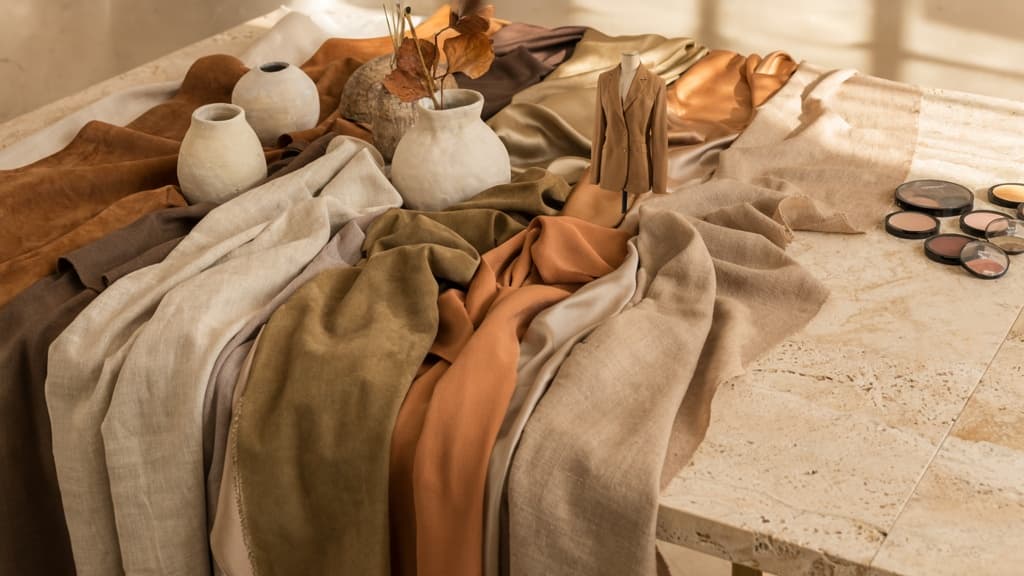
Soft Autumn sits in the seasonal color analysis system as a warm, softened, understated palette. It is not bright, icy, high-contrast, or heavily saturated. Instead, it has a grounded quality: colors feel blended, earthy, calm, and slightly sun-warmed.
For agencies, that distinction matters because “autumnal” can easily drift too rich, too orange, or too rustic if the palette is not clearly defined. The soft autumn color palette is more restrained than that: warmth is present, but it is filtered through softness.
Soft Autumn at a Glance
Soft Autumn is best understood as a warm-neutral, muted season with medium depth. It has some connection to classic autumn palettes, but it is less intense and less contrast-heavy.
At a glance, Soft Autumn typically feels:
- Warm, but not fiery
- Earthy, but not heavy
- Muted, but not dull
- Natural, but still polished
- Gentle, but not pastel
- Medium in depth, rather than very light or very dark
The overall impression is quiet harmony. Nothing shouts. Colors look as though they have been softened with a touch of grey, brown, or beige, creating a cohesive, low-glare effect.
The Three Traits: Warm, Muted, Medium-Deep
Soft Autumn is defined by three traits working together. If one is missing, the palette can quickly shift into another season.
Warm
Soft Autumn has a warm undertone, but it is usually subtle rather than golden or vivid. The warmth feels softened and natural, not sharp or saturated. This is why overly cool colors can feel disconnected, while highly fiery warm colors can feel too loud.
Muted
Mutedness is the defining feature. Soft Autumn colors are desaturated, blended, and low in chroma. They do not have the crisp clarity of bright palettes or the icy quality of cool palettes.
This muted quality is what gives Soft Autumn its calm, lived-in feel. It is also what separates it from more dramatic autumn palettes that lean richer, deeper, or more intense.
Medium-Deep
Soft Autumn is not an extremely light palette, but it is not especially dark either. Its depth sits in the middle range, often leaning slightly deeper than Soft Summer but softer than True Autumn.
That medium-deep quality gives the palette enough substance to avoid looking washed out, while still keeping the overall effect gentle and approachable.
How Soft Autumn Differs from Soft Summer and True Autumn
Soft Autumn is often confused with Soft Summer and True Autumn because it sits between softness and warmth. The easiest way to separate them is by looking at temperature, saturation, and depth together.
Palette | Temperature | Saturation | Depth | Overall feel |
|---|---|---|---|---|
Soft Autumn | Warm-neutral | Muted | Medium to medium-deep | Earthy, gentle, sun-warmed |
Soft Summer | Cool-neutral | Muted | Light to medium | Misty, cool, delicate |
True Autumn | Warm | Richer, more saturated | Medium-deep to deep | Golden, spicy, robust |
Soft Summer shares Soft Autumn’s muted quality, but it is cooler and often lighter. If a palette starts to feel misty, blue-based, or silvery, it is likely moving toward Soft Summer.
True Autumn shares the warmth, but it has more intensity. If the palette starts to feel bold, golden, saturated, or high in contrast, it is moving toward True Autumn.
Soft Autumn lives in the middle: warm, softened, balanced, and quietly earthy.
Soft Autumn Colors: Neutrals, Accents, and Combinations
Once you know the palette’s warm, muted, medium-depth character, the practical question is simple: which colors do you actually reach for first?
Core Soft Autumn Neutrals
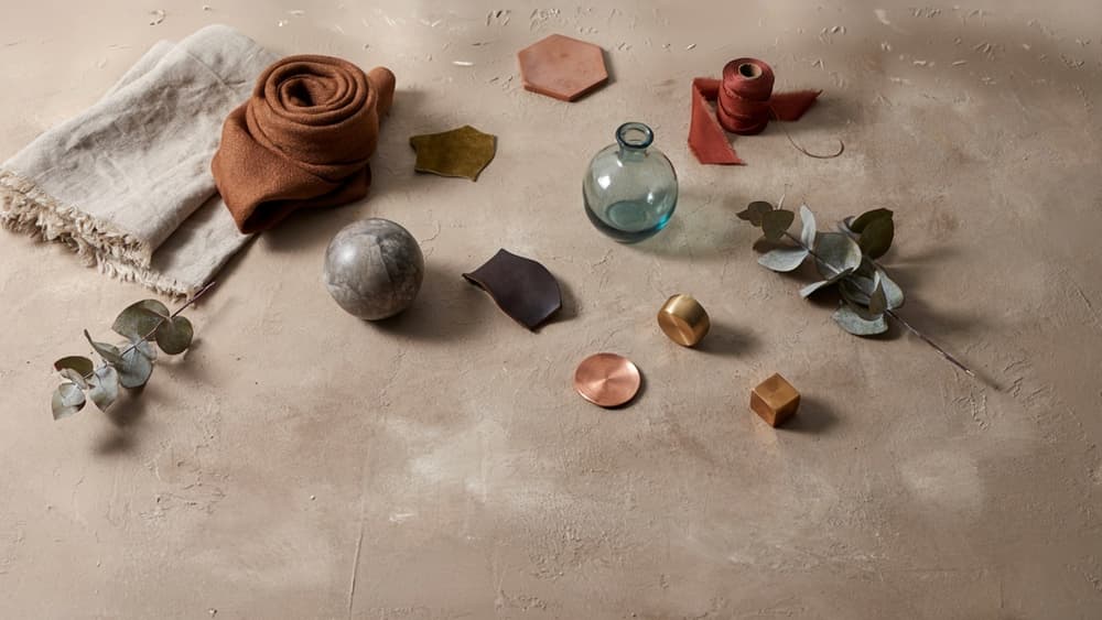
Soft Autumn neutrals are never stark, icy, or high-contrast. They feel softened by warmth: more oat milk than bright white, more mushroom than charcoal, more olive-brown than flat black.
Strong core neutrals include:
- Ivory and cream instead of pure white
- Warm beige, oatmeal, and camel for light foundations
- Taupe, mushroom, and warm gray-brown for understated depth
- Olive, moss, and muted khaki as nature-based neutrals
- Chocolate, espresso brown, and bronze-brown for deeper contrast
- Soft navy or petrol blue when a cooler dark is needed
For agency work, these neutrals are useful because they create an immediate sense of restraint. A wellness client, artisan food brand, interiors studio, or premium lifestyle product can feel polished without relying on black-and-white minimalism.
Best Accent Colors and Metals
Accent colors in the soft autumn color palette should feel rich but not loud. Think sun-faded spice, dried florals, aged leather, and softened botanicals.
Reliable accents include:
- Terracotta
- Rust
- Burnt coral
- Paprika
- Mustard
- Ochre
- Muted teal
- Warm sage
- Eucalyptus
- Dusty olive
- Deep peach
- Aubergine-brown
- Soft plum
The key is moderation. A saturated orange, bright turquoise, or electric pink will overpower the palette quickly. If an accent feels too clean or digital, dull it slightly, warm it up, or deepen it.
Metals should follow the same logic. The best options are:
- Antique gold
- Brass
- Bronze
- Copper
- Warm rose gold
Avoid bright silver, chrome, and icy platinum when the goal is a cohesive Soft Autumn feel. They can work as functional UI details, but they rarely support the palette’s warmth as well as aged or brushed warm metals.
Easy Color Combination Formulas
The easiest way to use Soft Autumn well is to build from a neutral base, add one grounded accent, then reserve the deepest tone for structure or emphasis.
Try these formulas:
- Cream + camel + terracotta + chocolate
Warm, premium, and simple. Useful when the creative direction needs to feel natural but still commercially polished.
- Oatmeal + olive + rust + bronze
Earthy and organic without drifting too rustic. Strong for lifestyle, food, beauty, and wellness concepts.
- Mushroom + muted teal + ivory + espresso
A slightly cooler take that still stays within Soft Autumn. Good when a brand needs calm sophistication rather than overt warmth.
- Warm beige + sage + ochre + deep brown
Soft, approachable, and editorial. Works well when you want color without making the system feel playful or youthful.
- Taupe + dusty peach + moss + antique gold
Gentle and refined, especially for premium service brands that need warmth without heaviness.
For the most dependable results, keep contrast controlled: one light neutral, one mid-tone neutral, one accent, and one deeper anchor. That gives the palette enough range for hierarchy without breaking its muted, cohesive character.
Soft Autumn Outfit and Personal Styling Inspiration
Once the palette is defined, styling becomes less about “matching” and more about keeping every choice softly warm, grounded, and low-contrast.
Everyday Outfit Ideas for Soft Autumn
For casual looks, start with softened neutrals instead of stark basics. Swap bright white tees for oatmeal, ivory, or warm stone; replace black denim with olive, cocoa, mushroom, or muted espresso. A simple uniform might be a cream knit, olive trousers, tan leather belt, and bronze jewelry.
For workwear, the soft autumn color palette lends itself to relaxed polish. Try:
- A camel blazer with a muted teal blouse and warm taupe trousers
- A sage button-down with chocolate wide-leg pants
- A warm beige suit with a dusty peach or terracotta top
- An olive midi skirt with an ivory knit and cognac loafers
For occasionwear, avoid icy pastels, blue-based jewel tones, or high-shine black. Better options include deep moss, antique gold, muted coral, warm plum, cinnamon, or soft bronze. These colors feel dressed-up without overpowering the wearer.
Prints work best when they stay tonal and blended. Think blurred florals, soft checks, heritage plaids, paisley, or animal prints in camel, olive, rust, cream, and brown rather than crisp black-and-white patterns.
Textures and Fabrics That Strengthen the Palette
Soft Autumn looks especially strong in materials with depth and softness. The colors are naturally muted, so texture helps the outfit feel intentional rather than flat.
Good fabric choices include:
- Suede and nubuck in camel, tan, olive, or chocolate
- Brushed cotton, corduroy, and twill
- Linen blends in warm neutrals
- Cashmere, merino, alpaca, and soft knits
- Matte silk, crepe, and washed satin
- Tweed, herringbone, and bouclé with warm flecks
Highly glossy, icy, or synthetic-looking finishes can pull the palette too sharp. If using shine, keep it antique or softened: brushed gold, aged brass, bronze, tortoiseshell, or warm pearl rather than chrome, silver, or mirror-like metallics.
Layering also works well because Soft Autumn colors sit close together in value. A tonal outfit—say, oatmeal, camel, and warm olive—often looks more expensive than a high-contrast combination.
Makeup and Hair Color Notes
Makeup should echo the same warmth and softness. For lips and cheeks, flattering shades often include muted peach, warm rose, cinnamon, terracotta, soft coral, and dusty apricot. Brown or olive eyeliner is usually gentler than black, while eyeshadows in bronze, taupe, moss, warm beige, and cocoa support the palette without adding harsh contrast.
Foundation and concealer should avoid overly pink or gray undertones. A slightly warm or neutral-warm base typically harmonizes better.
For hair, Soft Autumn usually works best with warmth that looks natural rather than vivid: golden brown, chestnut, soft auburn, caramel, dark honey blonde, or warm mushroom brown. Very cool ash tones, blue-black, platinum, or intense copper can feel disconnected because they are either too cool, too stark, or too saturated.
Using a Soft Autumn Palette in Branding and Design
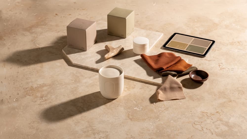
Those same understated color qualities translate well beyond wardrobes. For agencies, the soft autumn color palette can become a strong visual direction for clients who need warmth and polish without looking overly rustic, loud, or trend-led.
Brand Mood: Calm, Premium, Organic, Approachable
Soft Autumn works especially well for brands that want to feel grounded rather than glossy. Its muted warmth creates a sense of ease, which makes it useful for sectors where trust, taste, and emotional comfort matter.
Good-fit brand categories include:
- Wellness and skincare brands that want a natural, non-clinical feel
- Interior designers, florists, and lifestyle studios with earthy, tactile positioning
- Boutique hospitality brands aiming for quiet luxury
- Coaches, consultants, and service providers who need warmth without looking casual
- Sustainable products that want an organic mood without defaulting to bright green clichés
The key is restraint. Soft Autumn branding should feel curated, not muddy. Pair warm neutrals with one or two deeper accents so the brand still has structure and memorability. Too many similar mid-tone colors can make the identity feel flat, especially in digital environments.
Design Applications for Web, Social, and Packaging
On websites, Soft Autumn colors are strongest when used as atmosphere rather than decoration. Warm off-whites, clay-tinted backgrounds, mushroom neutrals, olive accents, and muted terracotta buttons can create a premium editorial feel. For service businesses, this palette works particularly well with generous spacing, serif or humanist typography, and photography with natural light.
For social content, the palette helps create a cohesive grid without every post looking templated. Agencies can assign roles to colors: one neutral for educational posts, one deeper shade for testimonials, one accent for launches, and one soft background for quotes or founder-led content. This keeps the feed recognizable while giving designers enough flexibility to avoid repetition.
Packaging is where the palette can feel especially elevated. Muted olive, camel, cocoa, ochre, and warm taupe can make labels, boxes, and wraps feel tactile before the customer even touches the product. Matte finishes, recycled stocks, embossed details, and bronze or antique-gold foils tend to reinforce the palette’s natural premium quality.
Accessibility and Contrast Considerations
Because Soft Autumn colors are often muted and medium in depth, contrast needs deliberate planning. A beautiful clay background with taupe text may look elegant in a moodboard but fail on a product page, email, or mobile ad.
For digital use, avoid relying on subtle shade differences for important information. Calls to action, navigation, pricing, form labels, and body copy need enough contrast to remain readable across devices. Deeper espresso, warm charcoal, or dark olive can often preserve the palette while giving layouts the clarity they need.
A practical agency approach is to define separate roles for aesthetic colors and functional colors. Let softer tones carry mood in backgrounds, borders, icons, and secondary graphics. Reserve the strongest darks and lightest neutrals for text, buttons, and conversion-critical elements. This keeps the brand feeling Soft Autumn without sacrificing usability.
How Agencies Can Keep Soft Autumn Creative Output On-Brand at Scale
Once the palette moves from moodboard to client work, the challenge becomes consistency: keeping every landing page, carousel, ad concept, email header, and packaging mockup aligned without making your senior designer police every asset.
Turn the Palette into Reusable Brand Rules
Don’t leave “Soft Autumn” as a loose creative preference. Translate it into production rules your team and AI tools can actually follow.
For each client, document:
- Approved hex codes for primary neutrals, secondary neutrals, accents, and CTA colors
- Usage rules, such as “olive is a support color, not a dominant background”
- Pairing rules, such as “warm ivory background + cocoa headline + muted clay CTA”
- Avoid lists, including stark black, icy gray, neon coral, bright white, or overly saturated orange
- Image direction, such as warm natural light, matte textures, organic materials, and low-contrast compositions
- Typography and layout notes that reinforce the same mood: refined, grounded, calm, tactile
This turns the soft autumn color palette from a stylistic idea into a repeatable client system. It also protects margin: junior creatives, freelancers, and AI assistants can produce closer first drafts because the boundaries are clear.
Brief AI Once, Then Generate Consistently
The most expensive version of AI is the one your team has to re-brief every time.
Instead, agencies should ingest the client’s brand once: palette, positioning, visual rules, tone of voice, example assets, preferred layouts, and known dislikes. From there, every AI-generated concept should inherit the same constraints automatically.
For example, a skincare client using this palette might need:
- Instagram captions that sound calm and sensory, not clinical
- Product page copy that emphasizes warmth, texture, and ritual
- Ad variations that use muted terracotta and olive without drifting into bright wellness clichés
- Designer prompts that specify matte packaging, warm neutrals, and natural shadows
Aethera is built for this exact workflow: store the client’s brand system once, then generate on-brand copy and creative direction across channels without rebuilding the brief from scratch. For small agencies, that means less tool sprawl, fewer “almost there” drafts, and more output without adding headcount.
Quality Checks Before Client Delivery
Before anything goes to the client, check the work against the brand rules—not against personal taste.
A simple pre-delivery review can include:
- Color fit: Are the approved palette values used, or did the output drift brighter, cooler, or higher contrast?
- Hierarchy: Are accent colors used intentionally, especially for CTAs, icons, and emphasis?
- Mood match: Does the piece still feel calm, premium, organic, and approachable?
- Cross-channel consistency: Would this asset sit comfortably beside the website, social feed, email templates, and packaging?
- Client-specific rules: Are any banned colors, visual clichés, or off-brand phrases present?
The goal is not to slow production down. It’s to make review faster because the agency is measuring against a shared system. When every output starts from the same brand rules, QA becomes a final polish pass—not a rescue mission.