
August 10, 2026
What Is the Soft Autumn Color Palette?
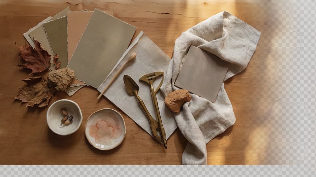
The soft autumn color palette sits in a specific sweet spot: warm enough to feel human and grounded, muted enough to feel refined, and low-contrast enough to avoid visual noise.
Soft Autumn Definition: Muted, Warm, and Low-Contrast
Soft Autumn is a warm-neutral palette made up of softened, desaturated colors. Think clay, oatmeal, olive, mushroom, dusty peach, muted teal, warm taupe, and cocoa rather than bright orange, crisp white, or high-saturation green.
For agency teams, the key characteristics are:
- Muted: Colors look slightly grayed-down, not vivid or electric.
- Warm: Undertones lean beige, golden, earthy, or peach rather than icy or blue.
- Low-contrast: Colors sit close together in intensity, creating a calm, blended look.
That low-contrast quality is what gives Soft Autumn its commercial appeal. It can make a brand feel considered, tactile, premium, and approachable without becoming sterile. It’s especially useful when a client wants “warm minimalism” or “natural sophistication” but doesn’t have the language to describe it.
When Agency Teams Should Recommend Soft Autumn
Recommend Soft Autumn when the brand needs to feel grounded, trustworthy, and quietly elevated. It works well for clients who want emotional warmth without looking rustic, bohemian, or overly feminine.
Good-fit categories include:
- Wellness and skincare brands that need softness without clinical coldness
- Boutique hospitality looking for relaxed luxury
- Interior, home, and lifestyle brands with natural materials or craft cues
- Coaches, consultants, and personal brands that want warmth without loudness
- Sustainable or ethical brands that want earthiness without cliché “eco green”
It’s also a strong choice when a client’s existing brand feels too stark. If their current identity relies on black, white, and one bright accent, shifting toward a Soft Autumn direction can make the system feel more editorial, mature, and ownable.
Avoid recommending it when the brand strategy calls for high energy, disruption, youth culture, speed, or strong visual contrast. A sports-tech startup, nightlife brand, or bold challenger product may need more saturation and sharper tension than this palette naturally provides.
Soft Autumn vs. Similar Seasonal Palettes
Soft Autumn is often confused with neighboring palettes because it shares warmth with other autumn palettes and softness with summer palettes. The distinction matters: choosing the wrong neighbor can push a client brand into the wrong emotional territory.
Palette | Temperature | Saturation | Contrast | Brand impression |
|---|---|---|---|---|
Soft Autumn | Warm-neutral | Muted | Low | Grounded, calm, refined, approachable |
True Autumn | Warm | Richer | Medium | Earthy, confident, traditional, harvest-like |
Dark Autumn | Warm-deep | Rich and dark | Higher | Dramatic, premium, intense, moody |
Soft Summer | Cool-neutral | Muted | Low | Gentle, airy, elegant, understated |
Light Spring | Warm | Clearer | Light-medium | Fresh, optimistic, youthful, bright |
The simplest agency test: if the palette starts feeling crisp, icy, jewel-toned, or high-contrast, it has moved away from Soft Autumn. If it still feels warm, softened, and gently layered, you’re in the right zone.
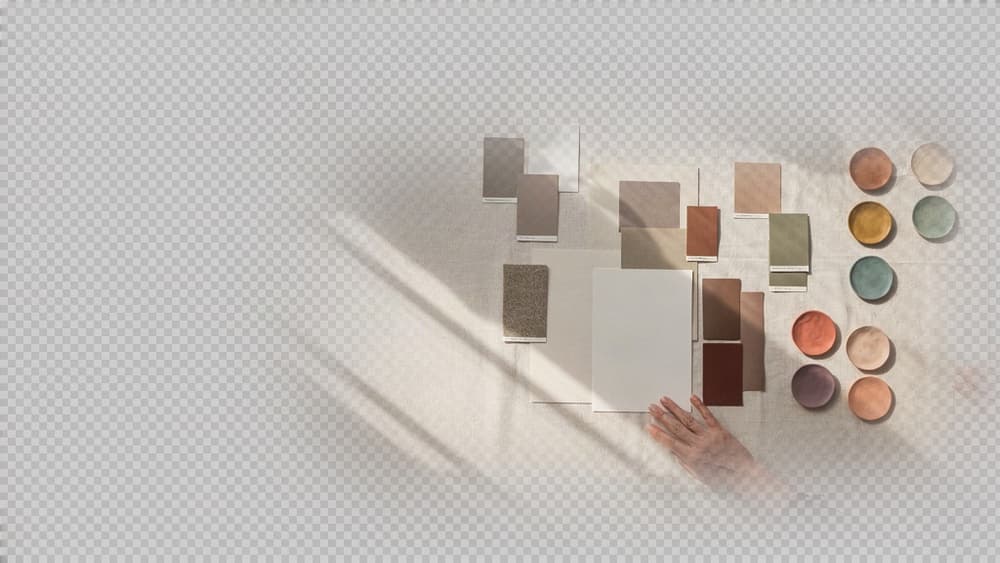
Soft Autumn Color Palette Hex Codes and Core Color Roles
Once the seasonal direction is approved, the next agency task is turning “warm, muted, and refined” into a usable brand palette your designers, copywriters, and AI tools can apply consistently.
Essential Soft Autumn Neutrals
Soft Autumn neutrals should feel grounded, not stark. Avoid pure white, jet black, icy gray, or sharp navy. They create too much contrast and can make the palette feel disconnected from the client’s intended visual tone.
Use these as dependable base colors:
Color role | Hex code | Best use |
|---|---|---|
Warm ivory | `#F3E8D2` | Backgrounds, presentation decks, packaging space |
Oat beige | `#D8C3A5` | Secondary backgrounds, cards, social templates |
Mushroom taupe | `#A99985` | Body text on light backgrounds, UI dividers, subtle frames |
Warm gray | `#8E8778` | Supporting typography, icons, navigation elements |
Cocoa brown | `#5B4636` | Primary text, logo marks, buttons when a deeper anchor is needed |
Olive charcoal | `#4F5145` | Editorial headings, footer areas, premium-feeling accents |
For agency brand systems, the most useful neutral stack is usually: ivory for breathing room, taupe or warm gray for structure, and cocoa brown instead of black for depth.
Muted Warm Accent Colors
Accent colors give the system personality without pushing it into loud, saturated territory. In a soft autumn color palette, accents should look slightly softened, as if mixed with beige, brown, or gray.
Accent | Hex code | Brand impression |
|---|---|---|
Terracotta | `#B76E50` | Earthy, crafted, confident |
Dusty coral | `#C9826B` | Warm, approachable, human |
Muted peach | `#D6A47A` | Gentle, optimistic, editorial |
Soft ochre | `#C49A4A` | Artisanal, thoughtful, heritage-inspired |
Moss green | `#7C8061` | Organic, calm, grounded |
Sage olive | `#9A9B76` | Wellness, lifestyle, quiet sophistication |
Muted teal | `#5F7F78` | Balanced, modern, slightly unexpected |
Warm plum | `#7B5A59` | Mature, intimate, boutique |
For client work, pick two to four accents rather than handing over a bloated rainbow. A restrained accent set is easier to govern across social graphics, pitch decks, ads, and AI-generated variations.
How to Assign Each Color a Brand Role
A palette becomes scalable only when every color has a job. Otherwise, each designer or tool starts improvising.
Use this role structure:
Brand role | Recommended color type | Example |
|---|---|---|
Primary background | Light warm neutral | `#F3E8D2` |
Secondary background | Beige or taupe | `#D8C3A5` |
Primary text | Deep brown or olive charcoal | `#5B4636` |
Secondary text | Warm gray | `#8E8778` |
Primary action | Terracotta, ochre, or muted teal | `#B76E50` |
Supporting accent | Sage, coral, or plum | `#9A9B76` |
Decorative highlight | Muted peach or soft ochre | `#D6A47A` |
Name colors by function, not just vibe. “Primary CTA,” “Editorial Background,” and “Muted Accent 01” are more useful inside a client brand system than “Autumn Clay” alone.
For small agencies, this is where consistency is won. When the palette is documented by role, every output—landing page mockups, Instagram carousels, sales decks, email headers—has the same visual logic behind it.
Best Soft Autumn Color Combinations for Brand Systems
Once the palette roles are set, the real agency challenge is turning them into repeatable combinations your team can use across landing pages, carousels, decks, ads, and client approvals without remixing from scratch every time.
Ready-to-Use Soft Autumn Pairing Recipes
Use these as system-level combinations, not one-off moodboard choices. Each recipe should map to your client’s approved color tokens so designers, strategists, and AI-assisted production workflows are all pulling from the same logic.
Combination | Best use case | How to structure it |
|---|---|---|
Warm ivory + mushroom + muted terracotta | Premium service brands, consultants, wellness, hospitality | Use ivory as the main background, mushroom for sections or cards, terracotta for CTAs and key highlights. |
Oat + olive + deep warm brown | Organic, sustainable, editorial, lifestyle brands | Keep oat dominant, use olive for navigation or secondary blocks, and reserve brown for type, icons, and grounded contrast. |
Taupe + dusty peach + cocoa | Feminine but mature brands, boutiques, personal brands | Use taupe as the base, peach for warmth and campaign moments, cocoa for headlines and buttons. |
Sand + muted teal + clay | Creative studios, interiors, artisan products | Let sand carry the layout, teal add quiet distinction, and clay create warmth in calls to action or badges. |
Cream + sage + rust | Food, home, retreat, slow-living brands | Use cream for openness, sage for calm supporting areas, and rust sparingly for conversion points. |
For client-facing brand systems, name these combinations by function rather than color: “Primary Landing Page,” “Editorial Social,” “Sales CTA,” “Quiet Luxury,” or “Seasonal Campaign.” That makes the soft autumn color palette easier for non-designers to apply correctly.
Contrast Rules for Web, Social, and Print
Soft Autumn combinations are naturally muted, so contrast has to be designed deliberately rather than guessed by eye.
For websites, avoid placing muted accents on similar-value neutrals for body copy. Terracotta on sand may look elegant in a brand board but fail on a mobile screen. Use the darkest warm neutral for paragraph text, navigation, form labels, and small UI elements. Save softer pairings for backgrounds, dividers, cards, and large display type.
For social, contrast needs to survive compression, small screens, and fast scrolling. A muted peach headline over cream can disappear in-feed; anchor social templates with one darker text color and one consistent accent for emphasis. If every post uses a different accent, the grid starts to feel improvised instead of branded.
For print, muted warm palettes can shift depending on paper stock. Creams may yellow, olives can dull, and clay tones can print heavier than expected. For important collateral, specify which combinations are approved for coated versus uncoated stock, and keep fine text away from low-contrast accent pairings.
A simple rule for agency teams: low contrast can be aesthetic; poor contrast is a production risk.
How to Keep Combinations Cohesive Without Looking Flat
Soft Autumn systems can become too quiet if every element sits in the same mid-tone range. The fix is not adding brighter colors; it is creating controlled variation.
Build each layout with three levels:
- A light base for breathing room
- A mid-tone support color for structure
- A deeper warm neutral or accent for emphasis
Then vary proportion, not palette. One landing page might be 70% cream, 20% taupe, 10% rust. A campaign graphic might flip the mood with 60% olive, 30% ivory, 10% cocoa. Same system, different energy.
Texture also helps prevent flatness. Subtle grain, paper warmth, soft shadows, tonal photography, and layered neutrals can add depth without breaking the palette. For agencies managing multiple deliverables, document these treatments alongside the combinations so every designer is not inventing their own version of “warm and muted.”
The goal is a palette that feels flexible to the creative team but unmistakably consistent to the client.
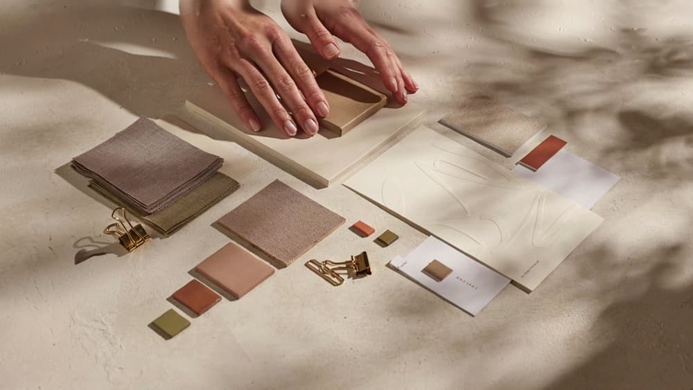
Design Inspiration: Applying Soft Autumn Across Creative Projects
Once the palette rules are set, the creative opportunity is in how the system feels across touchpoints: refined, grounded, intimate, and premium without becoming bland.
Brand Identity and Logo Direction
For identity work, Soft Autumn is strongest when the logo system avoids high-gloss polish and leans into quiet confidence. Think wordmarks with humanist serifs, softened sans-serifs, or custom lettering that feels crafted rather than engineered.
For agency clients in wellness, interiors, boutique hospitality, lifestyle retail, coaching, food, or sustainable products, the soft autumn color palette can support a brand world that feels warm and considered without looking overtly “earthy.”
Practical identity directions to explore:
- Primary logo in a warm dark neutral instead of pure black, keeping the mark softer on stationery, packaging, and web headers.
- Secondary marks in muted accent tones for stickers, social avatars, product labels, or campaign lockups.
- Fine-line illustration or monogram details that give the brand a tactile, editorial quality.
- Embossed, debossed, or letterpress applications where the palette’s softness is reinforced through material, not just color.
Avoid making every logo asset low-contrast or overly delicate. A Soft Autumn identity still needs presence, especially at small sizes. The goal is a mark that feels calm and premium, not faint.
Website, Social, and Campaign Visuals
Digital applications are where this palette can either feel elevated or wash out quickly. The best executions use warm backgrounds, generous whitespace, restrained accent moments, and photography that carries some of the emotional weight.
For websites, Soft Autumn works well for:
- Editorial homepages with calm background fields and strong typographic hierarchy.
- Service pages where muted panels separate content blocks without harsh dividers.
- Product or portfolio pages that let photography and case imagery sit inside a warmer brand environment.
- Landing pages for premium offers where the CTA feels inviting rather than aggressive.
On social, the palette is especially useful for agencies creating ongoing content systems. Build templates that vary format rather than relying on constant color changes: quote cards, carousel covers, stat slides, testimonial frames, launch graphics, and behind-the-scenes posts can all feel cohesive while serving different purposes.
For campaigns, introduce energy through composition: cropped photography, oversized type, layered cards, handwritten annotations, or subtle pattern work. The color story should stay controlled, but the layout can carry momentum.
Photography, Texture, and Material Cues
Soft Autumn creative direction depends heavily on the surrounding visual language. If the photography is too cool, glossy, or over-saturated, the palette will feel disconnected from the rest of the brand.
Look for imagery with:
- Warm natural light rather than blue studio light
- Cream, clay, olive, oat, taupe, terracotta, or muted brown environments
- Skin tones and materials that feel natural, not heavily retouched
- Low-sheen surfaces such as linen, paper, ceramic, wood, leather, stone, and brushed metal
Texture helps agencies make the palette feel ownable. Subtle grain, recycled paper scans, woven fabric, plaster walls, botanical shadows, or ceramic details can turn a simple color system into a fuller brand atmosphere.
For print and packaging, specify uncoated stocks, kraft-inspired wraps, soft-touch finishes, blind embossing, or tonal foils. These material choices make the visual system feel intentional before a customer reads a single line of copy.
How Agencies Can Scale Soft Autumn Output Without Losing Brand Consistency
Once the palette is approved, the real challenge is repetition: keeping every landing page, ad set, carousel, pitch deck, and email sequence aligned when multiple strategists, designers, and AI tools are producing work at once.
Build the Palette Into the Client Brand System Once
Don’t leave the soft autumn color palette buried in a moodboard or Figma file. Turn it into a usable brand system your whole team can reference.
For each client, document:
- Approved hex codes and color names
- Primary, secondary, accent, background, and CTA usage
- Pairing rules for light/dark backgrounds
- “Do not use” colors that push the brand too cool, bright, or high-contrast
- Example applications across web, social, email, and presentation design
- Tone notes that connect the palette to the client’s positioning
This matters because small agencies often scale through parallel work. One person is building paid social, another is updating the website, another is creating a sales deck. If each person is interpreting the palette from scratch, visual drift is guaranteed.
Aethera helps agencies avoid that by ingesting the client’s brand once, then applying those rules across future AI-assisted output. Instead of re-prompting every tool with “make it warm, muted, earthy, premium, but not too beige,” your team works from a shared brand memory.
Use AI Without Letting Every Output Drift
AI can speed up production, but it also loves to improvise. Left unchecked, one prompt may generate polished olive and clay tones while the next introduces coral, icy gray, or saturated gold that doesn’t belong.
The fix is to stop treating each AI request as a blank slate.
Before generating copy, image directions, layout ideas, or campaign concepts, anchor the tool in the client’s actual brand system. Give it the approved palette roles, examples of correct usage, and constraints around what to avoid.
For example, instead of asking for “Instagram concepts for a wellness brand,” your team should be able to generate from instructions like:
- Use the client’s approved muted warm neutrals as the visual base
- Reserve accent colors for emphasis only
- Avoid cool pastels, neon tones, and stark black-white contrast
- Keep layouts calm, understated, and editorial
- Match the client’s existing visual language across campaign assets
That’s where agencies can gain leverage. AI becomes less of a random idea machine and more of a production layer that understands the brand before output begins.
Quality Checks Before Client Delivery
Before anything goes to the client, run a quick brand consistency pass. This does not need to become a bottleneck; it just needs to be systematic.
Check:
- Are all colors pulled from the approved palette?
- Are accents used with restraint, not as dominant colors?
- Does the piece still feel warm, muted, and low-contrast?
- Are CTAs and key messages clear enough against their backgrounds?
- Does the output match previous approved work for the same client?
- Has AI introduced any off-brand visual language, phrasing, or layout patterns?
For small agencies, this final review protects margin. The fewer rounds spent correcting “almost right” assets, the more confidently your team can scale production without adding headcount or diluting the client’s brand.