
August 12, 2026
Set the SaaS Product Design Brief Before Anyone Opens Figma

A SaaS launch gets expensive when “design” starts as screens instead of decisions. Before your team opens Figma, align the client on what the product must prove, who it must convince, and how it should feel when users experience it.
What is product design for a SaaS launch?
For a SaaS launch, product design is not just interface polish. It is the translation of a business bet into a usable, sellable product experience.
That means the brief should connect three things:
- The commercial goal: what the launch needs to achieve for the client
- The user expectation: what the product must make easier, faster, or more valuable
- The brand experience: how the product should look, sound, and behave at every touchpoint
This matters for agencies because SaaS clients often arrive with scattered inputs: founder opinions, competitor screenshots, sales decks, feature wishlists, investor narratives, and half-formed positioning. If those inputs go straight into design, every review becomes subjective: “Can we make it more premium?” “This competitor does it differently.” “The dashboard needs more wow.”
A strong product design brief gives your team a shared filter before screens exist.
Define the launch promise, audience, and brand guardrails
Start by pinning down the launch promise in one sentence:
“This product helps [specific audience] achieve [specific outcome] without [specific pain or tradeoff].”
For example:
“This product helps independent finance teams close monthly reporting faster without relying on spreadsheet-heavy manual workflows.”
That sentence does not need to become homepage copy. Its job is to stop the product from drifting. If a feature, flow, or design choice does not support the promise, it needs a stronger reason to exist.
Next, define the audience at the level needed for design decisions. Not “B2B teams” or “operations leaders,” but the specific buyer or user mindset the first version must serve. A launch aimed at a skeptical enterprise buyer will need different signals than one aimed at a hands-on startup operator.
Then document brand guardrails your team can actually use:
- Visual tone: minimal, technical, playful, premium, bold, calm
- UX personality: guided, self-serve, expert-led, fast, reassuring
- Copy style: direct, warm, analytical, founder-led, enterprise-safe
- Trust signals: data security, expertise, speed, integrations, support
- Avoids: gimmicky AI language, overused SaaS gradients, jargon-heavy onboarding
For small agencies juggling multiple client brands, this step protects margin. It reduces revision loops, keeps freelancers and AI-assisted workflows aligned, and gives every designer, strategist, and copywriter the same creative constraints.
Turn client inputs into decision criteria
Once the promise, audience, and guardrails are clear, convert them into practical decision criteria.
A useful format is:
Client input | Design decision it should influence |
|---|---|
“We need to look enterprise-ready.” | Use restrained layouts, clear hierarchy, security cues, and confident copy. |
“Our users are switching from spreadsheets.” | Emphasize familiarity, clarity, and low-friction navigation. |
“The product is faster than competitors.” | Prioritize speed cues, short paths, and visible progress. |
“We want to feel modern but trustworthy.” | Avoid novelty for novelty’s sake; balance clean visuals with proof points. |
This turns vague stakeholder preferences into reviewable standards. Instead of debating taste, your team can ask: does this direction support the launch promise, fit the audience, and stay inside the brand guardrails?
That is the real value of the brief: fewer subjective cycles, clearer creative direction, and a SaaS product experience built around the launch outcome before production time gets burned.
Use User Research to Find the SaaS Problem Worth Designing
With the brief in place, research keeps the team from designing around the loudest stakeholder opinion. For a SaaS launch, the goal is not “more insights.” It is sharper decisions: who the product must win over, what problem matters enough to change behavior, and which requirements deserve space in the first release.
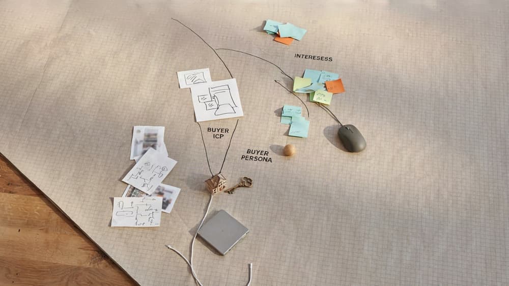
Map the ICP, buyer, and end user separately
Small agency teams often get handed one vague audience label: “mid-market finance teams,” “busy founders,” “HR managers.” That is not enough for SaaS product design because the person who feels the pain, approves the spend, and uses the product every day may be three different people.
Separate them early:
- ICP: the company profile most likely to adopt and retain the product
- Buyer: the person who owns budget, risk, and approval
- End user: the person whose workflow the product must improve
For example, a SaaS tool for agency reporting might target 10–50 person agencies as the ICP. The buyer may be the founder or operations lead. The daily end user may be an account manager building reports at 5 p.m. on a Friday. If you design only for the buyer, the product may demo well but fail in daily use. If you design only for the user, it may feel helpful but never clear procurement.
This split also helps agencies manage client conversations. When a client asks for a feature, you can ask: “Is this solving adoption for the buyer, activation for the user, or fit for the ICP?” That keeps research tied to launch decisions instead of becoming a pile of interview notes.
Run lean research that fits agency timelines
You do not need a six-week research phase to reduce risk. You need enough signal to challenge assumptions before screens become expensive.
A practical sprint might include:
- 3–5 customer or prospect interviews focused on current workflows, workarounds, and switching triggers
- Sales/support review if the client has an existing product, waitlist, community, or service business
- Competitor teardown to understand category expectations, not to copy UI
- Landing page or message testing to see which pain points create urgency
- Internal stakeholder interview to capture business constraints, pricing assumptions, and launch goals
Keep interviews concrete. Ask about the last time the problem happened, what they did, what it cost them, and why existing tools failed. Avoid asking people what features they want. They will often describe familiar solutions, not the underlying problem.
For agency owners, this lean approach protects margin. It gives your team evidence without turning the project into an open-ended discovery engagement.
Convert research into jobs, pains, and design requirements
Research only becomes useful when it changes what the team designs. Synthesize findings into three decision-ready outputs.
First, define the core jobs-to-be-done. For example: “When monthly reporting is due, an account manager needs to pull campaign data into a client-ready summary without rebuilding slides from scratch.”
Second, capture the pains blocking that job: scattered data, manual formatting, unclear client narrative, approval bottlenecks.
Third, translate those pains into design requirements:
- Users must connect priority data sources during onboarding
- Reports must be editable before sharing
- The product must surface anomalies or changes worth explaining
- Templates must match the agency’s client-facing tone and structure
This turns research into a filter for scope. If a proposed feature does not support a validated job, reduce friction, or strengthen launch adoption, it belongs in the backlog—not the MVP.
Build the UX Workflow: From Jobs-to-Be-Done to Clickable Structure
With the client’s jobs, pains, and design requirements in place, the next move is to turn research into a path users can actually follow. This is where SaaS product design starts becoming tangible: workflows, screens, and decisions that either support activation or quietly create friction.
Translate user jobs into core workflows
Start by mapping each priority job to the smallest successful user journey. Not the “full platform vision.” The launch-critical path.
For a SaaS launch, that usually means answering:
- What does the user need to accomplish first to feel value?
- What steps must happen before that value is visible?
- Where will they need guidance, reassurance, or proof?
- What can be delayed until after activation?
For example, if the job is “help a marketing manager approve campaign assets faster,” the core workflow may be:
- Create workspace
- Invite stakeholders
- Upload or generate asset
- Leave feedback
- Approve final version
That workflow gives your team a sharper design target than a feature list like “dashboard, comments, notifications, approvals.” It also helps agency teams push back when clients want to squeeze every roadmap idea into v1.
A useful test: if a screen does not help the user move toward the first meaningful outcome, it probably belongs later.
Design information architecture for activation and retention
Once the core workflows are clear, structure the product so users can find their way without a walkthrough doing all the work.
For SaaS, information architecture should support two moments:
Moment | Design priority | Agency question to answer |
|---|---|---|
Activation | Help users reach first value quickly | What should be obvious on the first session? |
Retention | Help users repeat and expand usage | What should become easier the second, fifth, and tenth time? |
This is where navigation, labels, hierarchy, and empty states matter. A “Projects” area may make sense to the product team, but “Campaigns,” “Clients,” or “Workspaces” may better match how the user thinks. Small naming choices can reduce support burden and make the SaaS feel more intuitive from day one.
For agency teams managing multiple client brands, this is also where consistency can slip. Product areas, onboarding prompts, tooltips, and settings labels all need to sound like they belong to the same company. Keep UX copy tied to the client’s brand voice, not whatever phrasing happens to come from the designer, strategist, or PM that day.
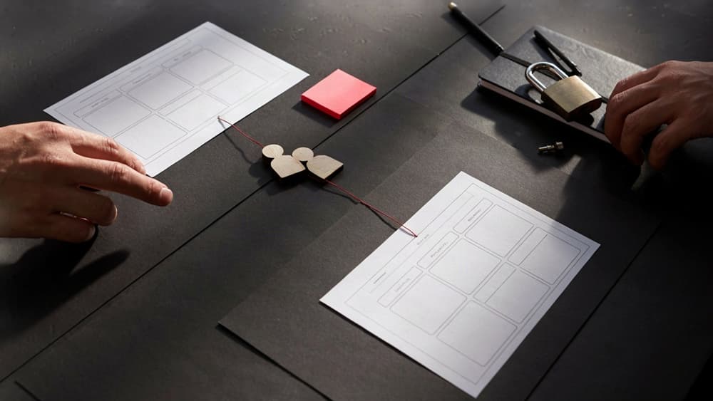
Create wireframes that keep brand and usability aligned
Wireframes should not be treated as plain grey boxes with the brand “added later.” Even before visual design, they should reflect the product’s positioning, tone, and user confidence level.
A finance SaaS may need more confirmation, structured explanations, and trust-building moments. A creator tool may need faster paths, lighter copy, and more expressive empty states. The layout can be low fidelity, but the intent should already feel on-brand.
In wireframes, define:
- Primary actions and secondary actions per screen
- Required content blocks, not placeholder filler
- UX copy for key states: empty, error, success, loading
- Moments where users need proof, guidance, or reassurance
- Reusable patterns for forms, lists, modals, and dashboards
This gives the client something concrete to react to before visual polish distracts the conversation. It also gives your internal team a shared structure for design, copy, and development—reducing rework when the SaaS moves from concept to clickable prototype.
Prototype and Validate Before Development Spend Locks In
With the workflow mapped and the clickable structure taking shape, the next job is to test the decisions that would be expensive to unwind later.
Choose the right prototype fidelity for each decision
Not every question needs a polished prototype. Agencies lose margin when they over-design too early, especially on SaaS launches where the riskiest assumptions are often about comprehension, sequence, or perceived value—not visual detail.
Use fidelity based on the decision you need to make:
Decision to validate | Best prototype fidelity | What you’re testing |
|---|---|---|
Does the user understand the flow? | Low-fidelity clickable wireframe | Navigation, sequence, missing steps |
Does the onboarding explain the value fast enough? | Mid-fidelity prototype with real copy | Activation clarity, motivation, friction |
Does the product feel credible and on-brand? | High-fidelity key screens | Trust, visual expectations, brand fit |
Will stakeholders approve the launch experience? | Polished demo path | Narrative, positioning, sales confidence |
For a small agency, the practical move is to prototype the “money path” first: the sequence most tied to activation, conversion, or retention. That might be creating the first project, inviting a teammate, generating a report, connecting an integration, or reaching the first “aha” moment.
Avoid prototyping every settings page or edge case before validation. The goal is not to simulate the whole product. It is to create enough reality to expose the weak assumptions before engineering starts.
Run focused usability tests with real SaaS scenarios
Generic prompts create generic feedback. “What do you think of this dashboard?” usually produces polite opinions, not useful evidence.
Instead, write test scenarios around actual user intent:
- “You’ve just signed up and need to connect your first data source.”
- “Your manager asked you to invite two teammates and assign permissions.”
- “You need to find the report that shows this month’s performance.”
- “You’re evaluating whether this tool is worth upgrading after the trial.”
Keep sessions tight: 30 minutes, five to seven participants per key audience, and one primary workflow per test. For agency timelines, that is usually enough to spot repeated confusion without turning validation into a research marathon.
Capture where users hesitate, misinterpret labels, miss calls to action, or take unintended paths. Pay attention to language. If three users describe a feature differently than the interface does, the product design problem may be copy, hierarchy, or mental model—not layout.
For client communication, record short clips of the most important moments. A 20-second clip of a user missing the activation step can settle a debate faster than another internal review.
Use validation findings to reduce launch risk
Validation only helps if it changes the plan. After testing, sort findings by launch risk rather than personal preference.
Prioritize fixes that affect:
- Activation: users cannot reach the first valuable outcome.
- Conversion: buyers do not understand why the product matters.
- Trust: the experience feels unfinished, confusing, or inconsistent.
- Retention: users cannot find the next action after initial setup.
Then turn findings into clear launch decisions: revise onboarding copy, rename navigation, remove a step, add an empty state, simplify permissions, or postpone a nonessential feature.
This is where agencies protect both the client’s budget and their own delivery margin. A validated prototype gives development a sharper target, reduces late-stage rework, and gives stakeholders confidence that the launch experience has been tested against real behavior—not just approved in a meeting.
Prioritize the MVP and Accelerate Launch With Brand-Safe AI
At this point, the agency has enough signal to stop treating every feature as equally important. The next move is to protect the launch from scope creep while keeping momentum high across design, build, and go-to-market.
Rank features by launch impact, effort, and evidence
For SaaS launches, MVP prioritization should not be a popularity contest between stakeholders. It should be a scored decision based on three questions:
Criterion | What to ask | Why it matters |
|---|---|---|
Launch impact | Does this feature help the user reach the core value moment faster? | Keeps the MVP focused on activation, not “nice to have” breadth |
Effort | How complex is this to design, build, test, and support? | Prevents small-looking features from quietly consuming the sprint |
Evidence | Do research, prototype feedback, or sales conversations support it? | Reduces decisions based on internal opinion alone |
A simple 1–5 score for each category is usually enough. Features with high impact, low-to-medium effort, and clear evidence belong in the launch MVP. Features with unclear evidence move to “later,” even if they are exciting.
For agency teams, this creates a defensible conversation with the client. Instead of saying, “We don’t have time,” you can say, “This does not improve the launch outcome enough to justify delaying the first release.”
Use AI productivity tools without creating off-brand output
AI can speed up product design work, but unmanaged AI creates a new agency problem: every strategist, designer, and copywriter starts producing slightly different versions of the client’s voice, UX language, and messaging.
That becomes expensive fast.
Use AI where it compresses production time without fragmenting the brand:
- Turning approved feature decisions into UX microcopy options
- Drafting empty states, onboarding prompts, tooltips, and error messages
- Generating launch page sections from the same product positioning
- Creating customer-facing FAQs from confirmed product functionality
- Summarizing sprint decisions for client updates and internal handoff notes
The key is not “write a better prompt every time.” It is giving the team one approved brand source to work from.
For example, with Aethera, an agency can ingest a SaaS client’s brand once — positioning, tone, audience, terminology, value props, do/don’t language — and then generate product copy, campaign copy, and client-ready drafts that stay aligned. That removes the tool-sprawl problem where ChatGPT, Claude, Notion AI, and random prompt docs all produce different interpretations of the same brand.
Prepare a clean handoff for build, marketing, and iteration
The MVP handoff should help three teams move without re-asking the same questions.
For development, package the prioritized feature list, user flows, component notes, states, and acceptance criteria. Make it clear what is in scope for launch and what is intentionally deferred.
For marketing, translate the MVP into launch messaging: the core promise, key use cases, audience-specific benefits, feature language, and proof points. This prevents the site, ads, emails, and product UI from sounding like they came from different companies.
For iteration, preserve the backlog logic. Tag deferred features by reason: low evidence, high effort, post-launch dependency, or future revenue opportunity. After launch, the client can revisit priorities using real usage and sales data instead of reopening every old debate.
That is how agencies keep SaaS launches lean without making them feel underpowered: tight MVP decisions, brand-safe AI acceleration, and a handoff that turns strategy into coordinated execution.