
July 3, 2026
What Packaging Design Must Achieve for Modern Brands
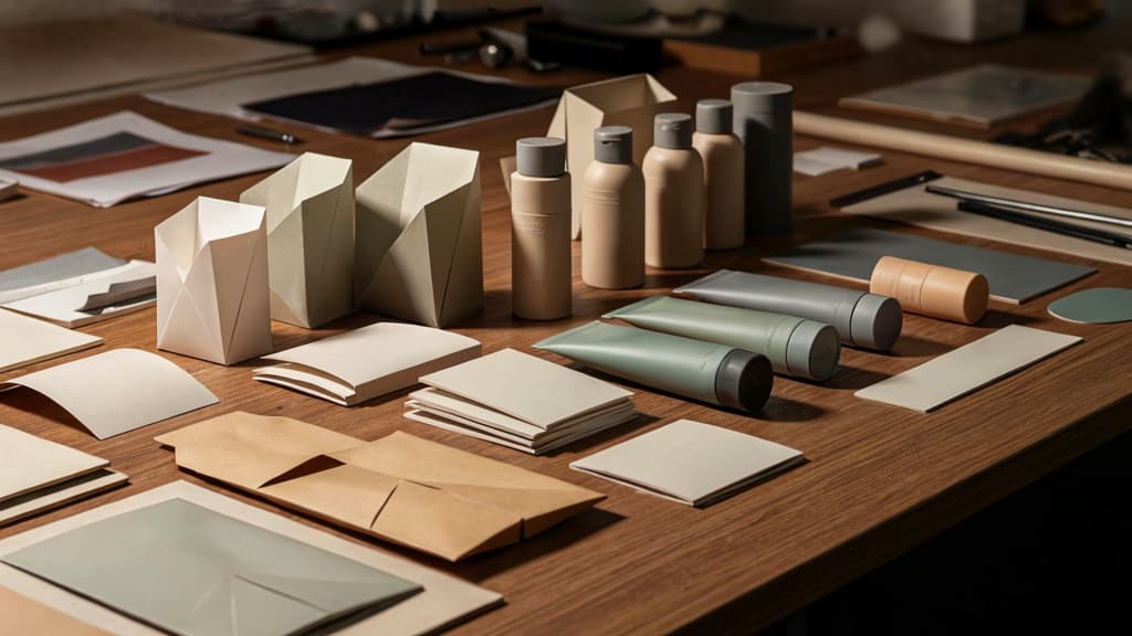
Packaging design definition for agency-client alignment
For agencies, packaging design is not just the look of a box, pouch, label, bottle, or mailer. It is the strategic design of a product’s physical presentation so the right customer understands what it is, why it matters, and why this brand is the one to choose.
That definition matters because client conversations can drift quickly: one stakeholder wants “premium,” another wants “fun,” another wants “clean,” and the founder wants it to “pop.” Without alignment, your team ends up designing against taste instead of strategy.
A stronger agency framing is:
Packaging design translates brand positioning into a physical product experience that can attract attention, communicate value, support purchase decisions, and reinforce recognition after the sale.
This gives your team a clearer basis for critique. Instead of asking, “Do we like this?” you can ask:
- Does it express the brand’s intended position?
- Does it make the product category and benefit clear?
- Does it create the right expectation before purchase?
- Does it feel consistent with the rest of the brand system?
That shift is especially useful for small agencies managing multiple clients. It keeps feedback tied to commercial outcomes, not personal preference.
The four jobs of effective packaging
Modern packaging has to work harder than “looking good.” For most brands, it carries four jobs at once.
1. Get noticed in the right context
Packaging must earn attention where the product is encountered: a retail shelf, an ecommerce thumbnail, an unboxing video, a trade show table, or a subscription delivery. The goal is not maximum visual noise. It is relevance. A skincare brand, craft beverage, pet product, and B2B sample kit each need a different kind of presence.
2. Communicate the offer quickly
A buyer should not have to decode the product. Effective packaging makes the category, variant, key benefit, size, and use case easy to understand. This is where many client-approved concepts fail: they win the moodboard but lose the moment of decision.
3. Build trust before purchase
Packaging often acts as the first proof point for the brand. Material feel, clarity of claims, finish, photography, illustration style, and language all signal whether the product is credible. If the packaging feels careless, customers assume the product may be careless too.
4. Create recognition over time
A single pack may sell one product. A coherent packaging system helps sell the next one. For agencies, this is where strategic value compounds: the design should support a family of SKUs, future launches, seasonal campaigns, and channel-specific adaptations without losing the brand.
How packaging turns brand strategy into a physical experience
Brand strategy can feel abstract to clients until it becomes something they can hold. Packaging makes positioning tangible.
If the strategy says “clinical expertise made approachable,” the pack experience might balance precise structure with warmer language. If the brand is built around “small-batch craft,” the physical cues may need to feel more human, textured, and imperfect. If the promise is “high-performance convenience,” the pack should feel efficient, durable, and easy to navigate.
This is where agencies can protect the value of the work. The package is not a decoration layer added after strategy. It is one of the most visible places the strategy has to prove itself.
For a modern brand, the best packaging answers three questions at once:
- What is this?
- Why should I care?
- Why does this feel like this brand?
When those answers are clear, packaging becomes more than a container. It becomes a sales asset, a brand memory, and a practical bridge between strategy and customer experience.
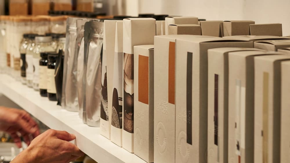
Core Packaging Design Principles That Protect Brand Consistency
Once the brand strategy moves onto a box, pouch, label, sleeve, or carton, consistency depends on a few disciplined design choices. For agencies managing multiple clients and SKUs, these principles keep packaging design from becoming a one-off art project every time a new product launches.
Hierarchy: make the buying decision easy
Packaging has seconds to communicate. A strong hierarchy tells the shopper what the product is, why it matters, and which variant they’re holding without forcing them to study the panel.
For agency teams, that means defining a repeatable order of information before exploring layouts:
- Brand identifier: logo, wordmark, or distinctive brand asset.
- Product category: what the item actually is.
- Product benefit or differentiator: the reason to choose it.
- Variant or flavor: especially important across ranges.
- Supporting details: size, claims, certifications, ingredients, usage cues.
The hierarchy should flex across formats without collapsing. A skincare client may need the product type and active ingredient upfront; a snack brand may prioritize flavor and appetite appeal. The principle is the same: the most commercially important information gets the clearest visual weight.
This is where many packaging systems drift. One designer enlarges the flavor name, another leads with a claim, another changes the logo placement to make a composition work. Documenting hierarchy rules protects the client’s brand while making future SKU work faster.
Brand codes: colors, typography, imagery, and voice
Brand codes are the signals customers recognize before they read a word. On packaging, they need to be specific enough to guide production across product lines, channels, and designers.
Useful brand-code rules include:
- Color roles, not just color palettes: primary brand color, range color, variant color, accent color, background color.
- Typography behavior: which typefaces handle product names, claims, functional copy, and regulatory information.
- Imagery style: photography vs. illustration, lighting, cropping, texture, ingredient treatment, lifestyle vs. product-led.
- Graphic devices: badges, frames, patterns, icons, seals, or shapes that should appear consistently.
- Voice on pack: whether copy is clinical, playful, premium, direct, sensory, or instructional.
The goal is not to make every SKU look identical. It is to create enough recognition that a customer can spot the brand across a shelf, marketplace thumbnail, retail display, or unboxing moment.
For agencies, this also reduces subjective feedback. When a client says a concept “doesn’t feel like us,” the team can point to concrete brand codes instead of debating taste.
Usability: structure, readability, and shelf impact
Beautiful packaging fails if shoppers cannot read it, handle it, understand it, or distinguish it in context. Usability connects the visual system to the real-world conditions where the pack has to perform.
Start with structure. The shape, material, opening method, label area, and printable surfaces all affect what the design can do. A wraparound label has different constraints from a folding carton. A small jar lid may become a key recognition asset. A pouch may need stronger front-panel discipline because it flexes and distorts.
Readability needs equal attention. Agencies should check:
- Minimum type sizes for key information.
- Contrast between text and background.
- Legibility at shelf distance and thumbnail size.
- Clear separation between marketing copy and required details.
- Consistent placement of variant names and product descriptors.
Shelf impact is not about being loud for its own sake. It is about being recognizable in the competitive set. A premium supplement, craft beverage, or direct-to-consumer beauty product may need restraint; a mass retail snack may need stronger color blocking and bolder claims.
The best test is context. Place the design beside competitors, adjacent SKUs, and ecommerce thumbnails. If the brand disappears, the system needs sharper codes. If the pack attracts attention but loses clarity, the hierarchy needs work.
Packaging Design Workflow: From Client Brief to Production-Ready Files
Once the strategy and brand system are clear, the workflow has to keep every decision traceable—from what the client approved to what the printer can actually produce.
Discovery and brand intake
A strong packaging brief should remove ambiguity before anyone opens Illustrator. For agencies juggling multiple clients, the risk is not just missing information; it’s teams interpreting the same brand differently.
Capture the practical inputs first:
- Product type, variants, sizes, and SKUs
- Sales channel: retail shelf, ecommerce, wholesale, subscription box, or DTC unboxing
- Mandatory claims, ingredients, warnings, barcodes, certifications, and legal copy
- Printer specs, material constraints, finishing options, and budget limits
- Existing brand assets, tone of voice, photography, illustration, and competitor references
Then pressure-test the brief with client-facing questions: What must a buyer understand in three seconds? Which claims are legally approved? Which brand elements are flexible, and which are non-negotiable? Who signs off on copy, compliance, and final artwork?
This prevents the classic agency bottleneck: beautiful concepts that collapse once regulatory copy, dielines, or production limits enter the room.
Concept development and client presentation
Concept development should move from strategic routes to specific packaging applications, not random visual exploration. For a small agency, three sharply differentiated routes are usually more useful than ten loosely related options.
Frame each route around a business decision: premiumization, shelf disruption, category familiarity, sustainability cueing, or range navigation. Show how the idea works across the real system, not just the hero pack. If there are multiple flavors, formats, or sizes, include enough range examples for the client to see whether the concept can scale.
Client presentations should make approval easier by separating feedback layers:
- Strategic fit: Does this express the right position?
- Range logic: Can shoppers distinguish variants quickly?
- Copy and claims: Is the hierarchy working?
- Production feasibility: Can this be made within budget and timeline?
Avoid presenting flat mockups alone. Use simple shelf context, ecommerce thumbnails, and physical or realistic 3D views where possible. Clients often approve packaging in a deck, then panic when it appears smaller, glossier, darker, or more crowded in the real world.
Prepress, dielines, and handoff
Production is where packaging design becomes unforgiving. A minor miss in a social graphic can be fixed tomorrow; a packaging error can mean reprints, launch delays, or wasted inventory.
Before handoff, confirm the dieline is current and supplied by the printer or manufacturer. Build artwork to spec, including bleed, safe zones, folds, glue areas, varnishes, embossing, foil layers, white ink, and spot colors. Keep cutter guides and non-printing marks clearly labeled.
Your final checklist should include:
- Approved copy and compliance text
- Correct barcode size, placement, and testability
- Linked or embedded high-resolution assets
- CMYK, Pantone, and finishing specifications
- Overprint, trapping, and transparency checks
- Exported print-ready PDFs plus packaged working files
- Version naming by SKU, size, language, and date
A clean handoff protects the agency as much as the client. It shows the work was not just creatively approved, but production-ready.
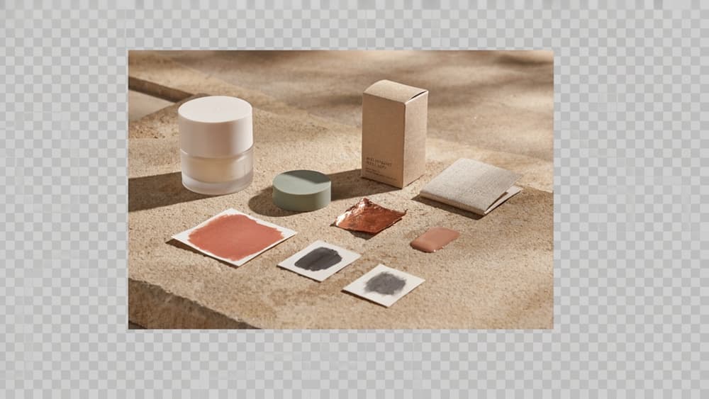
Packaging Design Trends Agencies Should Apply Selectively
Trends are most useful when they sharpen the client’s position—not when they make every SKU look like the same moodboard. For agencies, the opportunity is to translate what’s current into choices that still feel ownable six months and three product extensions later.
Sustainable and low-waste packaging choices
Sustainability is no longer a niche signal, but it can’t be treated as a visual style alone. Kraft paper, muted inks, refill formats, and recyclable materials only strengthen a brand when they connect to the client’s product, price point, and customer expectations.
For a premium skincare client, that might mean a refillable outer vessel with lightweight refill cartons. For an emerging food brand, it may be a simpler substrate change, reduced ink coverage, or eliminating unnecessary inserts. The strongest agency recommendation is usually practical: what reduces waste without creating production complexity the client can’t support?
Use sustainability cues carefully, too. Overusing “eco” colors, leaf icons, or vague claims can make the pack feel generic or expose the client to credibility issues. Better: make the material choice visible, keep claims specific, and ensure the design system still carries the brand’s recognizable codes.
Minimalist, tactile, and premium visual systems
Minimalism keeps trending because it reduces noise—but stripped-back packaging only works when the remaining elements are doing real brand work. A sparse front panel with weak typography, generic neutrals, and no distinctive cue can look polished in a presentation and disappear on shelf.
Premium systems often come from restraint plus texture: embossed marks, soft-touch finishes, sculptural labels, foil used sparingly, unusual paper stocks, or subtle color blocking. These choices help smaller brands feel more established, especially in categories where buyers associate physical detail with quality.
The agency challenge is knowing when “less” supports the strategy and when it removes too much context. A direct-to-consumer supplement brand may benefit from calm, clinical minimalism. A challenger snack brand may need more appetite, energy, and shelf interruption. Treat minimalism as a lens, not a default.
Personalization and limited-edition packaging
Personalization and limited editions can give clients fresh reasons to re-engage customers without rebuilding the entire brand system. Seasonal sleeves, collaboration drops, regional variants, event packaging, or name-based runs can create urgency while preserving the core identity.
The risk is fragmentation. If every campaign introduces new illustration styles, colors, or messaging patterns, the brand becomes harder to recognize across channels and SKUs. Agencies should define what stays fixed before exploring what can flex: logo placement, type system, claim structure, color logic, photography treatment, or icon style.
For small teams managing multiple clients, the smartest limited-edition work starts with a controlled kit of parts. That allows variety without reinventing the system each time—and helps packaging design remain consistent even when deadlines are tight, launches overlap, and clients want “something new” fast.
Scaling Packaging Design Output Without Diluting the Brand
Once the strategy, principles, workflow, and trend filters are in place, the scaling problem becomes obvious: every new SKU, format, market, or campaign creates more executional work—and more chances for the brand to drift.
Centralize brand knowledge before generating concepts
For agencies juggling multiple clients, the biggest bottleneck is rarely ideation. It’s context retrieval.
Before your team creates another concept route, gather the client’s usable brand knowledge in one place:
- Positioning, audience segments, and category context
- Approved messaging, claims, tone, and naming rules
- Visual identity rules, including type, color, imagery, icons, and layout conventions
- Existing pack examples, rejected directions, and client preferences
- Production constraints, retailer requirements, and SKU architecture
This matters because packaging work multiplies quickly. A boutique food brand may start with three flavors, then need seasonal variants, club-store formats, sample packs, Amazon thumbnails, and trade show mockups. If brand knowledge lives across decks, Slack threads, PDFs, and old Figma files, every expansion forces the team to reconstruct the same logic.
Centralizing that knowledge gives designers and strategists a shared source of truth before any AI-assisted exploration begins. It also protects agency margin: fewer repeated questions, fewer “that doesn’t feel like us” client comments, and less senior oversight required for every first draft.
Use AI to accelerate variations, not replace judgment
AI is most valuable in packaging design when the brand direction is already clear. It can help teams move faster through controlled variation work: headline options, flavor naming territories, front-of-pack claim treatments, PDP support copy, concept rationales, or adaptation prompts for different SKU families.
The mistake is using generic AI output as the starting point. That usually creates work that sounds plausible but loses the client’s category nuance, tone, or brand codes.
A better agency workflow is:
- Ingest the client’s brand foundation once.
- Generate concepts within those constraints.
- Explore variations by SKU, audience, retailer, or campaign.
- Keep creative directors focused on selection, refinement, and strategic fit.
For example, instead of asking AI for “premium skincare packaging ideas,” your team can generate directions based on the client’s specific positioning, ingredient philosophy, visual restraint, banned language, and existing product architecture. The output becomes closer to usable territory exploration—not a pile of generic moodboard captions.
That distinction is where agencies protect both creativity and profitability.
Build repeatable review systems for multi-client packaging work
As packaging programs scale, review cannot depend on whoever has the most client history in their head. Small agencies need repeatable checks that catch drift before work reaches the client.
Create a simple review layer for every packaging project:
- Brand fit: Does the concept reflect the client’s positioning and approved codes?
- Message fit: Are claims, benefits, and product descriptors aligned with the brand voice?
- System fit: Can this direction extend across SKUs, formats, and future launches?
- Channel fit: Will it hold up across shelf, ecommerce, social, and sales materials?
- Client fit: Does it avoid known dislikes, rejected territories, or compliance sensitivities?
This is especially important when multiple designers, freelancers, or AI tools touch the work. Without a repeatable system, each handoff introduces interpretation risk.
Aethera helps agencies make that system easier to maintain: ingest a client’s brand once, then generate and review output against that brand context across concepts, variants, and campaign extensions. For small teams, that means more output without turning every packaging project into a senior-level rescue mission.