
July 11, 2026
What Makes Infographic Examples Truly On-Brand?
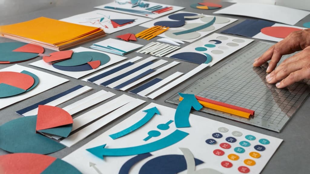
For agencies, the risk is rarely that an infographic looks “bad.” It’s that it looks plausible but not unmistakably like the client. Strong examples of infographics don’t just arrange information well; they carry the brand’s visual and verbal DNA from first glance to final CTA.
The five brand signals every infographic must carry
An on-brand infographic needs consistency across five visible signals:
- Color hierarchy
Not just “use the brand colors,” but use them in the right roles. Primary colors should guide attention. Accent colors should highlight key stats or actions. Neutrals should support readability without making the design feel off-system.
- Typography behavior
Fonts matter, but so do scale, weight, casing, spacing, and emphasis. A fintech client may need restrained, structured type treatments. A lifestyle brand may allow larger contrast, softer hierarchy, or more expressive headings.
- Visual style
Icons, illustrations, charts, shapes, photography, and patterns should feel like they came from the same brand universe. Mixing rounded SaaS icons with editorial serif pull quotes and stock-style illustrations can make even accurate content feel disconnected.
- Messaging tone
Infographics compress ideas, so every label, headline, stat caption, and CTA has to match the client’s voice. “Cut onboarding time by 32%” feels different from “Get new hires productive sooner,” even if both point to the same outcome.
- Information structure
Brand consistency also shows up in how a client explains ideas. Some brands lead with data. Others lead with pain points, process, proof, or transformation. The layout should reflect how the client sells, teaches, and builds trust.
Featured snippet: What should an on-brand infographic include?
An on-brand infographic should include the client’s approved color palette, typography rules, visual style, tone of voice, logo usage, data presentation standards, and preferred layout patterns. It should also match the brand’s messaging strategy, so the information feels recognizable—not just visually consistent.
For agency teams, this means the brief needs to go beyond “make this look like Client X.” A usable infographic brief should define:
- Which colors are used for emphasis, backgrounds, warnings, and CTAs
- How headlines, subheads, labels, and stats should be styled
- What icon, chart, and illustration styles are allowed
- Which words, phrases, or claims fit the brand voice
- How dense or minimal the design should feel
- Where the logo belongs—and where it does not
That level of specificity is what separates reusable brand systems from one-off design guesses.
Why inconsistent visuals quietly weaken client trust
Clients may not always articulate why an infographic feels wrong, but they notice when the details drift. One carousel uses bold gradients. The next uses muted editorial layouts. A report graphic introduces a new icon style. A sales one-pager treats data completely differently.
Individually, these choices seem small. Together, they create doubt.
For agency owners, that doubt becomes expensive. More revision rounds. Slower approvals. Stakeholders asking, “Did we already approve this direction?” Designers rebuilding assets that should have been standardized. Account managers spending time defending work instead of moving the project forward.
More importantly, inconsistent visual content weakens the client’s market recognition. If every campaign asset looks like it belongs to a slightly different company, the audience has to relearn the brand each time. The best examples of infographics reduce that friction: they make the message easier to understand and the brand easier to remember.

Marketing Examples of Infographics That Build Recognition
Once the brand signals are defined, the next question is where visual consistency actually compounds. For agencies, marketing assets are the highest-risk place to drift because they’re produced often, adapted quickly, and touched by multiple people across strategy, copy, design, and paid media.
Social carousel infographics for campaign awareness
Carousel infographics are useful when a client needs to make one idea memorable across LinkedIn, Instagram, or paid social without relying on a single static graphic.
For example, a B2B SaaS client might run a carousel around “5 hidden costs of manual reporting.” Each slide can carry one data point, one short explanation, and one visual cue. The brand consistency comes from repetition: the same headline structure, icon style, chart treatment, and CTA placement across every slide.
For agencies, this format works especially well because it creates a repeatable campaign system rather than one-off creative. A single approved carousel style can be reused for:
- Myth-versus-fact posts
- Statistic roundups
- Step-by-step educational content
- Event or webinar promotion
- Product feature awareness
The key is not making every carousel look identical. It’s making every carousel feel unmistakably like the client, even when the topic changes.
Blog and report infographics for thought leadership
Long-form content often breaks brand consistency because infographics get created after the article or report is mostly finished. That leads to rushed charts, mismatched illustrations, and visuals that look like they came from a different team.
Better examples of infographics in thought leadership start with the content strategy. If a client publishes a benchmark report, the infographic system should be planned around the argument the report needs to own: the core stat, the trend, the comparison, and the takeaway.
For a digital agency managing multiple client accounts, this is where reusable visual rules save time. A financial services client may need restrained charts, neutral colors, and precise data labels. A creator economy client may need bolder callouts, expressive shapes, and more editorial pacing. Both can use infographics in blog posts and reports, but the visual language should reinforce the client’s authority in their category.
Strong thought leadership infographics are especially valuable because they often get repurposed into sales decks, PR pitches, social posts, and email graphics. If the original visual system is on-brand, every derivative asset starts from a stronger place.
Email and landing page infographics for lead capture
Email and landing page infographics have a different job: they need to reduce friction quickly. The reader is deciding whether to click, register, download, or book a call, so the visual must clarify value without overwhelming the page.
Common high-performing formats include:
- A “what you’ll learn” visual for webinar registration pages
- A mini process graphic for service landing pages
- A stat-led graphic for gated report promotion
- A problem-solution visual inside nurture emails
- A checklist-style infographic for downloadable lead magnets
For agency teams, the biggest risk is designing these assets in isolation from the campaign. The landing page graphic, email header, paid ad, and follow-up nurture should look like parts of the same branded journey. When they do, the client appears more credible, the offer feels more intentional, and the campaign is easier to scale across channels without reinventing the visual direction each time.
Sales Infographic Examples That Help Buyers Decide Faster
Once the brand is recognizable in-market, sales content has a different job: reduce hesitation. The strongest sales-focused examples of infographics give prospects a clearer reason to choose, understand, or justify the offer.
Comparison charts for positioning and differentiation
A branded comparison chart helps sales teams explain “why this option” without turning the conversation into a feature dump.
For agency clients, this is especially useful when the offer is hard to evaluate at a glance: SaaS platforms, service packages, retainers, memberships, or multi-tier products. Instead of asking a buyer to read three web pages or sit through a long proposal, the chart makes the trade-offs visible.
Good comparison infographics typically clarify:
Use case | What the infographic should make obvious |
|---|---|
Product vs. competitor | Where the client wins, without looking defensive |
Package tiers | Which plan fits which buyer type |
Old way vs. new way | Why the prospect should change behavior |
DIY vs. done-for-you | The value of paying for expertise, speed, or reduced risk |
The brand consistency matters because these assets often circulate beyond the original sales call. A prospect may forward the chart to a CFO, founder, or department lead. If it looks like a one-off Canva file instead of part of the client’s ecosystem, it weakens the perceived maturity of the offer.
Process timelines for explaining the client journey
Buyers hesitate when they cannot picture what happens after they say yes. A process timeline removes that uncertainty.
For service businesses, agencies can use timeline infographics to show the path from kickoff to delivery: discovery, strategy, production, review, launch, reporting. For B2B products, the same format can explain onboarding, implementation, migration, or adoption.
The best versions avoid cramming every operational detail into the visual. They highlight the moments buyers care about:
- What happens first
- Where their input is needed
- When they will see progress
- How long key phases take
- What outcome each stage produces
This is particularly valuable for higher-ticket offers. A buyer may already like the pitch but feel unsure about the commitment. A clear, on-brand timeline turns a vague process into something concrete and manageable.
For agencies, these assets also reduce repetition for account teams. Instead of every salesperson explaining the process slightly differently, the client gets a reusable visual that keeps the story consistent across proposals, follow-up emails, and sales decks.
ROI and results snapshots for sales enablement
ROI snapshots help buyers defend a decision internally. They compress proof into a format that is easy to scan and easy to share.
These infographics work well for case study summaries, proposal inserts, sales decks, and follow-up emails after discovery calls. Rather than handing prospects a long success story, the visual can highlight the metrics that matter most: revenue influenced, time saved, cost reduced, conversion lift, pipeline generated, or operational capacity gained.
For example, an agency might create a one-page results snapshot for a client showing:
- The starting problem
- The action taken
- Three key metrics
- A short customer quote
- The business impact in plain language
The goal is not to decorate numbers. It is to make the business case easier to repeat when the buyer is no longer in the room.
For small agencies, this is where brand discipline can become a sales advantage. When every comparison chart, journey timeline, and ROI snapshot looks unmistakably like the client, the sales team gains assets that feel polished, consistent, and ready to influence decision-makers.

Internal Communication Infographics That Keep Teams Aligned
The same visual consistency that builds buyer confidence externally can reduce friction inside the agency, too—especially when multiple strategists, designers, copywriters, and account managers are touching the same client.
Onboarding infographics for faster client and employee ramp-up
For small agencies, onboarding often lives in scattered decks, docs, Slack threads, and “ask Sarah” tribal knowledge. A branded onboarding infographic gives new clients and new team members a fast, visual map of how the relationship works.
Useful internal-facing formats include:
- Client kickoff maps showing who owns strategy, approvals, production, reporting, and escalation.
- First-30-days timelines that set expectations for discovery, asset collection, first concepts, revision cycles, and launch.
- Brand immersion one-pagers summarizing the client’s audience, offer hierarchy, voice cues, visual references, and common “don’ts” for quick internal context.
For agency owners, the value is simple: fewer repeated explanations, fewer missed handoffs, and faster confidence from both clients and employees. Instead of every account lead explaining the process slightly differently, the infographic becomes the shared reference point.
SOP flowcharts for repeatable delivery standards
SOPs are only useful if people actually use them. Long process documents tend to get ignored during deadline pressure; visual flowcharts make the next step obvious.
For creative and digital teams, strong internal examples of infographics include:
- Creative request intake flows: what information is required before work starts, who reviews the brief, and when a request gets sent back.
- Content production workflows: draft, internal review, client review, revisions, scheduling, and publishing.
- Design approval paths: concept review, brand check, accessibility check, stakeholder signoff, and final export.
- Issue escalation charts: what happens when feedback is late, scope changes, assets are missing, or performance drops.
The key is to make the SOP operational, not decorative. A designer should be able to glance at the chart and know whether to wait for account approval or move to production. An account manager should know exactly when to involve leadership. That clarity protects margins because fewer projects get stuck in informal, undocumented decision loops.
Dashboard-style infographics for leadership updates
Agency leadership rarely needs another dense report. They need a clear view of what is healthy, what is slipping, and where attention is required.
Dashboard-style infographics turn internal updates into quick decision tools. They work well for:
- Client portfolio health: retention risk, upsell potential, delivery status, satisfaction signals, and upcoming renewal dates.
- Production capacity: team workload, bottlenecks, overdue reviews, and projects nearing scope limits.
- Campaign or account performance summaries: headline metrics, trend direction, recent wins, and priority actions.
- Quarterly agency snapshots: revenue mix, utilization, client concentration, delivery efficiency, and team priorities.
For partners and department leads, these visuals create a shared operating picture. Instead of discussing five different spreadsheets, the team can align around one clear summary and decide what needs action this week.
Internal infographics may never be seen by a prospect, but they still shape the client experience. When your team understands the process, the standards, and the current state of each account, the work feels more consistent from the client’s side—without adding more meetings or headcount.
A Scalable Agency Workflow for Creating and Reviewing Branded Infographics
Once you know which infographic formats belong in the mix, the next challenge is making them repeatable across clients without turning every asset into a one-off art direction exercise.
Turn each client’s brand into a reusable infographic brief
For each retained client, create a standing infographic brief that your team can reuse before strategy, copy, design, or AI prompts begin.
This should be more operational than a brand guideline PDF. Include the rules that affect infographic decisions specifically:
- Approved color combinations for charts, callouts, backgrounds, and icons
- Data visualization preferences, such as bar charts over pie charts or minimalist labels over dense legends
- Preferred narrative structure, like “problem → insight → action” or “before → after → outcome”
- Voice rules for headings, captions, stats, and CTAs
- Icon and illustration style, including what to avoid
- Layout patterns the client already uses in decks, reports, or landing pages
This turns brand consistency into a production input, not a subjective review comment. It also helps freelancers, junior designers, and strategists produce examples of infographics that feel client-specific from the first draft.
Create faster with AI while preserving client-specific rules
AI can speed up the messy middle: summarizing source material, suggesting infographic angles, drafting section labels, outlining visual hierarchy, and adapting one asset into multiple formats.
The risk is that generic AI output tends to flatten brands. Every client starts to sound “clear, confident, and approachable.” Every layout becomes the same three-step framework. Every CTA sounds like it came from a SaaS landing page.
The fix is to make the client’s reusable brief part of the workflow, not an afterthought. Before generating copy or structure, give AI the client’s rules for tone, terminology, audience, visual style, and forbidden patterns. Then ask for outputs within those constraints.
For example, instead of prompting:
“Create an infographic about customer onboarding.”
Use:
“Create a five-section infographic outline for a cybersecurity client. Use a direct, technical tone. Avoid playful metaphors. Prioritize risk reduction, implementation clarity, and executive confidence. Use short section headers and data-led captions.”
That difference matters at agency scale. You are not just creating faster; you are reducing the amount of senior review needed to pull work back on-brand.
Use a final QA checklist before anything ships
Before an infographic goes to the client or gets published, run a short brand QA pass. Keep it simple enough that the team will actually use it.
Check:
- Does the headline sound like this client, not your agency?
- Are colors, fonts, icons, and chart styles within the approved system?
- Is the hierarchy clear on the intended channel or format?
- Are stats, claims, and labels presented in the client’s preferred style?
- Does the CTA match the client’s funnel stage and language?
- Would this asset look native beside the client’s existing website, deck, or report?
This is where a platform like Aethera fits naturally: ingest the client’s brand once, then use it to guide AI-assisted creation and review across every infographic brief, draft, and variation. For small agencies managing multiple brands, that consistency is what lets you scale visual content without adding another layer of manual policing.