
July 20, 2026
Landing Page Examples for Agencies That Convert | Aethera
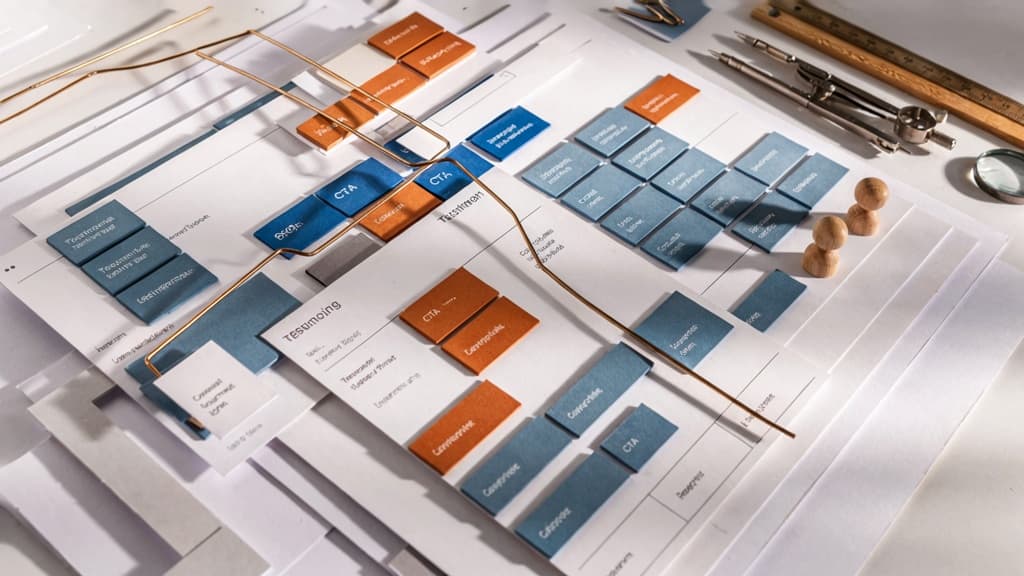
How Agency Owners Should Read Landing Page Examples Before Writing a Word
Before your team drafts copy, treat strong pages like source material—not swipe files. The goal is to understand why a page works, then translate that thinking into the client’s market, offer, voice, and sales motion.
What Makes a Landing Page Example Worth Studying?
Not every polished page is useful. A beautiful layout with vague copy can still underperform. For agencies, the best landing page examples are the ones where the strategy is visible.
Look for pages that make three things easy to identify:
- Who the page is for: The audience should be obvious without reading the nav, footer, or product docs.
- What action the visitor is being moved toward: The page should have a clear conversion path, even if there are supporting paths.
- Why this offer matters now: Strong pages create urgency through relevance, specificity, or a sharp problem—not through hype.
A page is also worth studying when the copy reflects the buyer’s actual decision process. For a productivity product, that might mean moving from “my team is scattered” to “we can centralize work without adding another messy tool.” For SaaS, it may mean showing how the product fits into an existing workflow instead of forcing a new category explanation too early.
Agency owners should also ask: could my team explain the page’s logic in two minutes? If not, it may be impressive but hard to learn from.
The SaaS and Productivity Page Patterns to Look For
When reviewing SaaS and productivity pages, don’t start by judging individual lines. Start by mapping the structure.
Useful patterns often show up in how the page handles:
- Audience clarity: Does the page speak to a role, team type, industry, use case, or maturity stage?
- Problem framing: Does it name a daily operational pain, a strategic business issue, or both?
- Offer positioning: Is the product positioned as faster, simpler, more collaborative, more automated, more accurate, or easier to adopt?
- Message progression: Does each section add a new reason to believe, or does the page repeat the same claim in different words?
- Decision support: Does the page anticipate what a buyer needs to understand before taking the next step?
For small agencies, this pattern-spotting is especially useful because it creates a shared language across strategists, copywriters, designers, and account leads. Instead of debating taste, the team can discuss the job each section performs.
Why Agencies Should Extract Patterns, Not Copy
Copying a strong page creates two problems: it weakens differentiation, and it ignores the client’s brand. The structure may be smart, but the words only work because they belong to that company’s audience, offer, and market position.
A better approach is to extract the underlying move.
For example, don’t copy a competitor’s “save 10 hours a week” claim. Identify the pattern: concrete time savings tied to a familiar workflow pain. Then rebuild it around your client’s actual customer insight, proof, and tone.
This is where agencies can turn research into leverage. A strategist can capture the pattern, a copywriter can adapt the message, and the team can keep output consistent across client work without starting from a blank page every time. The result is faster production, fewer off-brand AI drafts, and landing page copy that feels intentionally built—not borrowed.
Headline and Value Proposition Examples That Make the Offer Instantly Clear
Once you’ve spotted the pattern behind a strong page, the next question is whether the hero copy can pass the five-second test: who it’s for, what changes, and why this product is the obvious route.
Headline Formulas That Work for SaaS and Productivity Products
For SaaS and productivity offers, the best headlines usually do one of three jobs: remove friction, promise a workflow improvement, or make a messy outcome feel simple.
Formula | Best for | Example structure |
|---|---|---|
Outcome without the old pain | Productivity tools replacing manual work | “Create client reports without chasing spreadsheets” |
Audience + workflow improvement | Vertical SaaS or role-specific tools | “Project planning software for overloaded agency teams” |
Do X in less time | Time-saving tools with a clear task | “Build approval-ready proposals in half the time” |
Replace messy process with simple action | Tools consolidating fragmented workflows | “One place to plan, assign, and approve campaign work” |
Better result + specific mechanism | AI, automation, or analytics products | “Turn meeting notes into scoped tasks automatically” |
The agency trap is stopping at the formula. Two clients can both use “Save time on X,” but one brand may need to sound sharp and operational, while another needs to sound calm, premium, and consultative. The structure can repeat; the language should not.
A useful review question when studying landing page examples: could this headline sit on three competitors’ sites unchanged? If yes, it’s a placeholder, not positioning.
How Strong Value Propositions Compress Audience, Outcome, and Differentiation
A clear value proposition usually carries three pieces of information in one tight line:
- Audience: who the product is built for
- Outcome: what they can do, improve, reduce, or avoid
- Differentiation: why this product is not just another tool in the category
Weak version: “The easiest way to manage projects.”
Stronger version: “Project management for creative teams that keeps feedback, files, and approvals tied to the work.”
The second version gives the page more selling power because it narrows the buyer, names the operational mess, and hints at the mechanism. For agency owners, this is where a lot of client copy gets diluted. Stakeholders push to include every audience, every feature, and every edge case. The result is a hero section that technically says more but communicates less.
A practical value proposition test: remove the product name and ask whether the line still points to a specific buyer and situation. If it could describe ten tools, sharpen the audience or the differentiator.
Above-the-Fold Copy Patterns Agencies Can Reuse Without Sounding Generic
A strong above-the-fold section does not need to be clever. It needs hierarchy. For SaaS and productivity pages, this structure is reliable:
- Eyebrow: category, audience, or trigger moment
- Headline: primary outcome
- Subheadline: context, mechanism, or key differentiator
- CTA line: action tied to buyer intent
Example:
- Eyebrow: “For growing content teams”
- Headline: “Publish more campaigns without losing track of approvals”
- Subheadline: “Plan briefs, assign owners, collect feedback, and move every asset through review in one shared workspace.”
- CTA: “See how the workflow works”
The reusable pattern is not the wording; it’s the order of persuasion. The eyebrow qualifies. The headline creates momentum. The subheadline explains why the promise is believable. The CTA gives the next step.
This helps agencies scale landing page copy across clients without flattening every brand into the same SaaS voice. Keep the conversion logic consistent, then adjust vocabulary, sentence rhythm, and proof of expertise to match the client’s positioning.
Conversion-Focused Body Copy Patterns That Turn Features Into Buyer Momentum
Once the top of the page has made the offer clear, the body copy has one job: help the buyer believe the product will work in their world.
From Feature Lists to Outcome-Led Messaging
Weak body copy lists what the product includes. Strong body copy translates each feature into a business or workflow result.
For SaaS and productivity pages, that shift often looks like this:
Feature-led copy | Outcome-led copy |
|---|---|
“Automated task reminders” | “Keep projects moving without chasing every deadline manually.” |
“Team dashboards” | “See what’s stuck, what’s done, and what needs attention before your next check-in.” |
“AI meeting summaries” | “Turn calls into clear next steps before details disappear.” |
“Integrations with Slack and Asana” | “Keep work visible in the tools your team already checks every day.” |
For agencies, this is where many client pages get watered down. The team has the product notes, but not the buyer’s internal language. The copy ends up accurate but flat.
A better body section usually follows this pattern:
- Name the friction the buyer already recognizes.
- Introduce the capability.
- Show the operational payoff.
- Tie it back to the larger promise.
Example:
“Instead of digging through five tools to understand project status, your team gets one live view of what’s moving, what’s blocked, and what needs a decision.”
That sentence does more than describe a dashboard. It gives the buyer a before-and-after they can feel.
Problem-Agitate-Solve Patterns in Productivity Landing Pages
Productivity buyers are usually not buying “more features.” They are buying relief from drag: missed handoffs, messy workflows, duplicated work, slow approvals, unclear ownership.
That makes Problem-Agitate-Solve especially useful in body copy, as long as it stays specific.
A generic version sounds like:
“Work is chaotic. Our platform helps teams collaborate better.”
A stronger version sounds like:
“When project updates live across chat threads, docs, and status calls, small blockers stay hidden until they become missed deadlines. With one shared workflow, every owner, task, and approval is visible before work slows down.”
The difference is specificity. The better version names the actual mess, raises the cost of leaving it unresolved, then positions the product as the practical fix.
For client work, ask: what does the buyer complain about before they know the category name? That phrasing is often more persuasive than the client’s product terminology.
How to Sequence Benefits Without Repeating the Hero
The body copy should deepen the promise, not restate it with slightly different adjectives.
A useful sequence for SaaS and productivity pages is:
- Workflow benefit: How does daily work get easier?
- Team benefit: How does collaboration or visibility improve?
- Business benefit: What does the company gain from that improvement?
For example, if the hero promise is “Plan launches faster,” the body should not keep saying “faster launches.” It should unpack the mechanism:
- “Map every deliverable before kickoff.”
- “Spot approval gaps before they delay production.”
- “Give each stakeholder a live view of what is ready, blocked, or at risk.”
Each section advances the buyer’s understanding. That is what separates useful landing page examples from pages that only look polished.
For agencies producing this across multiple clients, the risk is sameness: every productivity product becomes “save time,” “stay aligned,” and “move faster.” The fix is to anchor each benefit in the client’s specific customer, workflow, and vocabulary before writing at scale.
Call-to-Action Examples That Reduce Friction and Match Buyer Intent
Once the page has created momentum, the CTA has one job: make the next step feel obvious, low-risk, and aligned with where the buyer actually is.
Primary vs. Secondary CTA Patterns
For SaaS and productivity pages, the strongest CTA pairs usually separate “ready to act” visitors from “still evaluating” visitors without splitting the page’s message.
Visitor intent | Primary CTA pattern | Secondary CTA pattern | Best fit |
|---|---|---|---|
High intent | “Start free trial” | “Book a demo” | Self-serve SaaS with product-led acquisition |
Sales-assisted | “Book a demo” | “Watch product tour” | Higher ACV tools, team adoption, complex workflows |
Research mode | “Get the template” | “See how it works” | Productivity tools, lead magnets, early-stage demand |
Internal buy-in | “Talk to sales” | “Download one-pager” | B2B products with multiple stakeholders |
The mistake to avoid is giving both CTAs equal weight. A primary CTA should carry the page’s commercial intent. The secondary CTA should reduce bounce from visitors who need more confidence, not compete with the main action.
For agency teams, this is where client consistency often breaks down. One landing page says “Get started,” another says “Request access,” another says “Schedule a call,” even though the offer is the same. Build a CTA vocabulary per client: preferred verbs, approved offer names, button hierarchy, and when each action appears.
CTA Microcopy That Clarifies the Next Step
Button copy gets the click. Microcopy earns it.
Good CTA microcopy answers the tiny question forming in the buyer’s head right before they hesitate:
- “No credit card required”
- “Takes less than 2 minutes”
- “See plans after setup”
- “Get the template instantly”
- “We’ll reply within one business day”
- “Includes a personalized workflow audit”
The best landing page examples use microcopy to remove a specific concern, not decorate the button. If the CTA is a trial, clarify commitment. If it is a demo, clarify who they will talk to or what they will see. If it is a download, clarify delivery and format.
Weak microcopy: “Start your journey today.” Stronger microcopy: “Create your workspace free — no credit card required.”
Weak microcopy: “Let’s talk.” Stronger microcopy: “Book a 30-minute demo with a product specialist.”
For agencies, this is especially useful when scaling variants. You can keep the CTA structure consistent while adjusting the friction reducer by segment: founder, marketing lead, operations manager, or enterprise buyer.
Offer Framing for Demos, Trials, Templates, and Free Tools
The CTA should match the buyer’s readiness. A demo is not always the right ask, and a free template is not always enough.
Use demos when the product needs explanation, customization, or stakeholder buy-in. Frame the CTA around what the buyer will gain: “See how your team could automate weekly reporting,” not just “Book a demo.”
Use trials when the product can deliver value quickly without hand-holding. Frame the CTA around speed and autonomy: “Start building your first workflow today.”
Use templates when the buyer has a known problem but may not trust the product yet. Frame the CTA as immediate utility: “Get the campaign planning template.”
Use free tools when the page can turn a small win into product curiosity. Frame the CTA around a quick result: “Calculate your meeting cost.”
For client work, the practical system is simple: define one primary offer per page, one fallback action for lower-intent visitors, and one approved microcopy pattern for each. That keeps CTAs sharp across campaigns without every new page becoming a copy debate.
Social Proof Examples and the Agency System for Keeping Every Page On-Brand
Once the page has made a clear promise and reduced action friction, proof has one job: make the prospect believe the outcome is real for someone like them.
Proof Types That Build Trust Fast
The strongest landing page examples rarely rely on one vague testimonial. They layer proof by risk level, buyer awareness, and sales motion.
Proof type | Best use | What makes it credible |
|---|---|---|
Customer logo strip | Fast recognition near the top of the page | Relevant names, not just the biggest names |
Short testimonial | Reinforcing a specific claim | Names, roles, company, and a concrete outcome |
Metric-based proof | Supporting productivity, revenue, or time-saving claims | Before/after numbers, timeframe, and context |
Use-case quote | Showing fit for a specific workflow or persona | Language that mirrors the buyer’s actual situation |
Case study card | Giving evaluators a deeper proof path | Clear problem, solution, result, and segment |
Review snippets | Reducing skepticism for lower-touch offers | Source attribution from G2, Capterra, App Store, etc. |
For SaaS and productivity clients, the easiest win is turning generic praise into claim-specific proof.
Instead of:
“This tool changed how we work.”
Use:
“We cut weekly status meetings from five to two, and our project managers finally have one view of every deadline.”
That second version proves the benefit without needing the reader to connect the dots.
Where to Place Social Proof on SaaS and Productivity Landing Pages
Proof should appear exactly where doubt is likely to surface.
Near the hero, use lightweight trust signals: logo strips, user counts, short ratings, or a single punchy quote. The goal is not to explain everything. It is to make the reader comfortable continuing.
After the first major benefit section, use proof that validates the primary outcome. If the page claims “ship client work faster,” show a testimonial about cycle time, review rounds, or throughput.
Near feature-heavy sections, pair proof with adoption. A productivity product can sound useful but hard to implement. Quotes like “Our team was fully onboarded in one afternoon” reduce perceived switching cost.
Before the final decision point, use the strongest proof asset: a compact case study, quantified result, or segment-specific testimonial. This is where buyers ask, “Will this work for a company like ours?” Your proof should answer that before hesitation turns into exit.
How Agencies Turn Winning Examples Into On-Brand Client Templates
For agencies, the scalable move is not collecting more landing page examples. It is converting proof patterns into reusable, brand-safe modules for each client.
Create a proof library per client with fields like:
- Approved customer quotes
- Preferred attribution format
- Logo usage rules
- Quantified outcomes
- Industry or persona tags
- Claims each proof point supports
- Tone notes: bold, restrained, technical, playful, founder-led
Then build modular templates your team can reuse:
- “Outcome quote + metric + role”
- “Logo strip + category label”
- “Mini case study card”
- “Persona-specific testimonial block”
- “Review snippet with source”
This is where agencies usually lose time: every page requires hunting through docs, Slack threads, old decks, and client approvals. Aethera solves that by ingesting the client’s brand, proof assets, messaging rules, and tone once, then helping every AI-generated page section stay aligned.
The result is faster production without flattening every client into the same voice. Your team can borrow the structure behind high-performing proof sections while keeping each client’s credibility, language, and brand standards intact.