
August 9, 2026
What Are Illustration Styles—and Why Agencies Need a Shared Style Language
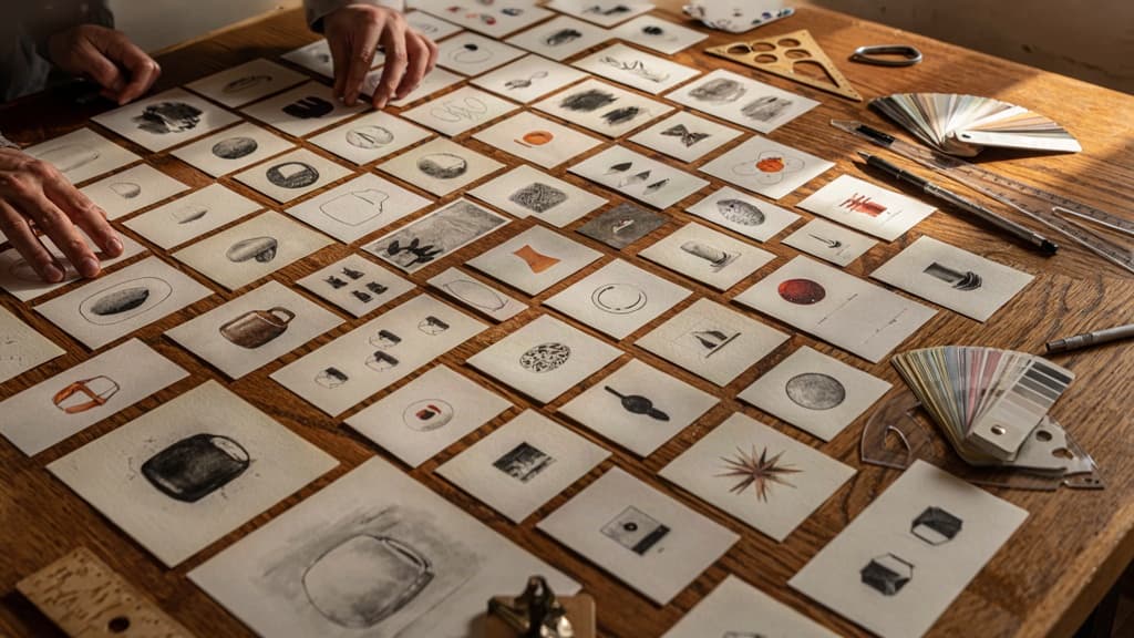
Before a team can choose, systemize, or scale a visual direction, everyone needs to mean the same thing when they talk about style.
Definition: What Is an Illustration Style?
An illustration style is the recognizable set of visual choices that makes artwork feel like it belongs to a specific brand, campaign, or creative world.
It is not just “how it looks.” It includes the repeatable decisions behind the look:
- Line quality: clean, rough, organic, precise, thick, thin, broken, or continuous
- Shape language: rounded, geometric, exaggerated, simplified, detailed, or abstract
- Color behavior: muted, high-contrast, monochrome, pastel, saturated, or brand-led
- Texture and finish: grainy, glossy, hand-rendered, flat, layered, or polished
- Character treatment: realistic, expressive, faceless, diverse, playful, editorial, or symbolic
- Depth and perspective: flat, dimensional, isometric, atmospheric, or collage-like
- Emotional tone: warm, premium, energetic, technical, calm, witty, or serious
For agencies, this matters because clients rarely ask for “inconsistent shape language” or “misaligned visual tone.” They say, “This doesn’t feel like us.”
A shared style language gives your team a practical way to diagnose why.
The Business Risk of Style Drift
Style drift happens when creative assets slowly move away from the approved visual direction. One landing page uses soft geometric characters. The next social campaign adds sketchy line work. A freelancer introduces new textures. A pitch deck swaps in stock illustrations that feel close enough—until the full brand starts looking patched together.
For a small agency, that inconsistency is not just an aesthetic issue. It creates operational and commercial drag.
Clients notice when campaign assets do not feel connected. Account leads spend more time explaining revisions. Designers waste hours reverse-engineering what “more on-brand” means. Creative directors become bottlenecks because they are the only people who can spot the difference between a useful variation and a brand-breaking one.
Style drift also weakens the perceived value of your work. If a client paid for a distinctive visual system but receives a mix of mismatched executions, the agency looks less strategic—even if each individual asset is well designed.
The risk compounds across retainers. The more channels, formats, freelancers, and quick-turn deliverables involved, the easier it is for illustration styles to fragment. Without a shared language, every new asset becomes a fresh interpretation instead of an extension of the same brand world.
A Simple Vocabulary for Creative Reviews
Creative reviews move faster when feedback points to specific visual decisions, not personal taste. Instead of saying, “This feels too childish,” a team can say, “The rounded proportions and oversized facial expressions are making the tone feel younger than the brand.”
A useful review vocabulary should cover five areas:
- Tone: Does the illustration feel premium, playful, calm, bold, technical, human, or editorial?
- Complexity: Is the level of detail appropriate for the brand and the asset’s size or channel?
- Consistency: Do line weight, color, proportions, and texture match previous approved work?
- Distinctiveness: Could this belong to the client specifically, or does it feel generic?
- Flexibility: Can the style stretch across ads, web pages, decks, email, and social without falling apart?
This kind of language helps agency teams give clearer feedback, onboard collaborators faster, and protect the client’s visual identity as output scales. It also turns subjective review into a more confident conversation: not “I like it” versus “I don’t,” but “Does this execution support the brand system we agreed to?”

Popular Illustration Styles and Their Defining Visual Characteristics
With a shared vocabulary in place, the next step is recognizing the visual signals that separate one direction from another—especially when a client says “clean,” “premium,” “playful,” or “more human” and means something entirely different each time.
Flat, Minimal, and Geometric Illustration
Flat illustration uses simplified shapes, solid color blocks, and little to no depth. It avoids realistic lighting, texture, and perspective in favor of clarity. You’ll often see it in SaaS websites, explainer graphics, onboarding screens, and product feature sections because it communicates quickly without competing with the interface.
Minimal illustration goes even further. It reduces the composition to only what is necessary: fewer colors, fewer details, more negative space. Characters may have no facial features. Objects may be represented by a few essential lines or shapes. The result feels restrained, modern, and efficient.
Geometric illustration is more structured. Forms are built from circles, rectangles, grids, angles, and repeated patterns. It can feel precise and technical, which makes it common in fintech, data, infrastructure, and B2B software brands.
Common visual characteristics:
- Solid fills instead of painterly texture
- Clean silhouettes and simplified anatomy
- Limited palettes, often pulled directly from brand colors
- Low-detail environments and props
- Emphasis on icons, shapes, and symbolic storytelling
The risk with these illustration styles is sameness. Many agency moodboards include the same rounded characters, floating UI cards, and abstract blobs. The differentiator usually comes from proportion, color discipline, shape language, and how much personality is allowed into faces, poses, and environments.
Hand-Drawn, Line Art, and Sketch Styles
Hand-drawn illustration signals warmth, imperfection, and human presence. It can range from loose marker-like doodles to polished digital drawings that still retain visible wobble, texture, or irregularity.
Line art relies primarily on outlines rather than filled shapes. It may use consistent stroke weights for a clean, elegant look, or varied strokes for something more expressive. This style works well when the goal is to add personality without making the layout feel visually heavy.
Sketch styles feel more exploratory. They may include rough construction lines, uneven shading, pencil texture, or unfinished edges. In agency work, this direction often appears in campaigns where the brand wants to feel approachable, founder-led, independent, or creatively driven.
Defining characteristics include:
- Visible strokes, grain, or texture
- Organic curves rather than perfect geometry
- Imperfect proportions and expressive gestures
- Lighter visual weight than full-color illustration
- A more personal, less corporate feel
Small inconsistencies are part of the charm here, but they need to feel intentional. If one asset looks like a loose notebook sketch and another looks like polished vector line art, the system starts to feel accidental rather than crafted.
3D, Isometric, and Editorial Illustration
3D illustration uses volume, lighting, material, and depth to create a rendered look. It can feel tactile, premium, playful, or futuristic depending on the finish: glossy plastic, soft clay, metallic, glassmorphism, or realistic product rendering.
Isometric illustration sits between flat and 3D. It uses angled perspective to show depth without realistic vanishing points. This makes it useful for systems, workflows, platforms, architecture, and process graphics where multiple components need to be visible at once.
Editorial illustration is more conceptual. Instead of literally showing a product or feature, it visualizes an idea—risk, collaboration, speed, complexity, trust, burnout, transformation. It often uses metaphor, exaggerated scale, unusual compositions, and more distinctive art direction.
Typical traits:
- 3D: depth, shadows, highlights, materials, rendered objects
- Isometric: angled grids, modular environments, process-friendly layouts
- Editorial: metaphor, stronger composition, more expressive visual storytelling
These directions can create stronger ownability, but they also demand tighter art direction. Lighting, camera angle, object treatment, and composition choices become just as important as color and subject matter.
How to Choose the Right Illustration Style for a Client Brand
Once the team can name what they’re looking at, the next step is deciding what actually belongs to the brand—not just what looks good in the deck.
Match Style to Brand Personality
Start with the client’s strategic adjectives, not visual references. If the brand is “precise, expert, and enterprise-ready,” the illustration direction should feel controlled, structured, and intentional. If it’s “warm, optimistic, and human,” the work can carry more irregularity, softness, and expressive detail.
A useful agency filter: ask whether the style reinforces the sales conversation the client needs to have.
Brand needs to feel | Illustration should signal | Watch out for |
|---|---|---|
Trustworthy and established | Order, clarity, restraint | Looking generic or overly corporate |
Playful and approachable | Energy, warmth, movement | Feeling childish for the category |
Premium and refined | Space, polish, selective detail | Becoming cold or inaccessible |
Innovative and bold | Contrast, unexpected composition | Chasing trends that date quickly |
Human and service-led | Imperfection, character, empathy | Becoming messy or inconsistent |
This keeps subjective feedback from taking over. Instead of “I like this one,” the conversation becomes: “Does this visual language make the client feel more credible to the buyer they’re trying to win?”
Fit the Style to the Audience and Channel
The right choice also depends on where the illustration will live. A detailed editorial treatment might work beautifully in a long-form report but collapse inside a paid social carousel. A playful character system might add warmth to onboarding emails but feel out of place on an enterprise security landing page.
Before presenting options, pressure-test the direction across the client’s real use cases:
- Website hero sections: Does it communicate quickly above the fold?
- Social posts: Will it remain recognizable in fast-scroll environments?
- Sales decks: Does it support persuasion without distracting from the message?
- Product UI or onboarding: Can it simplify concepts at small sizes?
- Reports and lead magnets: Does it add depth without slowing production?
Audience maturity matters too. Technical buyers often need clarity before charm. Consumer audiences may respond more to emotion, personality, and memorability. Internal audiences may need a style that feels energizing but easy to adapt for presentations, enablement, and culture comms.
The best illustration styles for agency work are rarely chosen in isolation. They’re chosen against the client’s buyer, content mix, and production reality.
Build a Repeatable Selection Framework
For small agencies, the goal isn’t to reinvent the decision process for every client. Build a lightweight framework your team can reuse during discovery and creative direction.
A simple version:
- Extract brand traits from strategy, positioning, tone of voice, and competitor context.
- Define the communication job: explain, humanize, differentiate, simplify, entertain, or elevate.
- List primary channels where the style must perform.
- Set practical constraints around timelines, budget, animation needs, and asset volume.
- Score 2–3 visual directions against brand fit, audience fit, channel fit, and scalability.
- Present the recommendation with rationale, not preference.
That last step is where agencies win trust. Clients don’t just see a moodboard; they see a decision backed by brand logic. It also reduces revision loops because feedback is anchored to agreed criteria instead of personal taste.
For agency owners, this creates leverage. A repeatable selection framework helps junior creatives make better calls, gives account leads clearer language for client conversations, and keeps every new visual direction tied to business outcomes from the start.
Turning an Illustration Style Into a Scalable Brand System
Once the direction is approved, the work shifts from “make it look right” to “make it repeatable.” For agencies, this is where margin is protected: fewer revision loops, faster freelancer onboarding, and less partner-level oversight on every asset.
Document the Non-Negotiables
Start by separating flexible choices from rules that define the client’s visual identity. A scalable system should make clear what cannot change, even when the brief, format, or creator does.
Document non-negotiables such as:
- Line weight and edge treatment: Are strokes thin and precise, bold and rounded, or absent entirely?
- Color behavior: Which brand colors dominate? Are gradients allowed? Can illustrators introduce secondary colors?
- Character rules: If people appear, how are faces, proportions, clothing, skin tones, and expressions handled?
- Perspective and depth: Is the world flat, layered, dimensional, or intentionally abstract?
- Texture and finish: Should work feel polished, organic, grainy, playful, premium, or editorial?
- Composition patterns: Are scenes spacious and minimal, dense and narrative, centered, asymmetrical, or modular?
- Do-not-use rules: No stock-looking icons, no exaggerated facial features, no off-brand metaphors, no unapproved props.
The goal is not to write an art textbook. It is to give anyone producing assets a fast way to know, “This belongs to the brand,” or “This is drifting.”
Create Reusable Style Rules for Teams and Freelancers
A style system becomes useful when it can be handed to a designer, illustrator, animator, or freelancer without a 45-minute briefing every time.
Turn the approved illustration style into practical production rules:
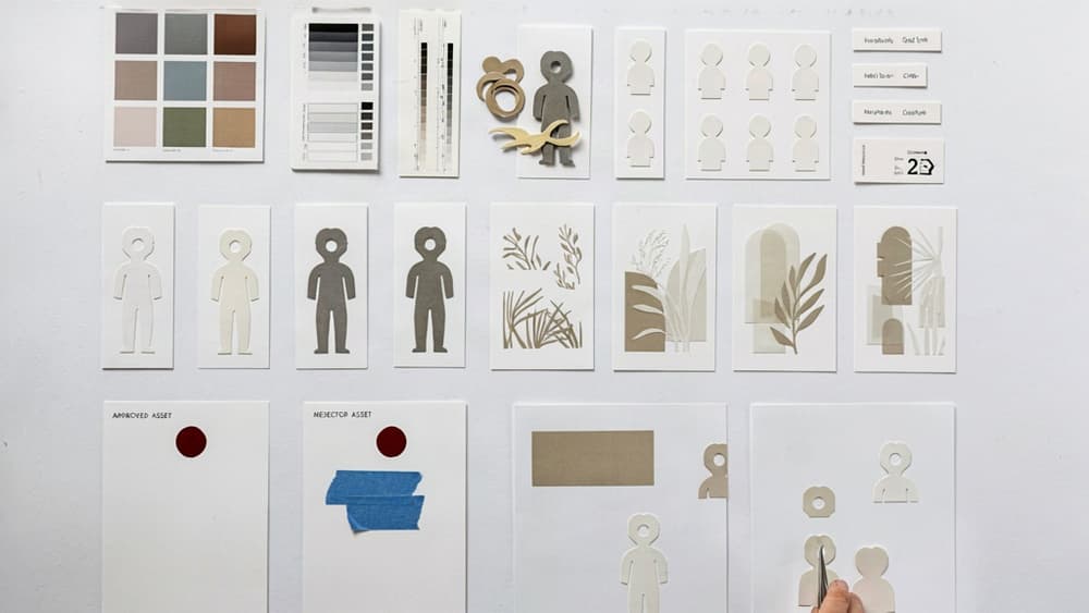
- Show approved examples with labels. Don’t just include a moodboard. Annotate why each example works: “limited palette,” “rounded geometry,” “no facial detail,” “soft shadow only.”
- Include near-miss examples. These are often more valuable than perfect references because they reveal boundaries: “too childish,” “too detailed,” “too SaaS-generic,” “too much contrast.”
- Create asset templates. Provide starter files for hero images, blog headers, social posts, landing page modules, email graphics, and pitch deck slides.
- Define component libraries. Build reusable people, devices, objects, backgrounds, icons, textures, and scene elements.
- Write brief-ready prompts and direction. Give account managers and creative leads approved language they can paste into briefs, instead of reinventing style guidance each time.
For small agencies, this reduces dependency on the one designer who “just gets it.” The system carries the judgment, not only the person.
Prevent Inconsistency Across Campaign Assets
Brand drift usually appears slowly: a social graphic gets extra shadows, a sales deck uses a different character style, a blog header introduces a new texture, and suddenly the campaign feels stitched together.
Prevent that by building checkpoints into production:
- Review early sketches or first drafts against the style rules before full execution.
- Keep a central source of truth for approved assets, templates, and references.
- Assign one owner to approve exceptions, instead of letting every project team improvise.
- Track new approved variations so the system evolves deliberately, not accidentally.
- Audit campaign sets together, not asset by asset, to spot mismatches across channels.
The payoff is consistency without bottlenecks. Your team can produce more visual content across more client campaigns while keeping the brand recognizable from the first touchpoint to the final deliverable.
Generating On-Brand Illustration Styles With AI Without Losing Creative Control
Once the style system is documented, AI becomes useful—not as a creative free-for-all, but as a faster way to produce work inside the boundaries your team already approved.
Translate Brand Rules Into AI-Ready Direction
AI needs more than “make it playful” or “use our brand style.” Turn the client’s illustration rules into explicit creative direction the model can follow.
A strong AI-ready brief should include:
- Subject matter: what should appear, and what should never appear
- Composition rules: close-up hero object, full scene, centered character, modular icon set
- Line and shape treatment: rounded geometric forms, imperfect hand-drawn strokes, no sharp angular edges
- Color constraints: approved palette only, dominant and accent color usage
- Texture and depth: flat fills, subtle grain, soft shadows, no glossy 3D effects
- Character rules: proportions, facial detail, diversity cues, clothing style, pose energy
- Brand exclusions: no stock-like corporate people, no neon gradients, no overly cute mascots
For example, instead of prompting:
“Create a friendly SaaS illustration.”
Use:
“Create a flat vector-style onboarding illustration for a B2B SaaS brand. Use rounded geometric shapes, calm facial expressions, limited detail, and the approved palette: navy, sky blue, off-white, and coral accents. Avoid 3D depth, glossy gradients, exaggerated cartoon features, and stock-style office scenes.”
That level of specificity keeps AI from inventing its own visual language every time someone on the team opens a new tool.
Review AI Outputs Against the Approved Style System
AI review should not be based on whether the image “looks good.” It should be based on whether the image matches the client’s approved system.
A practical review pass asks:
Review area | What to check | Common AI drift |
|---|---|---|
Palette | Are colors limited to approved roles? | Extra accent colors, oversaturated tones |
Shape language | Do forms match the brand’s geometry? | Random mix of sharp, soft, and organic shapes |
Detail level | Is complexity consistent across assets? | One asset feels editorial, another feels iconographic |
Character style | Are proportions and expressions consistent? | Different faces, hands, poses, or age cues each time |
Depth and texture | Does rendering match the system? | Unapproved shadows, gradients, 3D lighting, grain |
Brand fit | Does it feel like the same client? | Generic “AI-polished” output with no ownership |
This is where agencies often lose time: not in generating the first draft, but in chasing consistency across revisions. A shared review checklist shortens feedback loops because the team can reject or refine based on concrete style rules, not subjective taste.
Scale Visual Content Without Adding Headcount
For small agencies, the real value of AI is volume without brand dilution.
Once the brand rules are translated into reusable AI direction, your team can generate first-pass visuals for:
- blog headers
- social post series
- landing page spot illustrations
- email graphics
- ad concepts
- icon families
- presentation visuals
- campaign variations by audience or channel
The key is not asking every designer, strategist, or account lead to remember the client’s illustration rules manually. That creates tool sprawl and inconsistent prompting.
Aethera helps solve this by ingesting the client’s brand once, then keeping AI-generated output aligned to that approved direction. Instead of rebuilding prompts from scratch or policing every asset after the fact, agencies can give their teams a controlled way to produce on-brand creative faster.
That means more client-ready concepts, fewer revision cycles, and a scalable way to extend illustration styles across campaigns without hiring extra hands for every new asset request.