
July 30, 2026
How Agency Owners Should Read Brand Guidelines Examples Before Building a Template

Before you turn a strong client brand into a reusable agency template, study examples like an operator—not a designer collecting inspiration. The goal is to spot what makes the document usable under deadline pressure, across accounts, and by people who were not in the original strategy meeting.
What the best brand guidelines examples have in common
Strong brand guidelines examples are not just polished PDFs. They reduce interpretation.
For an agency, that matters because most brand drift happens in handoffs: strategist to designer, designer to copywriter, account lead to freelancer, internal team to client reviewer. The best examples make those handoffs less fragile.
Look for guidelines that:
- Explain decisions, not just rules. A direction like “confident but not aggressive” becomes useful when it includes the strategic reason behind that choice.
- Show correct and incorrect applications. Teams move faster when they can compare “yes” and “no” instead of guessing from abstract language.
- Prioritize practical use cases. A good guide reflects the work teams actually produce: landing pages, ads, decks, emails, social posts, proposals, and campaign concepts.
- Separate fixed rules from flexible principles. Some brand elements should never change; others need room to adapt by channel, audience, or campaign.
- Use plain language. If only the brand strategist understands the guide, it will not survive production.
When reviewing examples, ask: “Would a new team member be able to produce acceptable first-draft work from this?” If the answer is no, the example may be beautiful—but it is not a strong template model.
Example vs. template: what to copy and what to customize
The mistake many agencies make is copying the structure of an impressive brand document without asking whether that structure fits their own delivery model.
Use examples to copy the logic, not the client-specific content.
From examples, copy | For each client, customize |
|---|---|
Clear section hierarchy | The depth each section needs |
Rule-plus-example format | Actual brand decisions and rationale |
“Do / don’t” presentation | Client-specific edge cases |
Approval-ready language | Internal terminology and stakeholder needs |
Repeatable prompts or fields | Market, audience, offer, and channel nuance |
A template should create consistency in how your agency captures brand knowledge. It should not force every client into the same level of detail.
For example, a local services brand may need more emphasis on trust signals and review language, while a SaaS client may need sharper positioning distinctions and category language. The template should flex without becoming a blank page every time.
The agency lens: guidelines that prevent revision loops
Agency owners should evaluate every template decision through one commercial question: “Will this reduce avoidable revisions?”
Revision loops are often framed as a creative problem, but they are usually a documentation problem. The client says the work “doesn’t feel like us” because the team had no shared reference for what “like us” means in production.
To prevent that, your template should capture the areas that commonly trigger subjective feedback:
- What the brand should never sound or look like
- Where the brand can flex by audience or funnel stage
- Which competitors or category clichés to avoid
- What “premium,” “friendly,” “bold,” or “simple” means for this specific client
- Which examples the client has already approved
This is where brand guidelines examples become operationally valuable. Do not just admire the finished artifact; reverse-engineer how it would help your team defend decisions, onboard contributors, and get cleaner approvals.
A strong agency template is not a brand book for the sake of one. It is a system for turning client preferences into repeatable production standards—so every new asset starts closer to approval.

Visual Identity Standards: Logo, Color, Typography, and Image Rules
Once you’ve decided what a client’s template needs to prevent, the visual standards should remove the small judgment calls that usually slow production down.
Logo usage examples that stop off-brand layouts
Logo rules need to show the situations your team actually designs for: website headers, social avatars, proposal covers, ad units, email footers, event graphics, and partner lockups. A clean logo page should include:
- Primary logo: where it should appear first, such as homepage hero sections, pitch decks, and high-visibility campaign assets.
- Secondary logo: when space is tight, such as mobile headers, square social posts, or sponsorship grids.
- Icon or mark-only version: when the brand is already clear, such as app icons, favicons, profile images, or watermarks.
- Clear space: shown with a simple measurement based on part of the logo, not a vague instruction like “give it room.”
- Minimum size: separated by digital and print use so designers do not guess.
- Background control: approved logo versions on light, dark, image, and color backgrounds.
- Misuse examples: stretched logos, low-contrast placement, unapproved effects, recoloring, rotation, cropping, and adding taglines manually.
For agencies, the most useful brand guidelines examples are not the prettiest ones. They are the ones that answer, “Can a junior designer make the right call at 5:40 p.m. without asking the creative director?”
Color and typography specifications teams can actually follow
Color guidelines should go beyond a palette screenshot. Your template should separate colors by job:
- Primary brand colors: used for high-recognition moments.
- Secondary colors: used for variety without diluting the brand.
- Accent colors: used sparingly for CTAs, highlights, or campaign emphasis.
- Neutrals: used for backgrounds, dividers, text, and UI surfaces.
- Functional colors: error, success, warning, and information states for digital work.
Each color should include HEX, RGB, CMYK, and Pantone where relevant. For digital-heavy clients, include contrast guidance for text and buttons so accessibility decisions do not become a late-stage redesign issue.
Typography needs the same operational clarity. Define:
- Primary typeface: headlines, hero copy, major campaign messaging.
- Secondary typeface: body copy, captions, decks, long-form layouts.
- Fallback fonts: for Google Slides, email, CRM tools, and client-edited documents.
- Hierarchy: H1, H2, H3, body, caption, pull quote, CTA, and legal text.
- Usage rules: casing, tracking, line height, max line length, and when not to use display fonts.
This is where many templates fail: they name fonts but do not show how to use them. Include real layout samples so production teams can match spacing, scale, and hierarchy quickly.
Visual style rules for imagery, icons, and layout
Image guidance should define what the brand should feel like before anyone opens a stock library. Specify subject matter, lighting, composition, cropping, depth of field, color treatment, and what to avoid.
For example, a SaaS client might use bright, product-led imagery with clean UI crops and human context. A boutique hospitality client might need warm natural light, close-up textures, and candid guest moments. Those differences should be visible in the template.
Icon rules should cover line weight, corner radius, fill style, perspective, complexity, and approved sources. If the team mixes outline icons, emoji-style graphics, and 3D illustrations in one campaign, the brand starts to look assembled instead of designed.
Layout rules should give designers repeatable patterns:
- Grid and margin guidance for common formats
- Preferred alignment and spacing
- CTA placement
- Image-to-copy ratios
- Use of white space
- Approved treatments for cards, badges, stats, and testimonials
Strong visual standards do not restrict creativity. They protect the recognizable parts of the client’s brand so your agency can move faster without every asset becoming a fresh interpretation.
Voice and Messaging Guidelines: Turning Brand Personality Into Repeatable Copy
Once the visual rules are clear, the next failure point is usually language: one writer sounds polished, another sounds punchy, and an AI draft sounds like it came from a different client entirely. Strong voice and messaging rules close that gap.
Brand voice examples for tone, personality, and point of view
A useful voice section should move beyond adjectives like “friendly,” “bold,” or “expert.” Those words are too easy to interpret differently across strategists, copywriters, designers, and AI tools.
Instead, define the voice through contrast:
- Confident, not arrogant: “We’ll show you the clearest path forward” vs. “We’re the only team that can solve this.”
- Warm, not casual: “You’ll always know what’s happening next” vs. “We’ve got your back, no worries.”
- Direct, not blunt: “This process reduces approval delays” vs. “Your current process is slowing everything down.”
For agency teams, the most useful brand guidelines examples make voice operational. They explain how the brand should sound in different contexts:
- Website hero: sharper, more distilled, benefit-led.
- Email nurture: conversational, useful, lower-pressure.
- Case study: credible, specific, proof-heavy.
- Social post: opinionated, concise, easy to share.
- Sales deck: outcome-focused, confident, commercially clear.
Point of view matters too. If the client has a strong belief, capture it as a repeatable messaging principle. For example: “Great accounting should make founders feel in control, not dependent.” That sentence can guide landing pages, ads, email copy, and pitch materials without rewriting the brand from scratch each time.
Messaging templates for value propositions and proof points
Messaging templates help your team avoid rebuilding the client’s positioning every time a new asset is requested. The goal is not to lock everyone into identical copy; it is to give them approved building blocks.
A practical value proposition template might look like:
For [audience] who struggle with [problem], [brand] provides [solution] so they can achieve [outcome] without [common frustration].
Example:
For multi-location healthcare groups struggling with inconsistent patient communications, Northline provides centralized content systems so teams can launch campaigns faster without rewriting every message by location.
Proof points should follow the same structure. Separate claims from evidence so writers can quickly choose the right level of support:
- Claim: “We reduce campaign production time.”
- Evidence: “Average client launch timelines dropped from six weeks to three.”
- Mechanism: “Reusable content frameworks, centralized approvals, and pre-approved message libraries.”
- Client-facing phrasing: “Launch more campaigns without adding more review cycles.”
This gives your agency reusable language for websites, proposals, ads, sales collateral, and AI-generated first drafts while keeping the message anchored in approved strategy.
Do-and-don’t language examples for writers and AI tools
Do-and-don’t examples are where voice guidelines become usable under deadline pressure. They remove ambiguity for humans and create clearer constraints for AI-assisted production.
Keep them specific:
Do:
- “Help lean teams produce campaign assets faster.”
- “Give every location access to approved, on-brand messaging.”
- “Turn one approved positioning strategy into reusable content.”
Don’t:
- “Supercharge your marketing.”
- “Unlock unlimited growth.”
- “Create seamless synergy across channels.”
You can also define banned phrases, preferred terms, and replacement language:
- Use “clients,” not “customers,” if the brand sells high-touch services.
- Use “team,” not “users,” if the product is collaborative.
- Use “evidence,” not “data-driven insights,” if the brand favors plainspoken credibility.
For AI tools, these examples are especially valuable because they translate subjective taste into concrete instructions. Instead of prompting “make it sound premium,” your team can specify: “Use concise sentences, avoid hype, lead with business outcomes, and support claims with operational proof.”
That is what turns voice from a style preference into a production system.
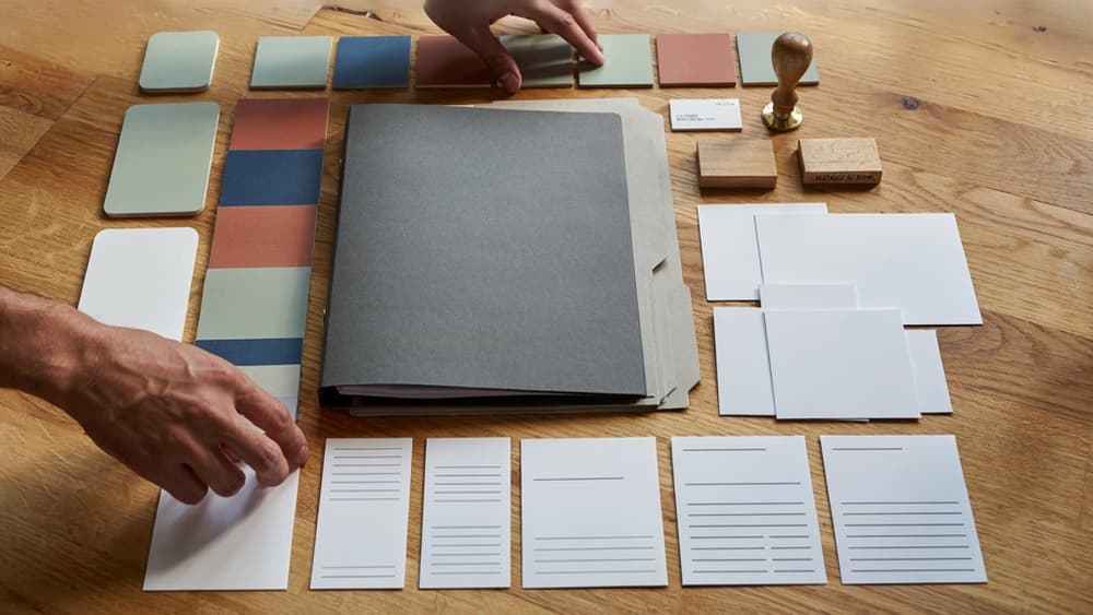
Reusable Brand Guideline Templates for Faster Client Onboarding
Once visuals, voice, and messaging are codified, the next agency challenge is operational: turning that knowledge into a template your team can reuse without rebuilding the wheel for every client.
The core sections every agency brand template should include
A strong agency template should make onboarding faster and reduce the number of “where is that documented?” questions mid-project. At minimum, structure it around sections your strategists, designers, copywriters, account leads, and production teams actually reference.
Include:
- Brand overview: client name, market, audience, positioning summary, and key business context.
- Strategic foundation: mission, vision, values, differentiators, competitive notes, and priority offers.
- Audience profiles: primary segments, buying triggers, objections, and decision criteria.
- Visual identity: links or embedded standards for logo, color, typography, imagery, and layout systems.
- Voice and messaging: tone attributes, messaging hierarchy, approved phrases, banned language, and sample applications.
- Channel guidance: how the brand should show up across website, social, email, ads, sales decks, proposals, and long-form content.
- Asset library: links to logos, fonts, templates, photography, icons, decks, and approved creative files.
- Workflow notes: who approves what, review timelines, legal or compliance needs, and escalation contacts.
The goal is not a beautiful PDF that gets ignored. It is a working reference that shortens briefs, prevents interpretation gaps, and helps new team members contribute without needing three onboarding calls.
Modular fields that make templates reusable across clients
The fastest templates separate fixed structure from client-specific inputs. Your agency should not rewrite the framework every time. Instead, build modular fields your team can complete during discovery and refine during the first few deliverables.
Useful reusable fields include:
- Client snapshot: industry, offer type, audience maturity, sales cycle, and service area.
- Brand maturity level: new brand, refresh, rebrand, campaign extension, or inherited legacy system.
- Primary use cases: website build, retainer content, paid media, social production, sales enablement, or launch campaign.
- Flexibility rating: where the brand is strict, where it can stretch, and where experimentation is allowed.
- Approval sensitivity: low, medium, or high review risk by asset type.
- Reference assets: strongest existing examples, weakest examples, and must-preserve elements.
- Delivery context: internal team size, client-side approvers, recurring formats, and production cadence.
This modular approach helps small agencies scale without adding process weight. A strategist can fill the strategic fields, a designer can complete identity references, and an account lead can document workflow expectations. The result is a client-specific brand system built from the same agency-owned structure.
Version control and approval rules for one source of truth
A reusable template only works if everyone knows which version is current. Without version control, teams end up pulling from old decks, Slack threads, stale PDFs, and forgotten folders.
Set clear rules from the start:
- Name one canonical location for the brand template, such as a shared workspace, client portal, or project management hub.
- Assign an owner responsible for updates, usually the account lead, strategist, or brand lead.
- Use version labels such as `Client Brand Guidelines v1.0`, `v1.1`, and `v2.0` for major changes.
- Log meaningful updates with date, editor, reason, and affected sections.
- Define approval authority so clients know who can sign off on changes.
- Archive old versions instead of deleting them, especially for long-term retainers.
- Link active templates from every brief so production teams never guess where to look.
For agency owners, this is where brand templates become operational leverage. Each approved template becomes a reusable source of truth that protects margin, speeds onboarding, and keeps client work consistent as your team, contractor bench, and service mix grow.
Using Brand Guidelines Examples as AI Guardrails for Scalable Production
Once your template is approved and structured, the next constraint is execution: making sure every AI-assisted asset respects the same brand decisions without your team re-prompting from scratch each time.
Ingest the client brand once, then generate on-brand outputs
For agencies, the biggest AI failure mode is context loss. A strategist writes a strong prompt for one campaign, a designer uses a different tool for social concepts, a copywriter drafts emails in another workspace, and the client’s brand starts fragmenting again.
The better workflow is to treat the completed brand template as the reusable source of context. Instead of pasting scattered notes into each prompt, ingest the client’s brand once: positioning, audience, voice rules, terminology, visual direction, messaging hierarchy, offers, proof points, and exclusions.
Then every output starts from the same brand foundation.
For example, a retained B2B SaaS client might need:
- LinkedIn posts for the founder
- Paid ad variations
- Landing page sections
- Nurture emails
- Webinar promo copy
- Sales enablement snippets
Without brand guardrails, each asset becomes a separate interpretation of the client. With the brand embedded, AI can generate variations that still sound like the same company, speak to the same buyer, and avoid language the client has already rejected.
This is where brand guidelines examples become operational, not just inspirational. They show the level of specificity AI needs to produce usable first drafts instead of generic marketing copy.
Quality checks for AI-assisted marketing assets
AI output still needs review, but the review should be structured around brand fit rather than subjective preference. Build a short QA pass your team can apply before anything reaches the client.
Useful checks include:
- Does the asset use approved claims, offers, and proof points?
- Is the tone aligned with the client’s voice rules?
- Are banned phrases, buzzwords, or competitor-style language absent?
- Does the CTA match the buyer stage and campaign goal?
- Are visual or copy concepts consistent with the client’s positioning?
- Would this feel at home beside the client’s existing website, pitch deck, or top-performing campaign?
This turns review into a repeatable production step. A junior copywriter, account manager, or freelancer can assess the work against agreed criteria instead of guessing what a partner would approve.
For agency owners, that matters because it reduces the hidden cost of AI: the extra cleanup time that erases the speed advantage.
Scaling consistency without adding more reviewers
Small agencies usually do not lose margin because they lack ideas. They lose margin when senior people become the brand memory for every client.
AI guardrails help move that memory into the system.
When the client brand is ingested once and applied across production, your team can create more assets without routing every draft through the same strategist, creative director, or founder. Senior review becomes an escalation point, not a bottleneck.
That creates practical leverage:
- Faster campaign turnarounds without hiring another copywriter
- More consistent deliverables across freelancers and internal teams
- Less time spent rewriting “almost right” AI drafts
- Easier onboarding when a new team member joins an account
- More confidence offering content retainers at scale
Aethera is built around this exact agency problem: capture the client’s brand once, then keep AI-generated content aligned across channels, campaigns, and contributors. The result is not just faster output. It is fewer revision loops, less tool sprawl, and a production system your agency can scale without diluting the brand work clients hired you to protect.