
September 8, 2025
An Introduction to AI Data Visualization Tools
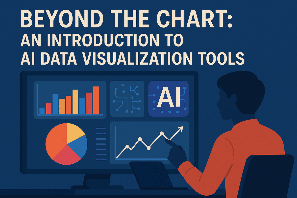
Beyond the Chart: An Introduction to AI Data Visualization Tools
For decades, data visualization meant painstakingly crafting static charts and dashboards. Analysts would spend hours slicing and dicing data, hoping to stumble upon a meaningful insight. But what if your tools could do the heavy lifting for you? What if they could not only display your data but also understand it, interpret it, and even predict what comes next? Welcome to the world of AI data visualization tools.
What Are AI Data Visualization Tools?
At their core, AI data visualization tools are sophisticated platforms that integrate artificial intelligence, particularly machine learning (ML) and natural language processing (NLP), into the process of data analysis and presentation. Unlike traditional Business Intelligence (BI) tools where the user is solely in the driver's seat, these AI-enhanced platforms act as intelligent partners.
Instead of manually selecting chart types and variables, a user can leverage AI to:
- Automatically suggest the best visualization for a given dataset.
- Clean and prepare data by identifying and correcting errors.
- Uncover hidden patterns and correlations that would be nearly impossible for a human to spot in massive datasets.
Think of it as the difference between a standard map and a GPS with real-time traffic analysis. Both show you the geography, but only the intelligent one tells you the best route, warns you of slowdowns, and estimates your arrival time.
How AI is Revolutionizing Traditional Data Analysis
The integration of AI marks a fundamental shift from reactive to proactive data analysis. Traditional analysis is often a retrospective exercise—looking at what happened last quarter or last year. AI-powered data visualization flips the script, transforming dashboards from historical records into dynamic, forward-looking strategic assets.
This revolution is unfolding in two major ways:
- Democratizing Data: AI lowers the technical barrier to entry. Through Natural Language Query (NLQ), anyone on your team—from a sales executive to a marketing manager—can ask complex questions in plain English (e.g., "What were our top-selling products in Germany last month?") and receive an instant, clear visualization.
- Augmenting the Analyst: For data professionals, these tools are not a replacement but a powerful force multiplier. AI handles the time-consuming tasks of data wrangling and initial exploration, freeing up analysts to focus on higher-level strategic thinking, hypothesis testing, and interpreting the "why" behind the data.
Key Benefits: From Automated Insights to Predictive Forecasting
The true power of AI data visualization tools lies in their ability to deliver tangible business value. They move beyond simply showing data to actively explaining it and anticipating future trends.
- Automated Insights: Perhaps the most significant benefit, AI algorithms can sift through millions of data points to automatically surface key drivers, anomalies, and significant trends. The platform might proactively alert you that sales in a specific region are declining unexpectedly, pointing to a potential cause without you ever having to ask.
- Enhanced Storytelling: AI can help weave a compelling narrative around your data, automatically arranging visualizations in a logical sequence to guide the audience through a discovery process. This turns a static report into an interactive and persuasive data story.
- Predictive Forecasting: By analyzing historical data, machine learning models embedded within these tools can generate reliable forecasts. This allows businesses to anticipate future demand, optimize inventory, and make data-driven decisions about what's next, not just what's already happened.
Head-to-Head: Comparing the Best AI Data Visualization Tools
The landscape of ai data visualization tools is bustling, with established giants enhancing their platforms with powerful AI and new challengers emerging with AI at their core. Choosing the right one hinges on your organization's specific needs, existing technology stack, and analytical maturity. Here’s a direct comparison of the leading contenders to help you decide.
Tableau with Einstein: The Enterprise-Level Powerhouse
For organizations that demand deep, robust analytics at scale, Tableau combined with Salesforce's Einstein AI is a formidable force. Tableau has long been a leader in visual analytics, and its AI integration elevates it beyond traditional business intelligence.
- Key AI Features: The platform shines with features like "Ask Data," which allows users to query complex datasets using plain English. "Explain Data" goes a step further, employing statistical models to automatically uncover the drivers behind any specific data point with a single click. For predictive analytics, Einstein Discovery integrates directly into dashboards, providing AI-driven insights, predictions, and actionable recommendations without requiring users to write code.
- Best For: Large enterprises, especially those already invested in the Salesforce ecosystem. Its power lies in handling complex data sources and providing sophisticated, AI-augmented analytics for dedicated data teams and business analysts.
Microsoft Power BI with AI: Seamless Ecosystem Integration
Microsoft's key advantage is its deeply integrated ecosystem. For the millions of businesses running on Office 365, Azure, and Dynamics 365, Power BI is the most natural, accessible, and often most cost-effective choice for data visualization.
- Key AI Features: Power BI excels at making AI accessible to a broader audience. The "Q&A" visual enables natural language queries, while the "Quick Insights" feature can scan a dataset and automatically surface interesting trends, correlations, and outliers. For more advanced use cases, it offers seamless integration with Azure AI and Azure Machine Learning, allowing data scientists to embed custom ML models directly into Power BI reports.
- Best For: Businesses of all sizes that are heavily invested in the Microsoft stack. It successfully democratizes data analysis, empowering everyone from executives to operational staff to leverage AI for smarter decision-making.
Google's Looker Studio & AI: Cloud-Native Collaboration
Born in the cloud, Google’s Looker Studio (formerly Data Studio) and the broader Looker platform are built for the modern, collaborative data workflow. Their primary strength is their tight integration with the Google Cloud Platform (GCP), particularly the BigQuery data warehouse.
- Key AI Features: Looker leverages the immense power of GCP’s AI and ML services. Users can tap into BigQuery ML to build and execute machine learning models using simple SQL commands and visualize the results directly in Looker. The platform’s core strength is its semantic modeling layer (LookML), which creates a governed, reliable source of truth, ensuring that AI-driven insights are consistent and trustworthy across the entire organization.
- Best For: Data-forward companies operating within the Google Cloud ecosystem. Its web-based, collaborative nature is ideal for teams that need to work on and share real-time insights from massive datasets.
Emerging AI-Native Platforms to Watch
Beyond the titans, a new breed of ai data visualization tools is gaining traction. Platforms like ThoughtSpot, Tellius, and others are considered "AI-native" because they were built from the ground up around search and AI-driven analytics. Instead of tasking users with building dashboards, these tools allow you to simply ask questions in a search bar. The AI engine then instantly generates the best visualization to answer your query. They focus on automating insight discovery and delivering a consumer-grade user experience, making sophisticated data analysis accessible to truly anyone in the organization.
Core Features of Leading AI Data Visualization Tools
While traditional business intelligence (BI) platforms can create charts and graphs, modern AI data visualization tools operate on a different level. They act as intelligent partners in the analytical process, actively surfacing insights that might otherwise remain hidden. These platforms are defined by a set of core capabilities that automate complex tasks and democratize data exploration. Let's explore the standout features that separate the leaders from the pack.
Automated Pattern and Anomaly Detection
Manually sifting through millions of data points to find significant trends or outliers is a monumental task prone to human error. This is where AI excels. Leading tools automatically scan your datasets to identify statistically significant patterns, correlations, and clusters. More importantly, they flag anomalies—unexpected spikes, dips, or deviations from the norm—that could signal a critical operational issue, a fraudulent transaction, or an emerging market opportunity. This proactive monitoring saves countless hours and empowers teams to address situations before they escalate, turning data into a first line of defense.
Natural Language Query (NLQ) for Intuitive Data Exploration
The era of needing to know SQL or complex query languages to interrogate data is fading. Natural Language Query (NLQ) is a transformative feature that allows users to ask questions in plain English. You can simply type or speak a query like, "What were our top-selling products in Germany last quarter?" and the AI will instantly translate it into a formal query and present the answer as an appropriate visualization. This functionality breaks down barriers, making powerful data analysis accessible to everyone in the organization, from executives to marketing managers, fostering a truly data-driven culture. This conversational approach makes interacting with AI data visualization tools as simple as talking to a colleague.
Predictive Modeling and 'What-If' Analysis
The most advanced AI data visualization tools don't just show you what happened in the past; they help you forecast the future. By integrating machine learning algorithms, these platforms can analyze historical data to build predictive models for sales, customer churn, or inventory demand. Furthermore, they enable powerful 'what-if' analysis, allowing you to simulate the potential impact of business decisions. For instance, you can model how a 10% price reduction might affect revenue or how a new marketing campaign could influence customer acquisition. This shifts decision-making from being reactive to proactive, providing a strategic edge.
Automated Data Storytelling and Report Generation
A chart is just a collection of data points until its story is told. AI is now taking on the role of the narrator. Instead of just presenting a dashboard, these tools generate automated narrative summaries that explain the key insights in plain language. They can highlight the "so what" behind the data, automatically captioning charts with key takeaways like, "Sales in the Western region grew by 25% this month, driven primarily by Product X." This feature significantly speeds up report generation and ensures that crucial findings are clearly communicated to all stakeholders, regardless of their data literacy level.

Practical Applications: How Industries Use AI Data Visualization Tools
The true power of AI-powered data visualization is not just in creating stunning charts; it's in driving tangible business outcomes. Across every sector, organizations are leveraging ai data visualization tools to transform complex datasets into strategic assets. These platforms move beyond static reports, offering predictive and prescriptive insights that fuel smarter, faster decision-making. Here’s how key industries are putting these tools to work.
Boosting Marketing ROI with Automated Trend Analysis
In the fast-paced world of marketing, staying ahead of consumer trends is paramount. AI data visualization tools are a game-changer, automatically sifting through terabytes of customer data from CRM systems, social media, and web analytics. The AI can identify subtle micro-trends and shifts in customer behavior that human analysts might miss.
Instead of manually building reports, marketers get dynamic dashboards that visualize campaign performance in real-time, segment audiences with incredible precision, and even predict which marketing channels will deliver the highest ROI. This allows for rapid A/B testing, personalized customer journeys, and optimized ad spend, directly connecting marketing activities to revenue growth.
Optimizing Financial Forecasting and Risk Management
The financial services industry runs on data. From stock market fluctuations to consumer credit scores, the volume is immense. AI-powered visualization tools are essential for making sense of it all. These platforms use machine learning algorithms to analyze historical market data, identify fraudulent transaction patterns, and model complex risk scenarios with greater accuracy.
An analyst can use an interactive dashboard to instantly visualize portfolio risk exposure under different market conditions or drill down into anomalies that signal potential fraud. This moves financial analysis from a reactive to a proactive state, enabling more reliable forecasting, stronger regulatory compliance, and a significant reduction in financial risk.
Enhancing Supply Chain Efficiency with Predictive Insights
Modern supply chains are a complex web of logistics, suppliers, and demand signals. AI data visualization tools provide a centralized, intelligent view of the entire operation. By analyzing data from IoT sensors, shipping manifests, and weather forecasts, these tools can predict potential disruptions before they occur.
A logistics manager can visualize an entire network, receive AI-generated alerts about a potential shipping delay, and see suggestions for alternative routes. The software can also forecast demand with uncanny accuracy, helping to optimize inventory levels and prevent costly stockouts or overstock situations. The result is a more resilient, agile, and cost-effective supply chain.
Improving Healthcare Outcomes Through Patient Data Analysis
In healthcare, data can be a matter of life and death. AI visualization platforms are revolutionizing patient care by securely integrating and analyzing data from electronic health records (EHRs), medical imaging, and wearable devices. The AI can identify patterns that correlate with disease risk, predict patient responses to different treatments, and visualize the spread of infectious diseases in real time.
For clinicians, this means a dashboard that presents a patient's complete medical history in an intuitive, visual format, highlighting critical risk factors. For hospital administrators, it means optimizing patient flow and resource allocation. Ultimately, these tools empower healthcare providers to deliver more personalized, effective, and preventative care.
Best Practices for Implementing AI Data Visualization Tools
Adopting powerful ai data visualization tools is more than just a technical upgrade; it's a strategic shift. To unlock their full potential, you need a thoughtful approach that combines high-quality data, intelligent inquiry, and strategic integration. Follow these best practices to move from simply viewing data to actively conversing with it.
Prioritize Data Quality for Accurate AI Insights
The most advanced AI is useless if it's analyzing flawed information. The principle of "garbage in, garbage out" is amplified with AI, as automated systems can quickly scale and perpetuate errors. Before you even connect a data source, ensure your data is:
- Clean: Remove duplicates, correct inaccuracies, and handle missing values.
- Structured: Organize data logically with consistent formatting and clear labels.
- Relevant: Use datasets that directly pertain to the business questions you need to answer.
By establishing a strong data foundation, you empower your ai data visualization tools to uncover genuine patterns and deliver trustworthy insights, rather than generating beautifully rendered but misleading charts.
Master the Art of the Question Using Natural Language
One of the biggest breakthroughs in modern BI is the ability to query data using plain English. However, the quality of your answer depends on the quality of your question. To get the most from Natural Language Query (NLQ) features, be specific and contextual.
- Vague: "Show me last year's sales."
- Specific: "Compare sales revenue for the 'Alpha' and 'Beta' product lines by quarter in 2023."
- Vague: "What are our customer trends?"
- Specific: "What is the customer churn rate month-over-month for the past 12 months, segmented by subscription tier?"
Think like an analyst. Provide the AI with clear parameters, timeframes, and segments to guide its analysis and generate the precise visualization you need.
Integrate AI-Driven Visuals into Your Business Strategy
An AI-generated dashboard is only valuable if it drives action. Avoid treating these tools as isolated platforms for the data team. Instead, embed them directly into your organization's operational rhythm.
- Embed Dashboards: Integrate live, AI-powered dashboards into the platforms your teams use daily, such as Salesforce, SharePoint, or internal portals.
- Automate Reporting: Set up automated alerts and reports based on AI-detected anomalies or trends, ensuring key stakeholders are informed in real-time.
- Center for Decision-Making: Make AI-driven visuals a central component of weekly meetings and strategic planning sessions to foster a proactive, data-informed culture.
Avoid Common Pitfalls and Misinterpreting AI Suggestions
AI is a powerful co-pilot, not an infallible oracle. It can identify correlations you might miss, but it lacks human context and business acumen. Stay vigilant to avoid common traps.
- Correlation vs. Causation: An AI might show a strong correlation between two unrelated metrics. Use your domain expertise to question whether a logical relationship exists before drawing conclusions.
- Confirmation Bias: Don't just look for visuals that confirm your existing beliefs. Be open to surprising or counterintuitive insights the AI presents.
- Over-reliance: Always treat AI suggestions as a starting point for further investigation. Use your critical thinking to validate the findings and understand the "why" behind the data. Human oversight is the critical final step in turning AI-generated insights into intelligent business decisions.

Conclusion: Choosing the Right AI Data Visualization Tool for Your Needs
The journey through the landscape of AI data visualization tools reveals a powerful truth: data is no longer a static resource but a dynamic, conversational partner. The right tool can transform complex datasets into clear, actionable narratives, empowering everyone in your organization to make smarter decisions. But with a market full of powerful options, making the final choice requires a strategic approach. This conclusion will guide you through the final steps: evaluating key factors, test-driving your top contenders, and looking ahead to the exciting future of AI in data analytics.
Key Factors to Consider Before You Choose
Selecting the best AI data visualization software isn't just about the flashiest features; it's about finding the perfect fit for your unique ecosystem. Before you commit, carefully evaluate these critical aspects:
- Integration Capabilities: Can the tool seamlessly connect to your existing data sources? Whether your data lives in SQL databases, cloud warehouses like Snowflake or BigQuery, or simple spreadsheets, frictionless integration is non-negotiable.
- User Experience and Learning Curve: Who will be using the tool? A platform designed for data scientists will have a different interface than one built for business analysts or marketing managers. Look for tools with natural language processing (NLP) capabilities that allow users to ask questions in plain English, significantly lowering the barrier to entry.
- Core AI Features: Dig deeper than the "AI-powered" label. Does the tool offer automated insights that uncover hidden patterns? Does it provide predictive analytics and forecasting? Look for specific features like anomaly detection, clustering, and automated chart recommendations that align with your business goals.
- Scalability and Performance: Your data volume will only grow. Ensure the chosen platform can handle increasing amounts of data and a growing number of users without compromising speed or performance.
- Pricing and Total Cost of Ownership (TCO): Understand the pricing model—is it per-user, usage-based, or a flat subscription? Factor in implementation, training, and support costs to calculate the true TCO and ensure a clear return on investment.
Where to Find Free Trials and Demos
Reading reviews is one thing, but experiencing a tool firsthand is invaluable. Nearly all leading vendors of AI data visualization tools offer ways to test their platforms before you buy.
Start by visiting the official websites of your top candidates, such as Tableau (Salesforce), Microsoft Power BI, and ThoughtSpot. They almost always feature prominent links to free trials, which typically last from 14 to 30 days. For more complex enterprise needs, scheduling a personalized demo with a sales engineer is a great way to see the tool in action with data relevant to your industry. Additionally, platforms like G2 and Capterra not only provide peer reviews but also link directly to trial and demo sign-up pages.
The Future Outlook: What's Next for AI in Data Analytics?
The evolution of AI in data analytics is accelerating, moving far beyond automated dashboards. The future is centered on creating a truly symbiotic relationship between humans and machines. Watch for these trends shaping the next generation of tools:
- Generative BI: The biggest shift on the horizon. Users will move from asking simple questions to giving complex prompts like, "Generate a report analyzing Q3 sales dips in the Northeast, identify the likely causes, and suggest three data-backed marketing strategies to recover." The AI will create not just a chart, but a complete, multi-page narrative.
- Hyper-Personalization: AI will deliver insights tailored not just to a role, but to an individual's specific projects, habits, and in-the-moment needs, proactively pushing relevant information before it's even requested.
- Explainable AI (XAI): As AI-driven recommendations become more critical, so will transparency. Future tools will need to explain why they've reached a certain conclusion, building trust and allowing users to vet the AI's logic.
Ultimately, choosing the right tool today means investing in a platform that not only solves your current challenges but is also prepared for the more intelligent, conversational, and predictive future of data analytics.